It happens to the best of us. You’ve spent hours putting together a landing page, fretting over headlines, CTA design, lead capture forms, and, of course, your copy.
You’re pouring cash into PPC ads and email marketing campaigns. But all you’re getting are clicks—and then crickets.
You’re paying every time a user clicks through to your landing page, but because they’re not following through with your CTA, your clicks are not translating into conversions.
You’re spending advertising dollars, but you’re getting nothing in return.
Clicks might not equal conversions—but you can increase the likelihood of conversions with these simple landing page edits.
Start with the ad and page message match
Your conversion story starts with the ad.
That means it’s crucial to target your ad to the right audience and ensure that your ad and landing page share the same message.
Google and Facebook reward relevant ad-to-page experiences via high Quality Scores and Ad Relevance Scores. Achieving high scores on both platforms helps advertisers get better ad rankings and lower CPC.
On the visitor side, maintaining an ad-to-page message match is critical for telling the person who clicked the ad they’ve come to the right place. The page needs to deliver on the ad’s promise—typically comprising more details about the offer, why they need it, and how to get it.
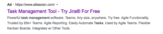
For example, this Jira ad promotes the “Try Jira For Free” offer. The ad copy highlights that Jira is a powerful task management software. It is agile, functional, and trusted by 65k+ teams.
When a user clicks through to the landing page, this is what they see:
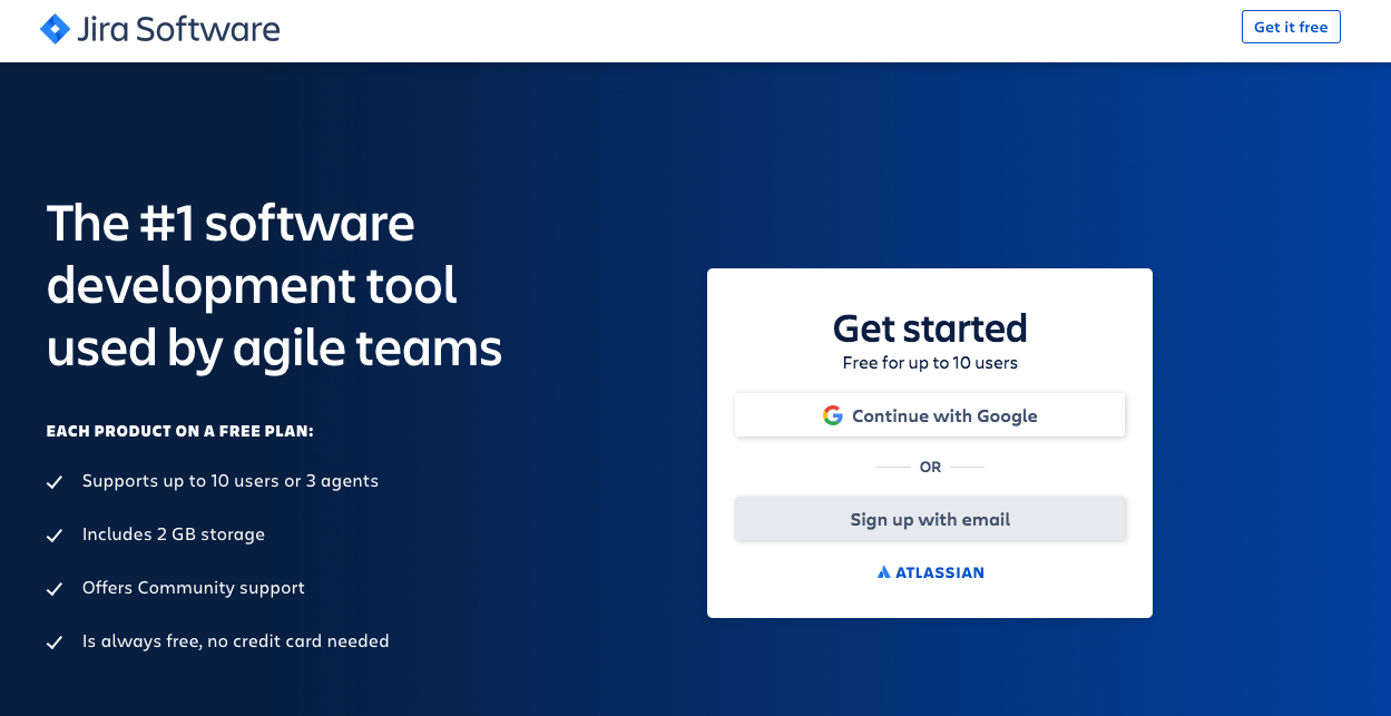
The page copy reiterates the ad messaging—you can get Jira for free, and it’s the leading software development tool used by agile teams. Plus, several name-brand companies like Cisco and Spotify trust the software.
Use landing page copy to pre-qualify traffic
Cost per lead is a crucial metric to track for growth. It’s also one of the trickiest.
Because while you want to get as many leads as possible at the lowest cost, you also don’t want to get unqualified leads that aren’t going to contribute to your ROAS in the long run.
You need to strike the perfect balance between lead quantity and lead quality. And this is where your landing page copy comes in. Your copy can filter out unqualified leads before they ever enter your sales ecosystem.
You do this by:
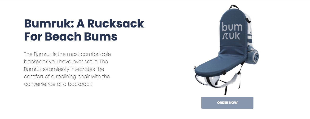
- Crafting messaging that subtly speaks to the people you’re targeting, while turning away those who aren’t part of your target audience. Bumruk, a unique bag/chair combo, uses their copy to highlight that the product is for regular beachgoers who want their “bum to have a place to sit.”
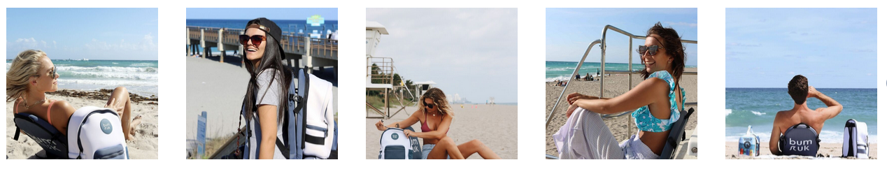
The user images on the page also showcase that the product is for millennials who like to spend their time outdoors.
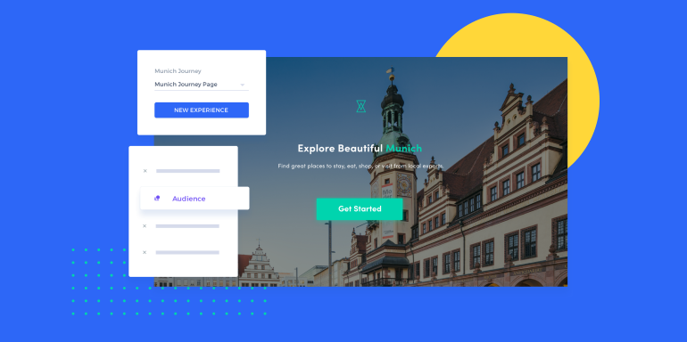
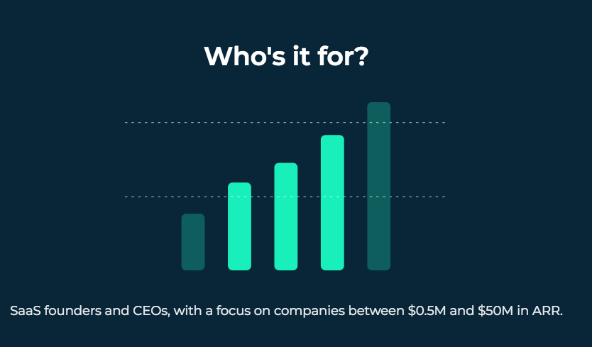
- Stating upfront who your service/offer is for with a dedicated section. Mogul.io, a community for SaaS founders and CEOs, clearly features their target audience on the landing page.
Put FOMO on the page
FOMO—or fear of missing out—drives human action via the principle of scarcity.
Scarcity encourages uncertain prospects to convert by emphasizing the offer only has limited availability—the shorter the supply, the more perceived value an item has for users.
You can use two primary types of scarcity on your page:
-
- Scarcity of quantity: When a product or offer is in short supply, its demand increases, along with the likelihood of conversions and sales.
- Scarcity of time: An offer available for a brief time instills a sense of urgency that moves users to take action before it expires.
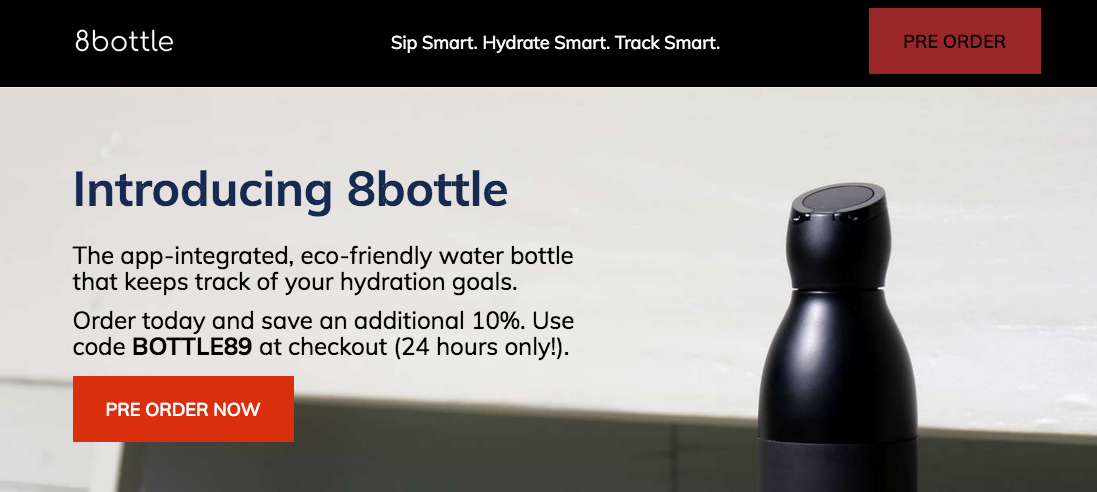
The smart water bottle, 8bottle, gets visitors to click the CTA button by emphasizing an additional 10% discount and putting a 24-hour clock on it.
The smart water bottle, 8bottle, gets visitors to click the CTA button by emphasizing an additional 10% discount and putting a 24-hour clock on it.
Add some social proof
Add social proof to your page and show visitors that people like them trust you.
You can add social proof in the form of:
-
-
- Counters: Add a customer counter to your page and showcase how many people trust you.
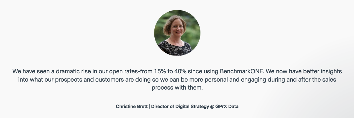
- Customer testimonials: Testimonials strongly influence prospects because they further your narrative on the landing page—but from a real customer’s point of view. A good testimonial includes a detailed quote and the subject’s affiliation, while a great one also features their headshot to form that human connection.
-
Email marketing and CRM tool BenchmarkONE’s customer testimonial checks all the boxes of the perfect customer quote.
-
-
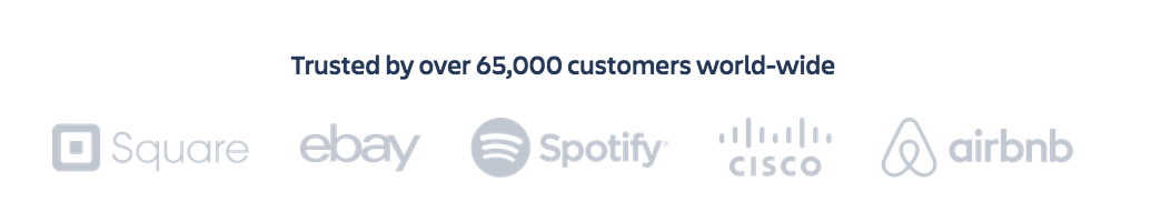
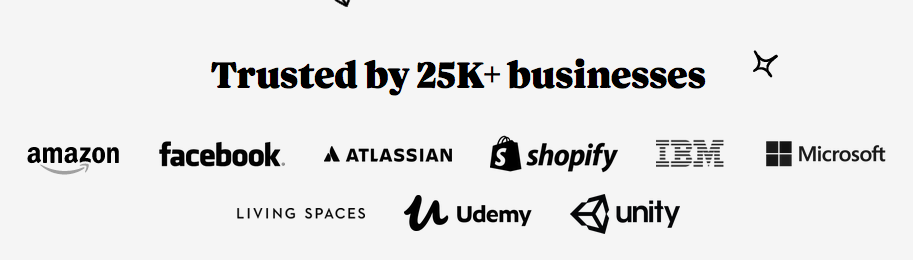
- Customer logos: Logos work the same way celebrity endorsements do. When people see that reputable brands are using your service, they’re more likely to trust your brand and convert.
-
Intercom uses a customer counter that reads “Trusted by 25K+ businesses” as well as customer logos from multiple credible brands as social proof on their page.
Get creative with page design
As a visitor lands on your page, all someone sees before their eyes zero in on the copy is the page design. Here is a valuable chance at a strong first impression—don’t waste it.
Use bold colors, creative typography, and the proper page contrast to create a seamless user experience that makes visitors want to scroll—and eventually click the CTA button.
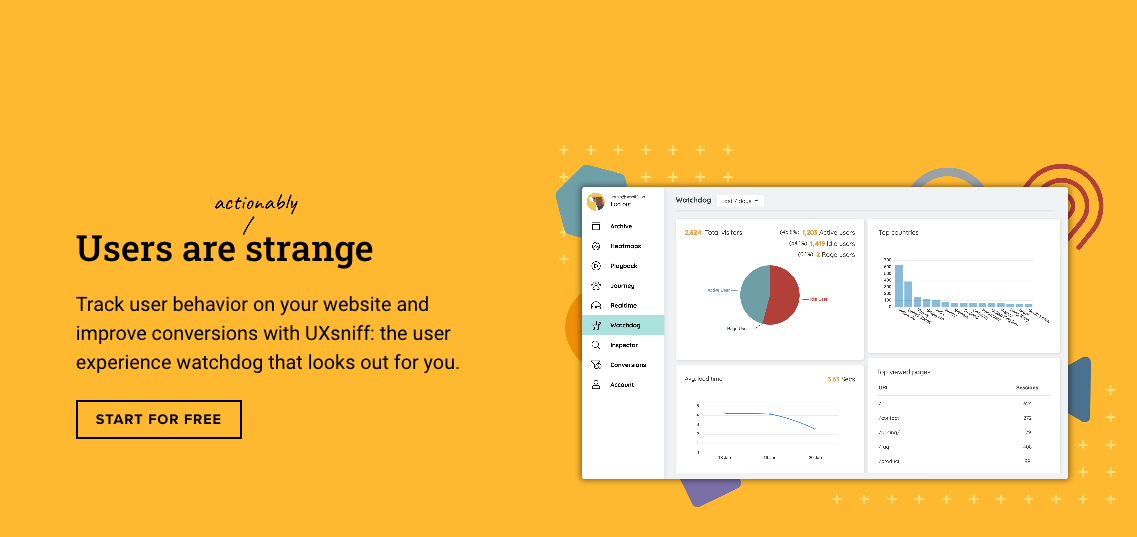
UXsniff uses bold colors to make their landing page more inviting.
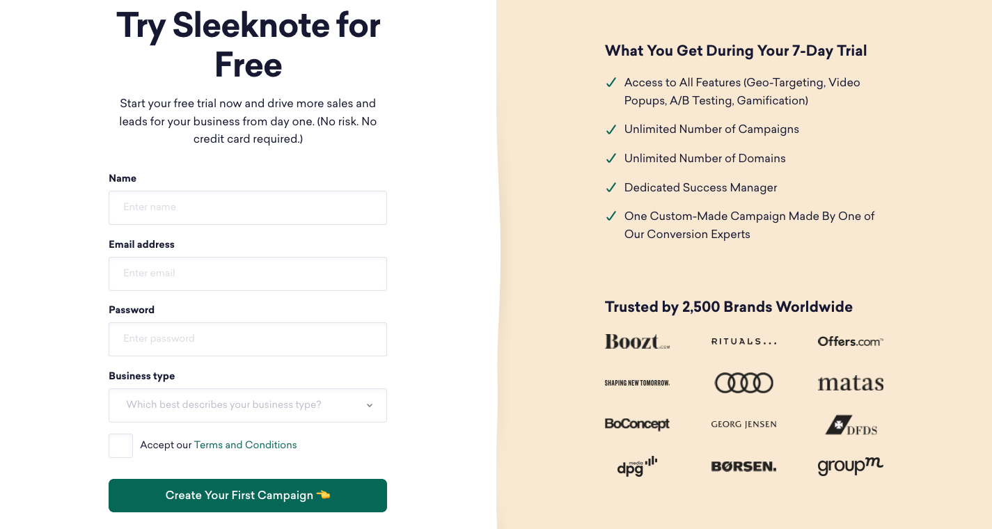
Sleeknote uses a vertical split layout to organize the page, remove unwanted clutter, and increase readability. The page also features a contrasting CTA button color and an emoji pointing to the button copy to get more clicks.
Make your page more human
The more you can build trust with visitors on your landing page, the better.
One way to build an instant rapport with visitors is by using pictures of real people to establish a human connection.
Help visitors identify with your messaging and become emotionally invested in your offer by showing them your “human side.”
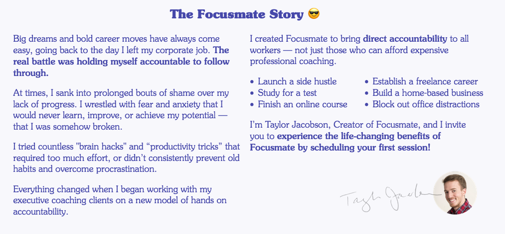
The Focusmate page features their origin story with a picture of the founder to get visitors more invested in the platform’s journey.
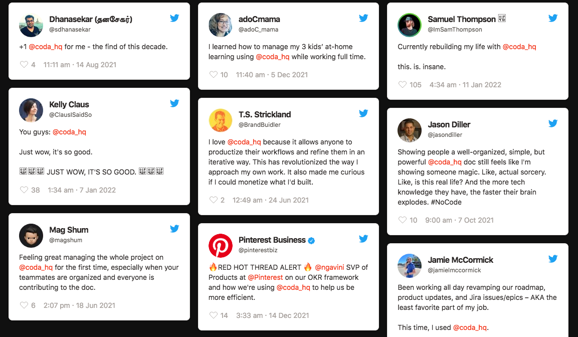
The Coda page has customer tweets explaining how the tool helped make their lives easier.
Increase landing page conversions with Instapage
It may seem like a daunting task, but increasing landing page conversions is possible when you know exactly what to do on the page.
Need help getting started? Consider Instapage.
Find out how you can create optimized, dedicated, fast-loading landing pages for every offer you advertise by signing up for an Instapage Enterprise Demo
