Today, we’ll explore the importance of hero sections and why they play a pivotal role in grabbing the attention of your audience from the moment they land on your page. Whether you’re an edtech entrepreneur, a marketing professional, or simply interested in optimizing landing page hero sections, this blog is packed with valuable strategies to help you elevate your online presence and drive outstanding results.
To help you optimize your landing pages and achieve higher ROAS, we have distilled some critical takeaways from Wondrium’s successful approach. By incorporating these tactics into the hero section of your landing pages, you can increase your chances of driving meaningful conversions and create a more impactful user experience.
Here are three of our favorite things about the Wondrium landing page (and why you should try them on your landing pages!)
The copy makes the visitor the main character
When visitors land on a page, they are seeking solutions to their specific needs or problems and may not have the patience to scroll past the hero section. By placing the focus on the visitor and addressing their pain points, desires, or aspirations immediately, the copy creates a personalized and empathetic experience. This approach resonates deeply with the audience, making them feel understood and valued.
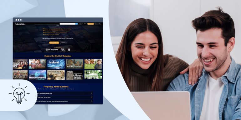
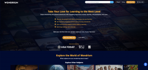
Take a look at Wondrium’s captivating landing page, strategically written for users who are actively searching for learning opportunities. The headline, “Take Your Love for Learning to the Next Level,” immediately draws them in by addressing their passion for education. The bullet points are easily scannable and speak directly to curious individuals eager to further their knowledge. With the enticing offer of “Start binge-learning with a free trial,” Wondrium makes the learning platform sound as enjoyable and entertaining as popular streaming services like Netflix or Hulu.
This landing page is a perfect example of how to make visitors the main character by tapping into their interests and desires and compelling them to embark on a journey of discovery and personal growth.

Ultimately, crafting landing page copy that places the visitor as the main character fosters a sense of empowerment and persuades them to take the desired action–leading to higher conversion rates and overall campaign success.
There is social proof above the fold
Placing social proof in the hero section or above the fold is strategically important as it captures the attention of visitors immediately. It’s one of the first elements they see, and it can quickly influence their perception of the product or service. Incorporating social proof
in this prominent position signals that the offering has garnered praise and approval from others, reinforcing the claim that it’s a worthwhile investment.
Above the fold, Wondrium strategically displays a mini social proof section featuring endorsements from reputable sources like the Wall Street Journal and USA Today. By leveraging these well-known logos, Wondrium maximizes trust without overwhelming visitors with excessive information or distractions. This simple and clever use of social proof in the hero section creates a compelling first impression and persuades visitors to explore further.
![]()
By showcasing positive feedback and experiences, landing pages can establish a solid foundation of trust with the audience, encouraging them to engage further and ultimately leading to higher conversion rates and business success.
The hero section entices people to continue scrolling by teasing the next section
The hero section of a landing page should entice people to continue scrolling by teasing the next section to create a sense of curiosity from the very beginning. When visitors first land on a page, their attention span is limited, and they may quickly decide whether to stay or leave.
By using the hero section to provide a glimpse of what’s coming next, the landing page piques the interest of the audience, encouraging them to explore further. Teasing the next section can be done through compelling visuals, intriguing headlines, or a brief preview of the valuable content that awaits below. This approach keeps visitors intrigued and eager to uncover more information, effectively guiding them through the entire page.
At the tail end of Wondrium’s hero section, a captivating secondary headline, “Explore the World of Wondrium,” emerges alongside intriguing snippets of class images just out of view. By provoking curiosity and leaving a sense of discovery, this clever tactic persuades visitors to linger on the page, compelling them to keep scrolling. The strategic use of page dynamics ensures that even those who may have hesitated initially are enticed to delve deeper into the captivating world of Wondrium, opening doors to higher engagement and conversion rates.
Ultimately, a well-crafted hero section that entices people to continue scrolling by teasing the next section plays a vital role in keeping visitors on the page, driving them deeper into the content, and ultimately leading them to take the desired action. It maximizes the effectiveness of the landing page by optimizing visitor engagement and conversion rates.
What we would experiment with:
At Instapage, we believe that constant testing & experimentation is necessary to achieve the best landing page conversion rates. With that in mind, here are some elements we would test on the Wondrium landing page:
- Experimenting with the Hero Image: Wondrium might want to try out a less busy hero image to understand its impact on user engagement and conversion rates. While the hero image does a great job highlighting the breadth of courses offered, some sections could be easier to read and it may feel overwhelming in mobile view. By testing different variations of the hero image, Wondrium can gain valuable insights into how users respond to each version.
- Streamlining the Navigation Bar: Wondrium’s landing page features a dynamic scrolling navigation bar that empowers visitors to convert seamlessly from anywhere on the page. Though it’s a condensed version of their main navigation bar, it still provides opportunities for visitors to pause or exit the conversion journey. To optimize the user experience and increase conversions, we recommend experimenting with an even more simplified navigation bar—one that solely showcases their compelling CTA.
By incorporating the key takeaways we have distilled from Wondrium’s landing page strategy, you can optimize your education and edtech landing pages and achieve better results!
If you’d like to explore ways you can easily implement these tactics on your landing pages, sign up for an Instapage 14-day trial and see the impact a powerful landing page platform can have on your campaigns. You can also watch the full Wondrium landing page review here.