
Founded in 2006, Marketo and its powerful marketing automation software began helping marketers all over the world effectively engage customers and prospects. Today, ten years later, the company has helped countless name brands find success with its software. Some of these brands include Canon, Hyundai, Microsoft, Sherwin-Williams, Nokia, and Panasonic.
One of the things Marketo does better than many other companies is use post-click landing pages to supplement their automation. By using post-click landing pages appropriately and efficiently, Marketo is able to increase conversion rates substantially. Let’s take a close look at how Marketo uses post-click landing pages to increase the number of leads entering their sales funnel.
Before we do that, though, let’s refresh your memory.
What is a post-click landing page?
A post-click landing page is a standalone web page, which has been created with a single goal in mind: to get visitors to convert. Your post-click landing page goal can vary; from signing up for a new service, downloading an ebook, generating sales, subscribing to a newsletter, registering for a webinar, and a whole list of other content.
Whatever the action is, the goal of a post-click landing page is to elicit that action using persuasive elements like compelling headlines, social proof, explanatory videos, and a color-contrasting form with a call-to-action.
8 Ways Marketo uses post-click landing pages
1. Demo sign-ups
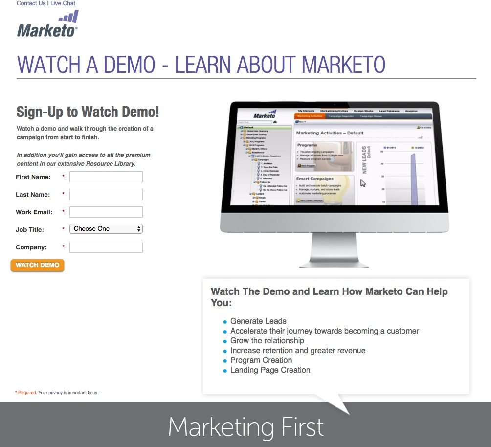
What the page does well:
- The CTA button contrasts well with the page and draws the reader’s attention to the button.
- The post-click landing page’s headline, ”Watch a Demo – Learn About Marketo” tells visitors exactly what they’ll be doing once they submit their information. This same copy is used multiple times throughout the page to drive home this post-click landing page’s purpose.
- The preview of the demo on the computer screen gives the audience a sneak peek into the Marketo platform.
- The text above the form “you’ll gain access to all the premium content in our extensive Research Library” informs visitors they will receive additional content (in addition to the demo), which adds value to the page and incentivizes visitors to convert on the form.
- The bulleted list at the bottom explains the highlights of the demo so visitors don’t have to guess what the content will be.
What could be changed and A/B tested:
- Marketo’s logo is linked to their homepage, which acts as an exit link and potentially limits the number of people converting.
- The CTA button size could be much bigger. It’s already a contrasting color, so why not make it more obvious to visitors where they can sign up for a demo by clicking a larger button?
- The live chat option in the top left corner allows prospects to leave the post-click landing page, as a different tab/window is opened up.
- Adding trust signals like testimonials, badges, etc. could be added. Marketo works with numerous successful companies, but visitors would never know this by simply looking at this post-click landing page.
- The privacy policy link could be moved higher up on the page, so that it’s easier to see without having to scroll to the bottom of the page. This gives the user more confidence in providing their information.
- Removing the “Contact Us” link in the top left corner would eliminate an exit link, which would, in turn, likely increase Marketo’s conversion rate on this post-click landing page.
- The “Marketing First” footer title is confusing. What does that even mean?
2. Demand generation success kit
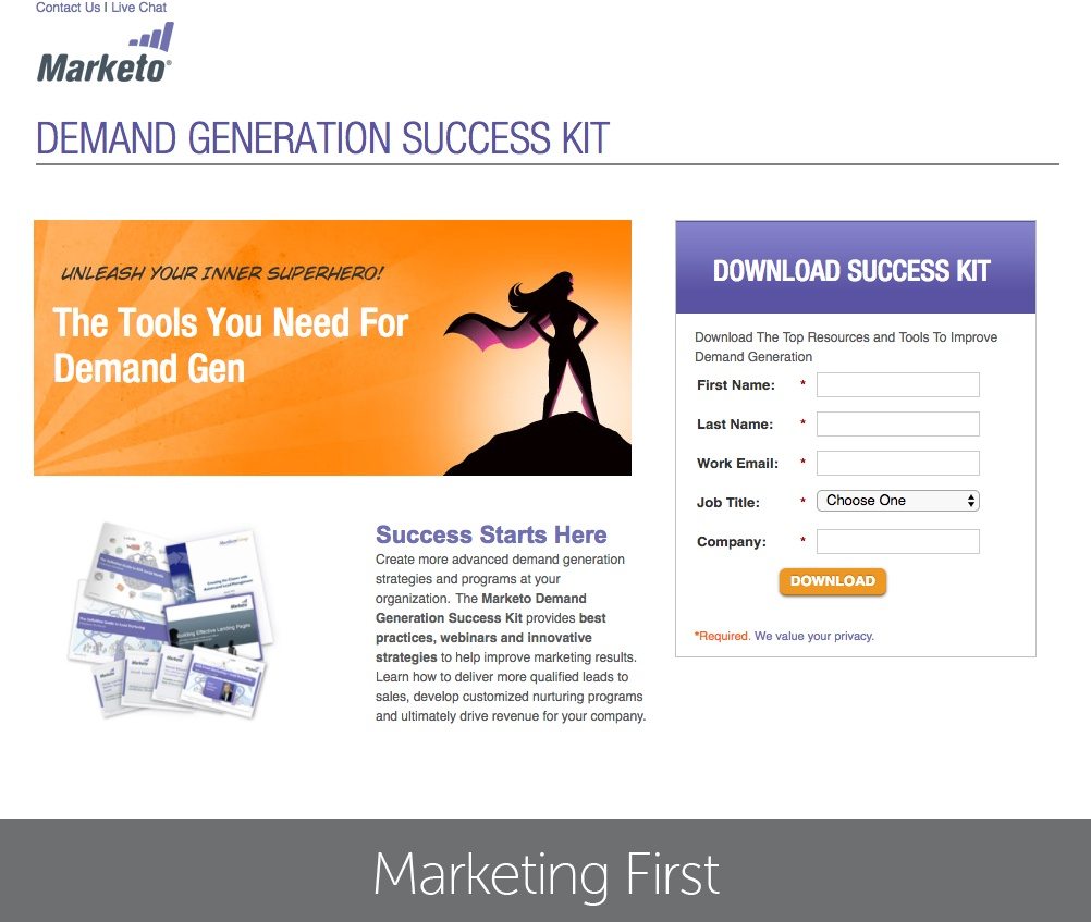
What the page does well:
- The relatively short form doesn’t intimidate visitors from converting.
- The privacy policy link is directly below the CTA button, which makes it very easy for concerned prospects to visit Marketo’s privacy policy.
- The page is balanced and isn’t any longer than it needs to be. It’s okay to have visitors scroll on your post-click landing page, but if your offer doesn’t warrant a longer page (like this one) then keep it short.
What could be changed and A/B tested:
- Marketo’s logo is linked to their homepage, which acts as another exit link and potentially limits the number of people downloading the success kit.
- The CTA button should be a different color. Orange is already used on the page, which makes the CTA button not stand out as much as it could.
- The “Contact Us” link in the top left corner acts as an exit link, which may decrease Marketo’s chances of converting prospects into leads.
- The live chat option, again, opens in a different tab/window, creating an exit point for visitors.
- The copy is a bit of a struggle to read because of the alternating bold text and unbold text.
- The image on the bottom left should be larger so that visitors are able to better evaluate whether or not the offer is worth converting.
- Making all form fields required could be limiting the number of conversions on this Marketo post-click landing page. Are job title and company name really required for this demand generation kit?
- The CTA button copy “Download” is a bit weak. Adding something to make it more personal, like “Download your success kit” may drive more leads.
- A lack of trust signals on this page. Adding elements like testimonials and reviews could increase the trustworthiness of the page.
3. Digital advertising guide
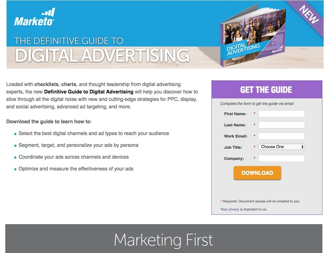
What the page does well:
- The logo in the top left corner is NOT hyperlinked to Marketo’s homepage, which is a great alteration from the previous examples. Visitors are able to identify this guide as being Marketo produced, but cannot exit the page through the company’s logo.
- There are no exit points on this post-click landing page.
- The bulleted list makes it easy for visitors to scan this post-click landing page and find out exactly what the guide will teach them.
- The CTA button contrasts well with the rest of the post-click landing page.
- The text beneath the CTA explains how visitors will receive the digital advertising guide (via email).
- The page is well-organized. It is crisp, clean, and clear so that people aren’t overwhelmed or distracted when they visit the page. Only the critical elements are present, and nothing seems cluttered or unnecessary.
What could be changed and A/B tested:
- The CTA button copy could be more inspiring. Instead of reading “Download,” it could say “Send Me the Guide,” and it would likely produce more conversions.
- Including a sample of a chart or checklist might drive more downloads. Users like transparency, so if they know exactly what they are getting (and they want it) they will be more likely to redeem your offer.
- Not requiring all fields could boost conversions on this page, especially since the form is relatively short.
- Trust signals could be added to the page. For example, a testimonial from a current customer who found the advertising guide beneficial to their campaign.
4. Social media marketing guide
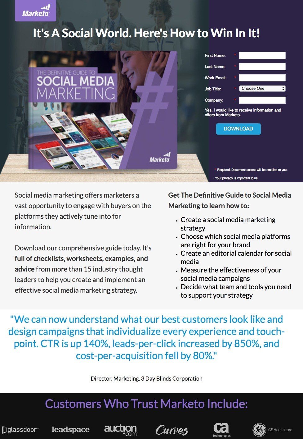
What the page does well:
- The page is balanced and well-organized. There is not a lot of white space. The simplicity and organization of the page greatly help people to not feel overwhelmed or distracted when they visit the page. Only the critical elements are included and nothing seems cluttered or unnecessary.
- The headline teases visitors because they imply that by downloading the guide, visitors will be able to win at social media marketing.
- The bright CTA button immediately draws attention to the form.
- The testimonial from 3 Day Blinds Corporation helps make visitors feel comfortable with the Marketo and the brand in general. (However, there is no name or headshot attached to the quote so it’s a little less credible.)
- Customer badges add credibility to Marketo’s marketing automation, especially from well-known brands like Glassdoor and GE.
- The bulleted list makes it easy for visitors to scan the page and find out exactly what the guide will teach them.
- The bold copy makes it easy for visitors to scan the copy and learn the highlights of what they will be getting in the guide.
What could be changed and A/B tested:
- The company logo in the top left corner is linked to the Marketo homepage, which acts as an exit link and potentially limits the number of people downloading the guide.
- There is no opt-out checkbox near the text, “Yes, I would like to receive information and offers from Marketo.” This could very easily deter some people from downloading the guide.
- The “Download” CTA button copy is boring and doesn’t entice visitors to convert as much as “I Want the Guide” or “Send Me the Guide” would.
- Adding more white space could help all elements “breathe” a little more and draw maximum attention.
5. Marketing automation guide

What the page does well:
- The subheadline, “100-Page Guide to Everything You Ever Wanted to Know About Marketing Automation,” is very catchy. 100 pages?! That has to be chock full of information!
- The bulleted list makes it very easy for visitors to scan the page and find out exactly what they will learn from the guide.
- Testimonials act as trust signals for prospects who are hesitant about Marketo and this marketing automation.
- Including two privacy policy links helps reassure visitors their information will be kept safe by Marketo when they convert on the form.
What could be changed and A/B tested:
- Multiple exit links evidenced by the company logo and “Contact Us” serve as exit points, which could decrease Marketo’s chances of converting prospects.
- Two subheadlines? “Your Comprehensive Guide to Today’s Hottest Marketing Trend” and “100-Page Guide to Everything You Ever Wanted to Know About Marketing Automation.” Although these are each catchy subheadlines, it’s probably not necessary to have both of them, as they are so similar.
- The live chat option in the top right corner allows prospects to exit the post-click landing page before converting. A live chat that opens up on the same page could be added instead.
- The CTA copy “Get Guide” seems incomplete. “Improve My Marketing Automation” is more specific and would probably generate more conversions.
6. Content marketing ebook

What the page does well:
- There are no exit points on this post-click landing page.
- There is a company logo in the top left corner of the page, but the logo is NOT hyperlinked to the company homepage. Visitors are still able to clearly see where they are, but are not able to exit the post-click landing page by clicking on it.
- The CTA button contrasts well with the white post-click landing page.
- The subheadline, “How to Create Content on a Budget,” is sure to grab a lot of visitors’ attention, as everybody likes to do things for as little money as possible.
- The bulleted list in the copy makes it very easy for visitors to scan the page and find out exactly what they will learn in the eBook.
What could be changed and A/B tested:
- The CTA button copy could be a little more enticing. The word “Download” alone is a bit boring, but reading “Download eBook” sounds more appealing.
7. Business event registration

What the page does well:
- Marketo’s logo is used for branding purposes, but is NOT hyperlinked to the company homepage.
- The very short form doesn’t intimidate visitors from converting.
- The San Francisco cityscape is visually appealing because it adds a level of excitement by notifying visitors of the host city.
What could be changed and A/B tested:
- There is no information about the event other than the date and location. Why not add a few bullet points outlining the main objective of the event, keynote speakers, and key takeaways?
- The “Next” CTA button should stand out more than the “cancel” button. A more contrasting color could be used for this button. Also, making the cancel button a text link would draw more attention to the “next” button.
- Adding scarcity with an early bird registration deadline could persuade more visitors to complete the registration process.
- Including the number of steps would help prospects know how long the registration process is.
8. Social event registration

What the page does well:
- The relatively short form doesn’t intimidate visitors from converting.
- The company logo is not hyperlinked to the Marketo’s homepage. Therefore, it doesn’t serve as an exit link.
- The short description of the event gives people a brief overview of what they’re signing up for.
- The bulleted list and bold print make it very easy for visitors to scan the page and find out the most important details about the event.
- The CTA button color contrasts well with the rest of the page, as orange is not used anywhere else on the page.
What could be changed and A/B tested:
- The CTA button size could be made larger to draw even more attention, especially since it’s already contrasting with the rest of the page.
- The CTA button copy could use some spicing up. “RSVP” is a little bland. An improvement such as “Save My Spot” is more descriptive and uses personalized copy.
- The “map” link acts as an exit point. Marketo could replace this link with a screenshot of the local area map around Lucky Strike to give visitors a better idea of the event’s location.
- Not requiring all form fields might be a better option. For example, is “job title” really necessary for this event?
What do you think of Marketo’s post-click landing pages?
With the help of post-click landing pages, Marketo continues to build lead generating campaigns that add more prospects to every stage of their sales funnel.
To generate maximum leads for your campaign, take some cues from these examples and start building your own pages with Instapage. Sign up for an Instapage Enterprise demo today.
