According to Entrepreneur, Infusionsoft is the “gold standard” for small businesses looking for sales and marketing solutions. With its CRM and email marketing software, the company helps marketers track their leads and customers at every stage of the buyer’s journey, and better nurture them to sale.
To win their own customers, Infusionsoft combines tactics like email marketing and customer relationship management with optimized post-click landing pages that persuade visitors to act.
What is a post-click landing page?
A post-click landing page is a standalone web page used to get visitors to take a specific action. This action could be to sign up for a trial or account, download a guide or report, buy a product or service, etc.
To convince visitors to take action, a post-click landing page should use a variety of persuasive elements like social proof, compelling copy, explainer videos, strong CTAs — which most other web pages don’t contain.
Here’s how the team at Infusionsoft has used them to generate business.
Keep in mind, for shorter post-click landing pages, we’ve shown the entire page. However, for longer pages, we only displayed above the fold. You may need to click through to each post-click landing page to see some of the points we discuss. Also, some of the examples listed may be A/B testing their page with an alternate version than the one displayed below.
How Infusionsoft uses post-click landing pages
Before we get to the good stuff, let’s take a quick look at this example of an Infusionsoft post-click landing page that is not fully optimized. Visitors are directed to this page from an Infusionsoft tweet:

The post-click landing page below isn’t optimized because it contains social links in the footer, various offers on the same page which act as exit links, and other distracting elements that take attention away from the main focus of the page, which is the ebook download:
While this one misses the mark narrowly, there are many ways in which Infusionsoft effectively uses post-click landing pages. As you’ll see in the examples below, the brand uses a variety of pages to establish a great first impression and to get people to convert on their offers.
1. To get people to sign up for their free “Growth Plan”

What the page does well:
- The company logo isn’t linked to the company’s main website; therefore, it is not an exit link.
- The form title uses the word “FREE,” which is very persuasive since everybody likes getting things at no cost. Also, the subtitle under the form title tells prospects exactly what the growth plan will help them with: attracting customers, growing sales, and saving time – three things that any marketer would be happy to improve.
- The very short lead capture form is appealing to prospects. Longer forms that ask for a lot of personal information tend to deter visitors from filling them out.
- The four CTA buttons located throughout the page increase the likelihood of prospects converting on the offer. The fact that all four buttons use the same copy, “Get Your Plan,” makes it clear to visitors what they are supposed to do on the page and what they will be getting by clicking any of the buttons.
- The visual content – numerous images and videos – could persuade prospects to convert, as they may, in fact, be real examples of employees, services, and customers.
- Trust signals throughout the page, including numbers and statistics, the names of other well-known brands that Infusionsoft has worked with in the past, and customer testimonials in video form.
- The bullet points in the “Maximize sales. Minimize stress” section tell prospects exactly what they’ll be getting with the free growth plan. The small relevant icons used as bullet points are a nice touch as well.
What could be A/B tested:
- The orange text throughout the page could be tested in a different hue so that the CTA buttons are the only orange-colored elements on the page.
- The email and social media links in the footer of the page are distracting and act as exit links. If it weren’t for these links, the entire page would be completely free of exit links.
- Outdated copyright information takes some of the trust value out of the page. Prospects may see this and wonder whether the offer contains old content.
2. To preview their university coursework

What the page does well:
- The page/form headline tells prospects exactly what they’ll be getting by submitting their information: a sneak peek of the course exercise at Infusionsoft University.
- The short, 4-field form likely captures more leads than a longer, more detailed form would.
- The ability to opt out of receiving more information about Infusionsoft University let’s people know that they won’t be bombarded with emails, likely making them feel more comfortable with signing up.
- The image coming out from behind the form also gives prospects an idea of what they’ll be getting by converting on the offer.
- Customer testimonials with names, business affiliations, headshots, and direct quotes provide prospects with increased trust before signing up for the coursework.
What could be A/B tested:
- There are several exit links on the page, including the Infusionsoft University logo at the top of the page, as well as the Infusionsoft logo and social share buttons at the bottom of the page. Each of these links takes visitors away from the post-click landing page before submitting their information.
- Missing content about what Infusionsoft University is for, or perhaps the benefits of the coursework, would be helpful on the page. Aside from the customer testimonials, there is not any explanation on the page at all.
- The CTA button doesn’t stand out. Although it turns orange once all of the fields are completed, it should be made attention-grabbing right from the get-go so that visitors are sure to see it right away.
- The copyright information is outdated. Again, having an outdated copyright date takes some of the trust value out of the page. Prospects may notice this and wonder how accurate the coursework preview really is.
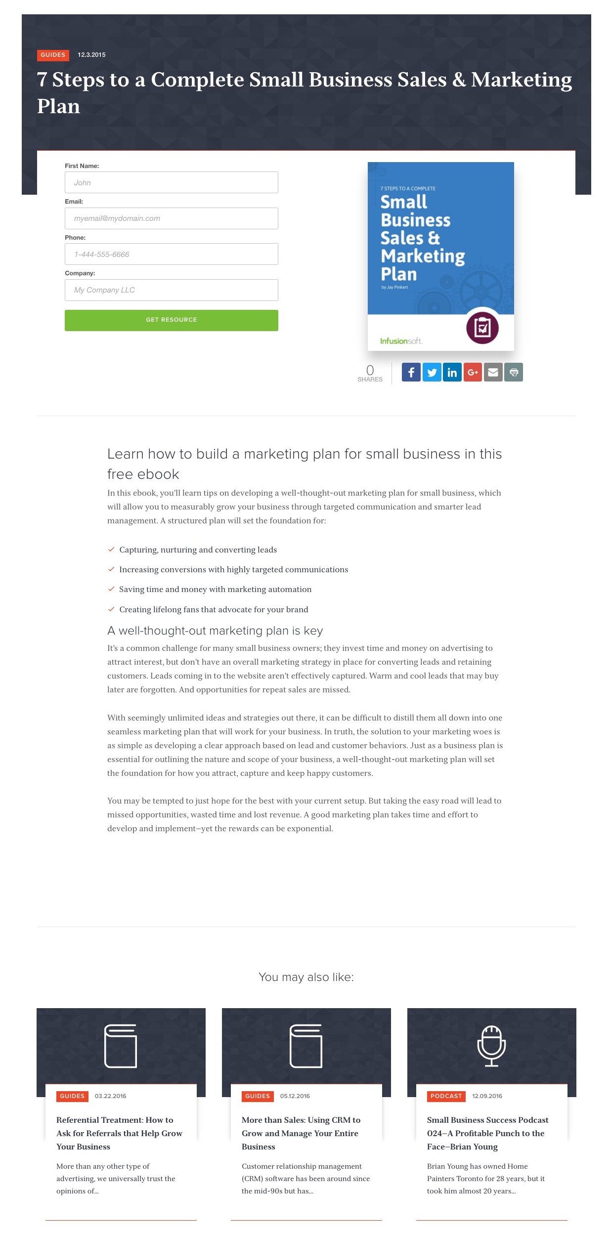
3. To offer a video marketing guide
What the page does well:
- The page headline and subheadline, “Video Marketing for Small Business: The Ultimate Guide,” tells visitors exactly what this post-click landing page is all about, and what they can expect to learn about by staying on the page.
- The short video is a great addition to the page, as it provides useful introduction and background information to viewers before they make their decision whether or not to convert on the main offer.
- The bullet points listing “What’s inside” the guide tell prospects exactly what they’ll be getting, should they choose to sign up for the video marketing guide.
- The relatively short form makes prospects more likely to convert on the offer, since short forms tend to acquire more leads than longer forms do.
- The copy below the form regarding Infusionsoft’s privacy policy is straightforward and honest. It assures prospects that they can opt out at any time likely increases comfort and security in them, in turn, likely driving more leads.
- The “I already answered these questions” button gives people an easy way around having to fill out the form again if they’ve already done it in the past. By clicking that button, all they have to do is enter their email address to receive the link to the guide again.
- A call-to-action written in first person provides people with a better idea of what this offer is going to do for them as a customer.
- Testimonials from clients like Animoto, Cisco, and Aberdeen serve as trust signals. These types of endorsements from others tend to greatly reassure new prospects. The testimonials are very specific, using ratios and percentages, which gives people a clear idea of the benefits they could receive by working with Infusionsoft as well.
What could be A/B tested:
- The social share buttons in the header of the page are distracting and act as exit links. If it weren’t for these links at the very top of the page, the entire page would be completely free of exit links.
- The CTA button color could be different since green is already used throughout the page. Even though it isn’t used very much, it still takes the focus away from the buttons.
- The CTA button copy, while written in first person, is vague. “Show me how” doesn’t really say anything about what the offer actually is. Something a bit more specific like “Show me how to boost conversions” or “Get my video marketing guide” may generate more leads.
4. To increase attendance at live events
Although the offer is now expired, this Infusionsoft post-click landing page can be found by clicking on the brand’s event offer link in their Twitter feed:

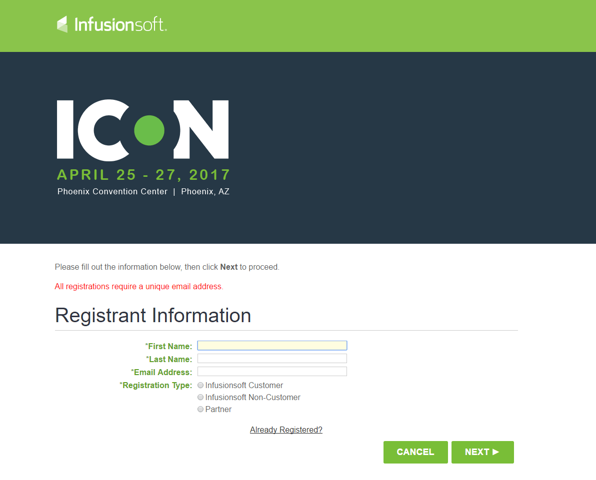
What the page does well:
- The main details of the event – the name, date, and location – are listed at the top of the page, above the fold, making it so that visitors don’t have to search the page, or even scroll down the page, to find these important details.
- The short, basic registration form increases the chances of visitors signing up to attend the event.
What could be A/B tested:
- The ‘Cancel’ button acts as an exit link, taking visitors away from the page without registering for the event.
- The ‘Next’ button could be larger and in a different color so that it contrasts better and stands out more on the page. It could also be changed to a ‘1 of X’ button so that prospects know exactly how many steps the whole signup process is going to be.
- A missing description of the event leaves prospects wondering what the benefits of attending are. Adding just a small paragraph about what the event will be like, information that guests will learn about, and who will be presenting, may get more event attendees.
5. To generate webinar registrations
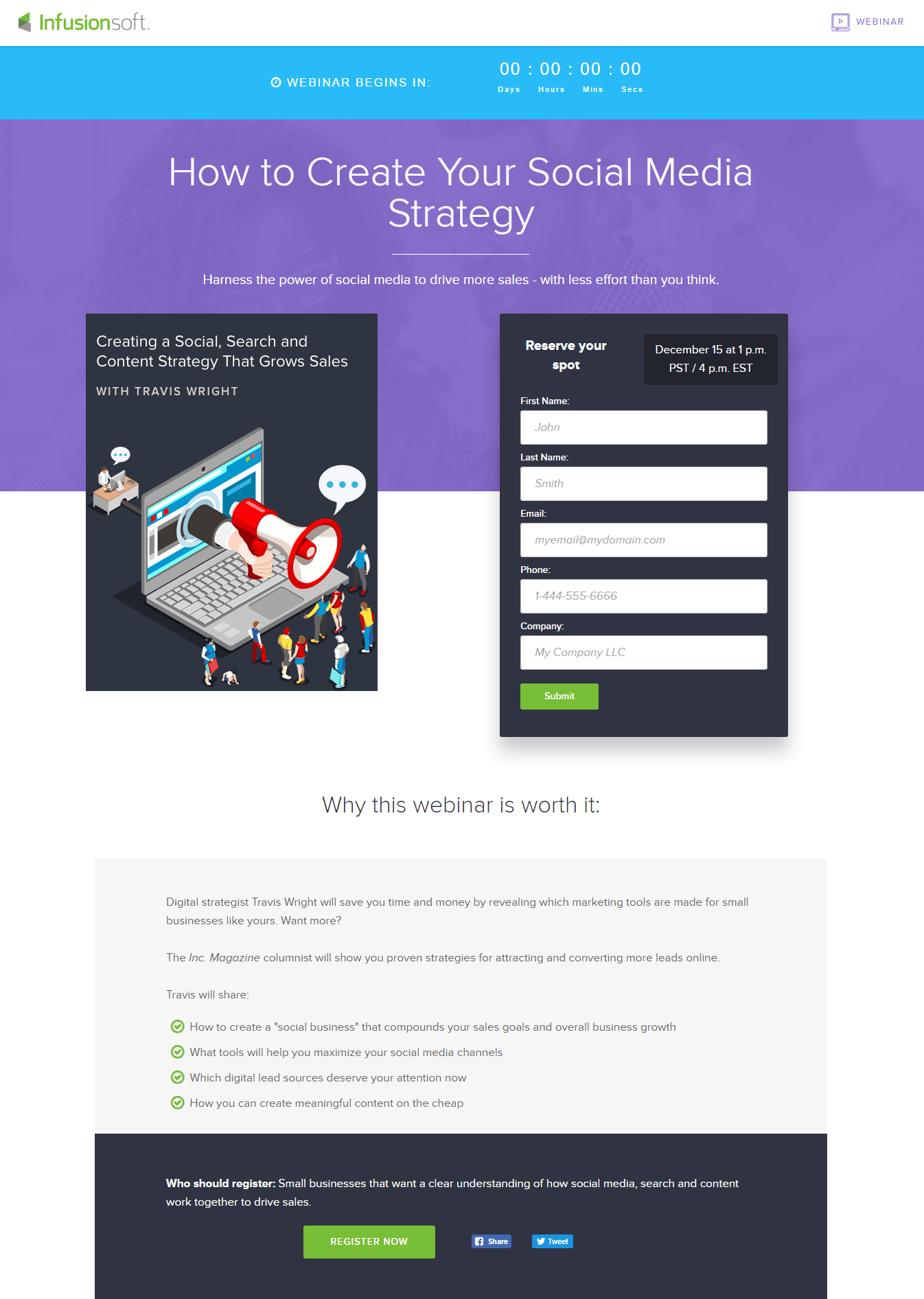
What the page does well:
- Critical information about the webinar is highlighted on the page — the webinar title, a description of what the webinar will offer, the presenter name, the date and time of the webinar, a countdown until the webinar (although it has passed now), who should register for the webinar, and why people should register.
- The relatively short form is appealing to visitors. As mentioned in the previous examples, a short form tends to convert more prospects than longer ones do.
- The bulleted list explaining “Why this webinar is worth it” tells prospects exactly what they will learn from the webinar, should they choose to register.
- The presenter bio at the bottom of the page tells prospects more about the person who is presenting, including why he is qualified. It also includes his headshot, which is another great way to introduce the presenter.
What could be A/B tested:
- The CTA button copy, “Submit,” is weak and vague. It doesn’t tell prospects what they are signing up for or receiving in return by submitting their information. Something like, “Save my spot” or “Attend the webinar” would probably be more persuasive.
- The social media links, both in the middle of the page and in the footer of the page, act as exit links. They may distract visitors and give them a way to leave the page without converting.
6. To drive toolkit downloads
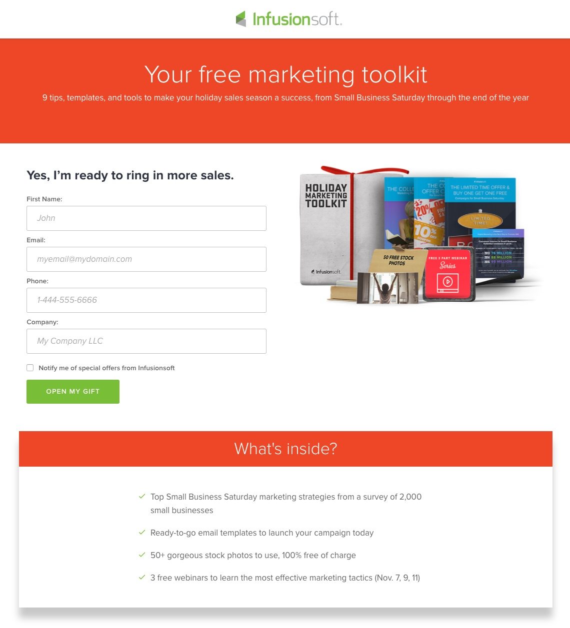
What the page does well:
- The page headline and subheadline tell prospects exactly what they’ll be getting by submitting their information: a free marketing toolkit that includes 9 tips, templates, and tools.
- The word “your” speaks directly to the reader, while “free” emphasizes that the offer costs nothing.
- The 4-field form is short, making it more likely that prospects will be willing to take the little time necessary to fill it out.
- The CTA button copy, “Open my gift,” is a creative and catchy phrase to include during the holiday season. It’s also written in first person, which has been shown to boost conversions.
- The CTA button color contrasts the rest of the page, making it stand out above everything else.
- The image to the right of the form gives prospects a good visual idea of what they’ll be getting by converting on the offer.
- The checklist of what’s inside let’s prospects know the specifics of what is included inside the marketing toolkit.
What could be A/B tested:
- The social share buttons at the top of the page open up new windows, acting as distractions from the post-click landing page and potentially decrease conversion rates.
- A sense of urgency should have been stressed. Since this offer was only valid from Small Business Saturday through the end of 2016, the post-click landing page could have included a countdown until the end of the year, or more urgent copy such as, “Don’t wait until it’s too late!” “Time is running out!” or “Get your toolkit while there’s still time!”
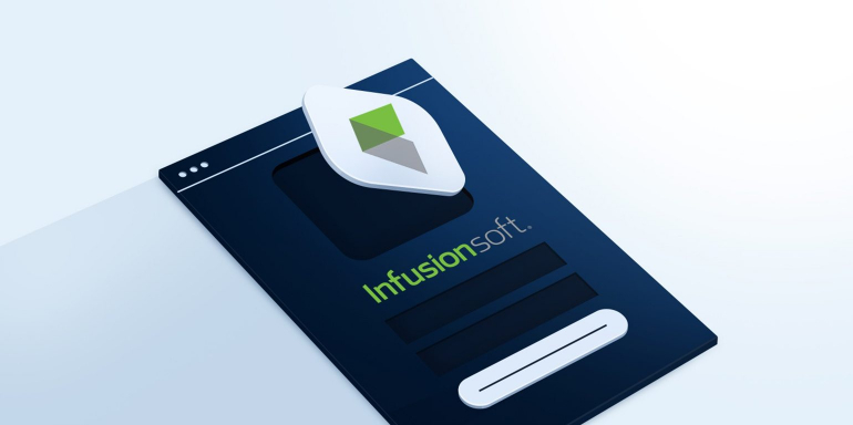
7. To offer a product demo
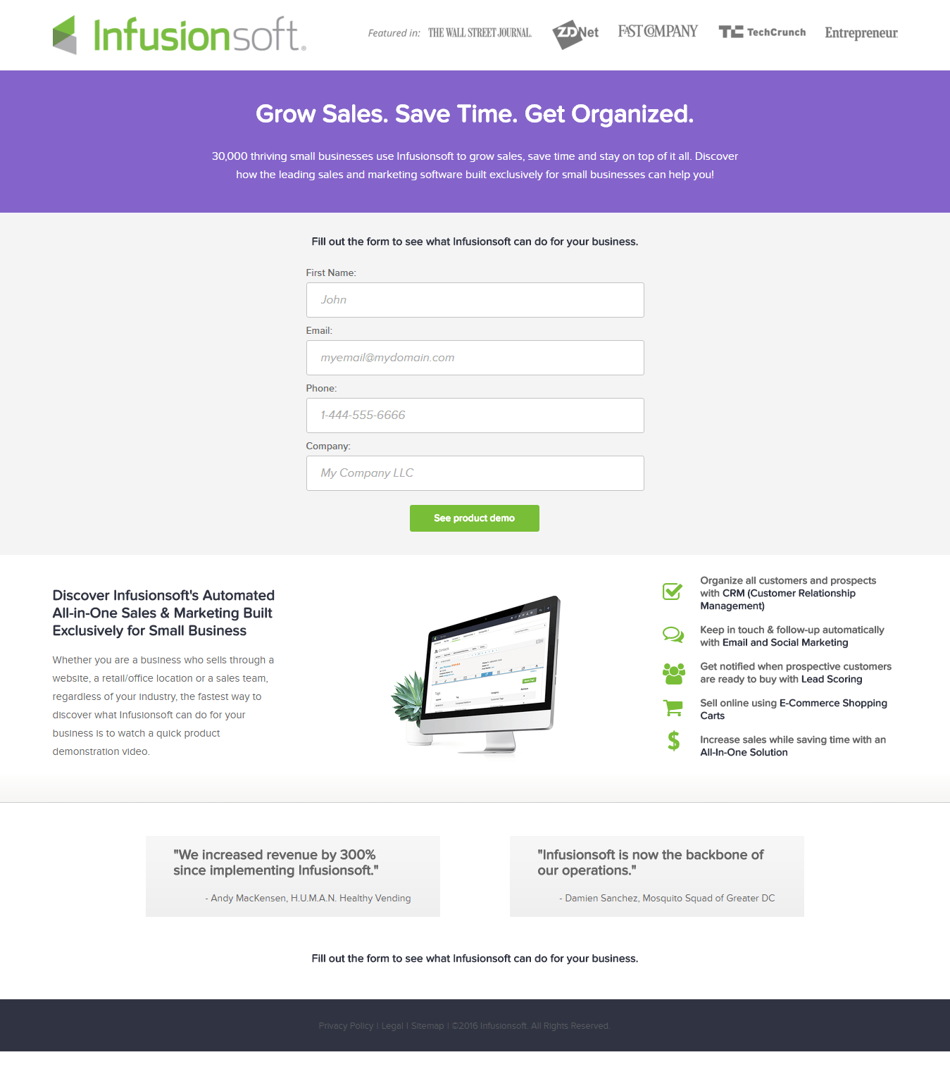
What the page does well:
- The page is very well balanced. It is laid out in a neat and organized fashion, with the form above the fold, minimal copy directly below it with an image in the center, and customer testimonials at the bottom of the page.
- Trust signals like the “Featured in” brand badges at the top of the page, as well as the quoted testimonials from previous customers at the bottom of the page, instill a sense of certainty and trust in prospects.
- The form is short and only asks for basic information, making it more likely that prospects will take the time to fill it out.
- The CTA button copy is informative and precise. Prospects know that by filling out the form and clicking the button, they will get to “See product demo.”
- The list of what Infusionsoft does, located in the section below the form, tells prospects exactly what they’ll be getting help with if they choose to work with Infusionsoft. The small icons used as bullet points, and bold font in the copy, are also nice touches.
- The image of the computer screen gives prospects a preview of what Infusionsoft’s software looks like.
What could be A/B tested:
- The CTA button could be larger. Currently, the button copy is the same size as most of the other copy on the page, so making it larger would surely make it stand out more.
- The CTA button color could be changed to draw more attention, since green is already used elsewhere on the page (in the company logo and the small icons listed in the section below the button).
- The sitemap link in the footer acts as an exit link. If visitors scroll down before filling out the form, they may become distracted by this and leave the page before converting.
Ready to start creating your own post-click landing pages like Infusionsoft?
Infusionsoft is just one of countless brands that truly understand the concept of post-click landing pages and why they’re a critical component of digital marketing. That is why the brand continues to use post-click landing pages to establish their best first impression, generate leads, and increase profit.
To create your best first impression and generate leads like Infusionsoft; get started today with Instapage. Sign up for an Instapage Enterprise demo today.

See the Instapage Enterprise Plan in Action.
Demo includes AdMap™, Personalization, AMP,
Global Blocks, heatmaps & more.
