
A well-crafted free trial landing page can do a lot for your return on ad spend—it can help you connect with your target audience, boost your conversion rates, and secure more sign-ups. .Creating an effective landing page, however, requires both strategy and creativity.
Whether you’re a seasoned marketer seeking fresh ideas or a business owner eager to revamp your current landing page, today’s post will feature a free-trial landing page sign-up collection designed to ignite your creativity and equip you with insights into the best practices of designing an impactful landing page.
Let’s begin.
10 free trial landing page examples
Please note, these landing pages are only displayed above the fold. You will need to click through to the page to see some of the points we discuss and some pages may be undergoing A/B testing with an alternate version than what is displayed below.
1. Later
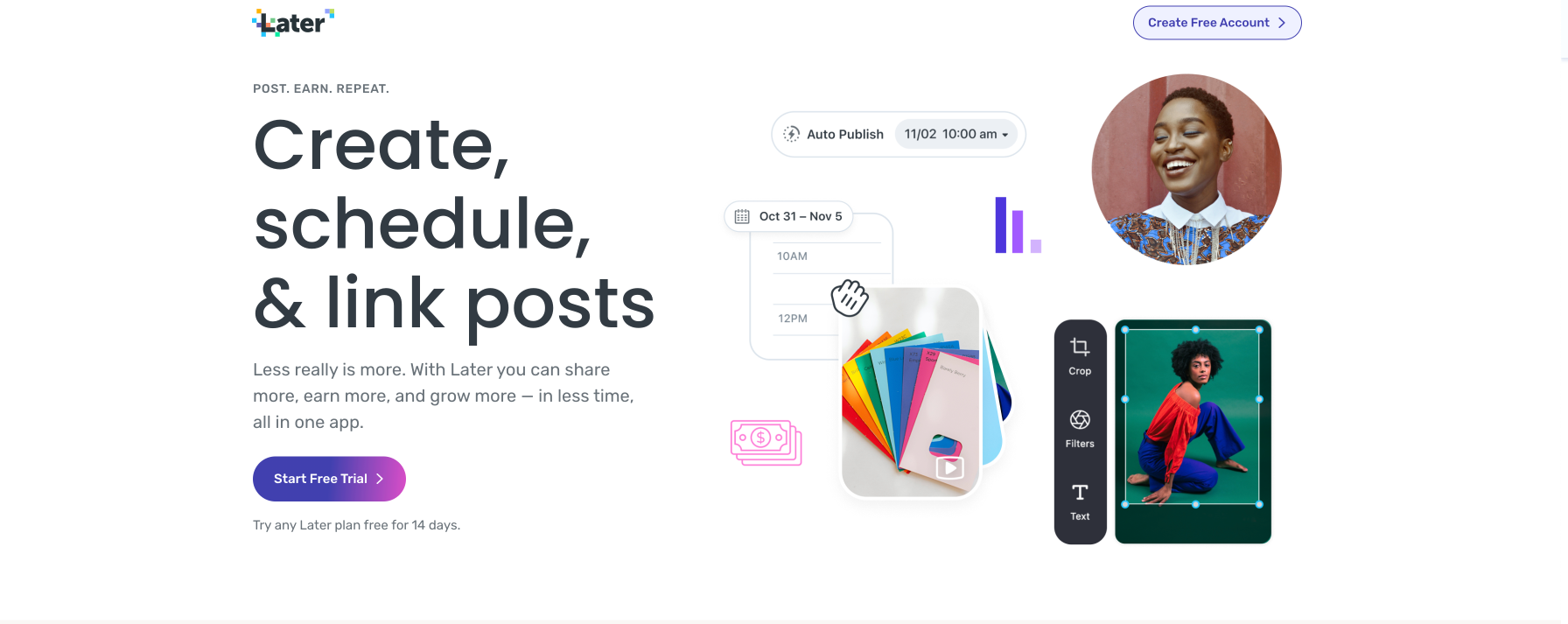
What the page does well:
- Minimal copy combined with graphics allow visitors to learn about the basics of Later’s features quickly.
- No navigation menu helps keep visitors focused on the page and not distracted by other links near the headline.
- The main CTA is a bright color with clear copy that stands out from the largely white background.
What the page could change or A/B test:
- Adding social icons to show which social platforms Later supports. Without those present, it may not be clear to marketers if the platforms they need a scheduler for are supported.
While the graphics are bright and eye-catching, they are only mock-ups of what a user may see on the Later platform. Try A/B testing utilizing real platform photos to give potential users a sneak peek of what to expect.
2. Sprig
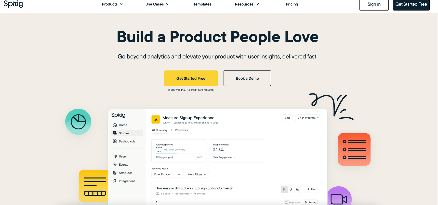
What the page does well:
- A clear product dashboard image provides potential users with a clear visual representation of the product. This can help buyers understand the interface and functionalities, making it easier for them to assess whether the platform aligns with their needs.
- Minimal copy in the hero section makes it easy for visitors to skim and find information relevant to their decision.
- Customer logos as you travel past the hero section continues to build trust and highlights the caliber of companies that use Sprig.
What the page could change or A/B test:
- The navigation menu may distract visitors from the CTA and lead them off the landing page.
3. Contentful
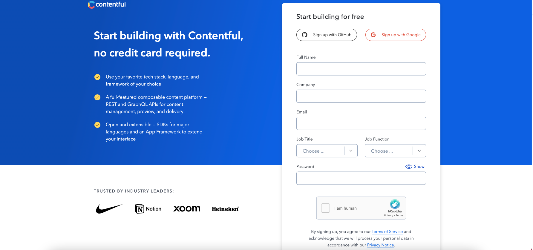
What the page does well:
- The headline conveys the benefit immediately. Visitors can quickly see the value of the free trial and the fact that they don’t have to share their credit card information removes friction from the conversion.
- Scannable copy in digestible bullet points helps visitors see the value of Contentful without being overwhelmed by information.
- Social Proof above the fold highlights a wide range of brands, from retailers to tech companies to alcoholic beverages, highlighting that this platform can be used by companies in any vertical.
What the page could change or A/B test:
- The form doesn’t have auto-fill capabilities.
- No imagery may lead to less distraction, but we would suggest adding a visual or video of the platform for visitors to see.
4. Wrike
Wrike, a work-management platform, understands that paid search ads should be connected with dedicated landing pages. A Google search on “Click Up Alternatives” displays this ad, which then sends visitors to a dedicated landing page:


What the page does well:
- The headline is intriguing and encourages visitors to continue evaluating Wrike as an alternative to ClickUp.
- The short form requiring only an email reduces friction and increases the odds a visitor will convert. It also underscores that no credit card is required for the trial.
- The header image is a gif that cycles through different views of the Wrike platform, giving potential users a sneak peek of what to expect.
- Social proof in the hero section highlights a wide array of platforms, from video games to ride shares, highlighting that Wrike can work for a multitude of industries.
What the page could change or A/B test:
- Changing the free trial button color to something more contrasting would draw more attention as green is already the main color of the page and may be easy to overlook.
- The live chat option opens in a new tab, away from this landing page. Offering live chat is okay as long as the visitors stay on the same page.
- An unclear demo offer appears as you scroll down the page as a consistent CTA, which seems different than the “Get Started Free” option in the hero section. It isn’t clear which type of buyer should leverage the free trial vs. the demo.
5. Supermetrics
What the page does well:
- The headline and secondary headline clearly state the offer, which helps prospects quickly decide whether to read on.
- Customer logos show that high-profile companies use Supermetrics to grow.
- The short form reduces friction and increases the odds that visitors will opt for the trial.
- “No credit card required” allows prospects to try out Supermetrics without having to worry about their credit card being auto-renewed once the free trial period ends.
What the page could change or A/B test:
- The navigation menu may distract visitors from the CTA and lead them off the landing page.
- Adding use cases could better showcase how potential users could leverage the platform.
6. Semrush
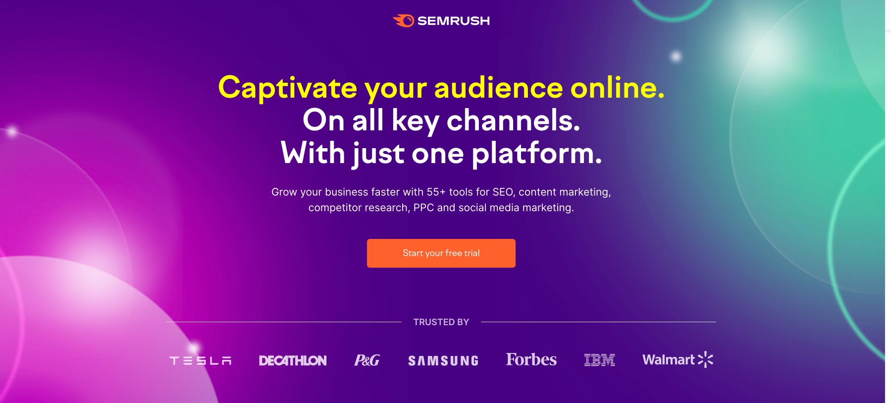
What the page does well:
- The orange CTA button stands out on the page and draws attention.
- Different types of social proof are showcased throughout the page and highlight customer testimonials, review sites, and customer logos to build a visitor’s confidence in the platform.
- The orange CTA buttons stand out on the page and draw the visitor’s gaze.
- The header scrolls with you, and the CTA in the header is a constant reminder to visitors to begin their free trial.
- Emphasizing the platform through imagery on the page gives visitors a taste of what to expect from the SemRush platform.
What the page could change or A/B test:
- The headline is a bit long. We would suggest A/B testing just keeping the “Captivate your audience online” portion and seeing which landing page performs better.
- Adding any award badges instead of just mentioning that they’ve received 20+ could showcase the prestige that sets Semrush apart from its competitors.
7. Dropbox
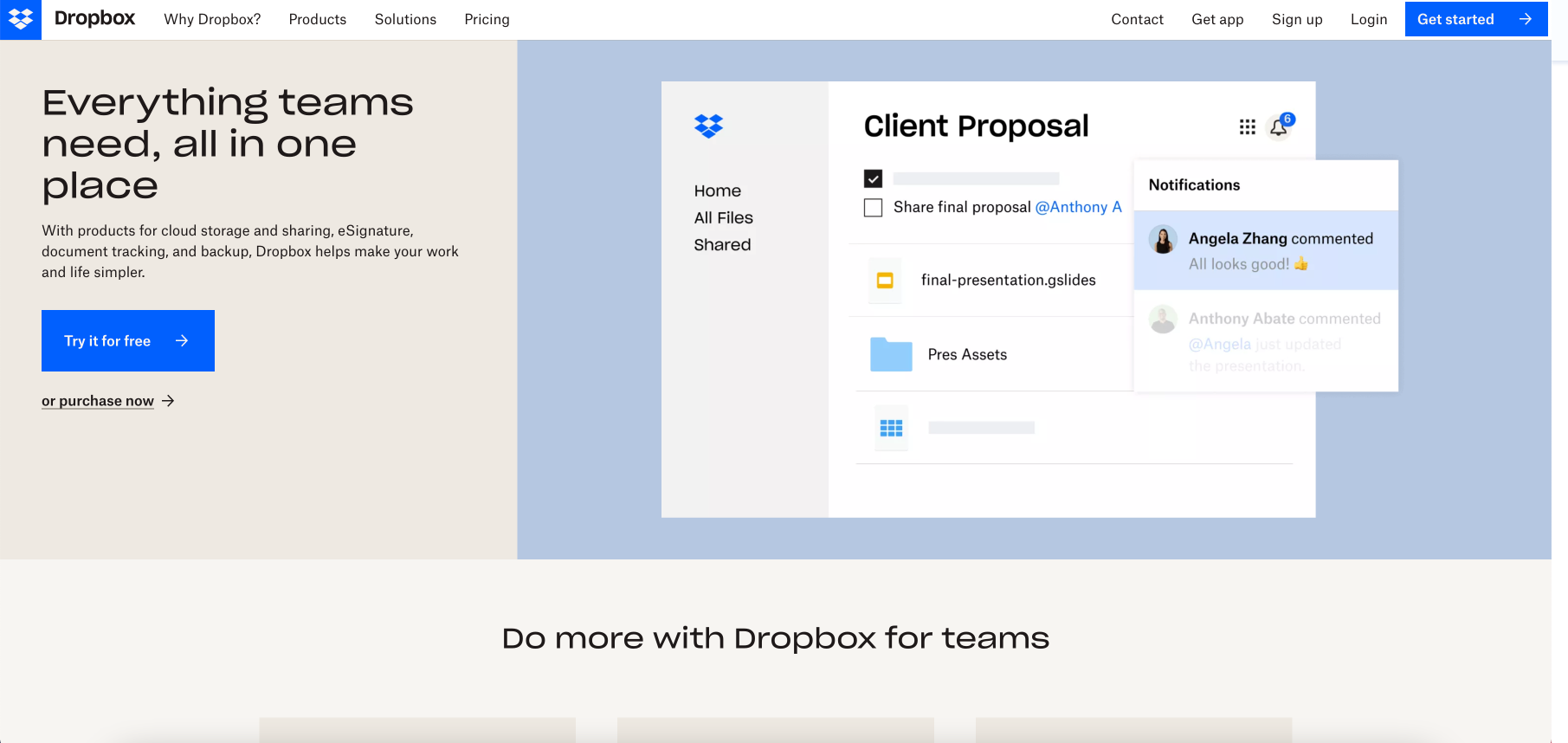
What the page does well:
- A powerful headline highlights the value for teams.
- Including use cases for the platform helps highlight what to test during your trial to see if this is a good fit for your team.
- Adding pricing transparency below the fold could help visitors decide what plan would be right for their team after the free trial ends.
What the page could change or A/B test:
- The navigation menu may distract visitors from the CTA and lead them off the landing page.
- More details about the trial to help convince visitors to convert. Adding how long the trial is, if a credit card is required, etc may result in more conversions.
- Adding customer logos above the fold would clearly show prospects which brands are currently using leveraging Dropbox.
8. HoneyBook
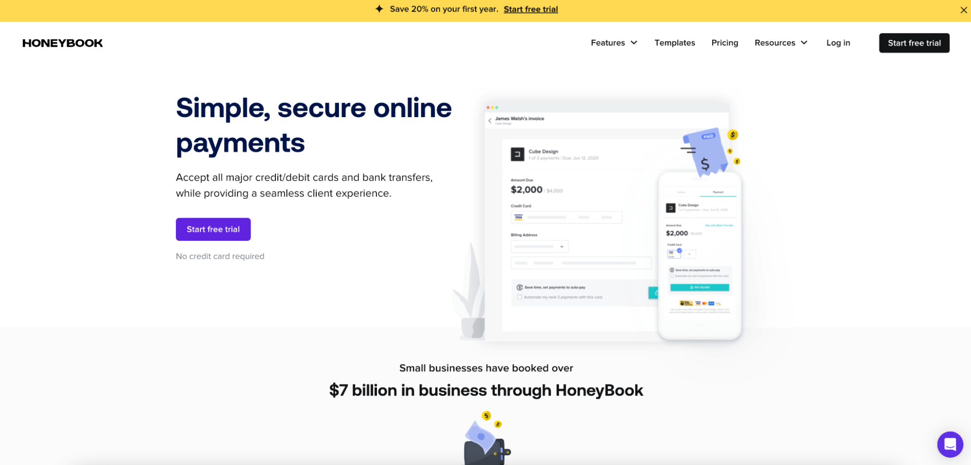
What the page does well:
- The purple CTA stands out and makes it easy for visitors to convert in the hero section.
- The “no credit card required” tab above the form can increase conversions. Although, making this more prominent would make the point even more persuasive.
- Presenting additional information in a Z-Pattern below the fold helps visitors scan information and makes it more digestible.
- The FAQ section helps answer potential users’ most important questions and gives them the confidence to convert on the page.
What the page could change or A/B test:
- Links in the header act as exit routes off this page.
- Experiment with scroll depth by removing some of the less-utilized sections of the landing page. For example, the blog links on the page don’t make a lot of sense because they take the visitor away from the offer.
9. Switcher Studio
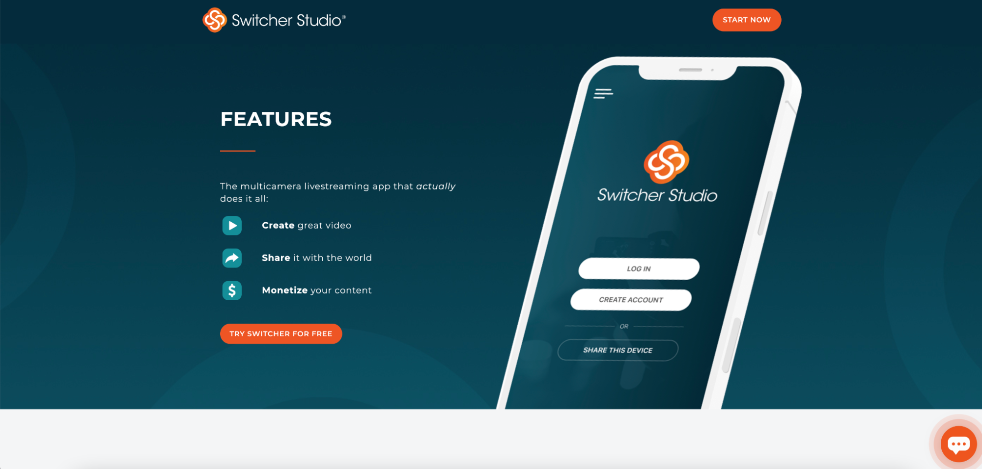
What the page does well:
- No navigation menu doesn’t provide options for visitors to leave the page.
- The orange CTA stands out and makes it easy for visitors to convert.
- The sliding scale tool helps visitors determine what plan they would need in the future.
- Minimal copy allows visitors to quickly scan the page and get the information they need to make a purchase decision.
What the page could change or A/B test:
- The headline “Features” is too vague of a headline. A more specific, benefit-focused headline could increase conversions.
- Adding an image of the platform to the hero section could help visitors to the landing page instantly know what to expect and get a better understanding of the platform.
- Move video and gifs of the platform higher on the page to better showcase the platform.
10. Customer.io

What the page does well:
- No header navigation keeps visitors focused on the page and the free trial offer.
- The offer is clear highlighting the length of the trial, that no credit card is required, and that you can cancel at any time.
- The page is clutter-free and each section lets visitors scan the content without confusion.
What the page could change or A/B test:
- Adding more platform information like a short list of bullet points of benefits, use cases, or integrations may provide more context for someone new to Customer.io.
How does your free trial landing page compare?
Is your business using free trials at the bottom of the marketing funnel to help prospects make a purchasing decision? Use the critiques featured in the post to create pages that can get you more conversions and a higher ROAS. Get started on your free trial landing page today by signing up for an Instapage 14-day free trial.

Try the world's most advanced landing page platform with a risk-free trial.