Pre-click advertising techniques tend to be the center of attention for many brands. From ad platforms to micro-targeting ads to ad personalization — even creating ads at scale. Each pre-click technique has been made progressively easier over time.
Meanwhile, post-click landing pages lack that same attention, which is likely why more than 95% of Google Ad clicks fail to convert.
To produce more conversions, you can’t ignore the post-ad-click stage. You must segment and personalize the entire user experience. Rather than linking every ad to your homepage or product page, send your ad traffic to personalized, post-click landing pages that continue the same story narrative from the ad.
Today’s article details how Capella University does it.
How Capella University segments post-click landing pages
Example 1: Bachelor’s Degree Google search
When someone searches Google for “bachelor’s degree from home,” they see this Capella ad:

We can tell the ad is segmented for a specific audience since it’s related to the search query:
- The first half of the headline “Online Bachelor’s Degrees” is simply an alternative way to phrase the original search query.
- The display URL repeats “bachelors” to let prospects know the destination page is relevant to their search.
Clicking the ad takes users to the post-click page below where the bachelor’s degree narrative continues:

- What is the offer for? — The headline begins the story by reassuring visitors they’re in the right place to get information on an online bachelor’s degree — exactly what they were searching for.
The subheadline makes the offer more appealing by telling prospects they can find a degree program that fits their specific goals and lifestyle.
- Why is Capella a great option? — Additional benefits of a bachelor’s degree are conveyed throughout the page, starting underneath the headline and subheadline with, “Finishing your bachelor’s degree is possible with flexible, online degree programs…”
Dropdown lists of online bachelor’s programs also helps tell this part of the story showing visitors all the various options available.
The comparison between GuidedPath and FlexPath continues to highlight benefits of pursuing a degree at Capella, depending on which learning format the student chooses.
- Who can testify for Capella? — Below the fold are numerous companies who have accredited and partnered with Capella University. Each example shows visitors that the school is one they can trust for higher education:

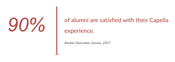
Stating that 90% of alumni are satisfied with their Capella experience also helps instill trust in prospective students.
- How can visitors take action? — Potential students can request more information about their area of study by completing the form and clicking the red “Agree and Go” CTA button. The black box to the right of the form explains what people can expect after submitting their information.
Example 2: Capella University branded search
Searching by Capella’s brand name shows a PPC ad. However, this ad is divided into several different audiences using sitelink extensions:

Clicking the Bachelor’s Degrees extension leads to the same post-click page (and story) above. The main headline, though, takes prospects to this page:

- What is the offer for? — Rather than explaining the bachelor’s degree program, the story on this page is about the variety of online degree programs Capella offers.
- Why is this school the best choice? — The answer to this is conveyed above the fold, directly beneath the headline and subheadline — because the student is in control of their online education with on-demand classes, manageable costs, self-paced experiences, etc.
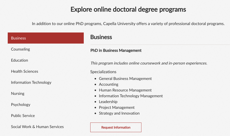
Again, the list of available degree programs, and the comparison between GuidedPath and FlexPath, also help tell this part of the story, showing visitors all the different options available to Capella students:

- Who agrees? — This part of the story is told the same way as the previous example by displaying accreditations and partnerships while highlighting that 90% of alumni are satisfied with their Capella experience.
- How can prospects redeem the offer? — Prospects can complete the lead capture form to request more information about their area of study and connect with an enrollment counselor.
Example 3: Master’s Degrees sitelink extension
Clicking the Master’s Degrees extension takes prospects to this unique post-click page:

- What is the page offering? — Similar to the example #1, the story begins with the headline letting visitors know they’re in the right place for details regarding an online master’s degree.
The subheadline makes the offer even more enticing by telling prospects they can have complete control over their education at Capella.
- Why Capella? — Next, the story highlights that Capella offers flexible and affordable programs, which are two essential qualities when investing in higher education. Just like the other examples, the degree programs list and the GuidedPath and FlexPath comparison support this.
- Who else supports Capella? — The school uses the same components as before: accreditations and partnerships along with the statistic at the bottom of the page:

- How can prospects move forward? — The form directly beneath the fold enables prospects to receive a free Doctoral Guide and connect with an enrollment counselor.
Example 4: PhD Degrees sitelink extension
Someone interested in a PhD program would click that specific extension and arrive on this segmented page:

- What is the offer? — Although this page includes many of the same elements as the previous examples, the offer is specifically for a doctoral degree.
- Why choose Capella? — Again, this part of the story discusses prospects being in control of their education — a huge benefit of online courses at Capella. Immediately following, is the list of available degree programs to show visitors all the different options they have at Capella:

- Who is Capella accredited by? — The same components from the previous examples — the accreditations section and the statistic from the Alumni Outcomes Survey.
- How can visitors convert? — Prospects can complete the form to request more information about their desired program. Then they’ll receive a free Doctoral Guide and be connected with a personal enrollment counselor.
Example 5: Scholarships Available sitelink extension
If someone was interested in learning about available scholarships at Capella, they’d click through the last ad extension to this page:

- What is the offer for? — Capella calls their scholarships “Progress Rewards” and expresses this in the headline so visitors immediately know they’re in the right place.
- Why choose a scholarship through Capella? — The subheadline helps explain why students should apply for a scholarship: to lower the overall cost of their tuition and they’ll never have to pay it back.
The extensive list of Capella Progress Rewards and eligible programs also tells people why they should consider a scholarship because there are many options.
- Who else has experience with this? — The accreditations and partnerships section shows visitors who Capella is supported by. The testimonial at the bottom of the page also lets prospects know how another student was satisfied with their Capella scholarship experience:

- How can visitors find out more? — Once prospects complete the form, they’re connecting with an enrollment counselor to learn more about their desired program.
Example 6: Retargeting ads
After visiting all of the different Capella pages above, I was retargeted by multiple ads across the web. First, a banner ad:

Then two LinkedIn ads:

And finally, a Gmail Sponsored ad:

All four ads led to this post-click landing page that highlights the FlexPath:

- What is the offer? — The FlexPath option is clearly conveyed through the headline, the UVP in the subheadline (FlexPath is an award-winning learning format, only at Capella University); and the paragraph underneath explaining how FlexPath is a self-paced format that allows students to set their own deadlines, control costs, and move at their own speed.
- Why redeem the offer? — The primary reason to opt for FlexPath is students can earn their degree in just 12 months and under $11,500 with this learning format.
The list of online programs available with the Capella FlexPath format also tells people why they should consider a scholarship (there are so many options).
This part of the story continues further down the page with the 6 reasons to choose FlexPath.
- Who else has followed FlexPath? — The accreditations, awards, and partnerships section shows visitors who Capella is supported by. The statistic from the Alumni Outcomes Survey also helps entice visitors.
- How can prospects find out more? — Visitors can complete the form to receive a FlexPath Guide, gain free access to the FlexPath Trial Course, and be connected with a personal enrollment counselor to learn more about their specific program.
Compared to the Capella University homepage…
Instead of delivering a unique, personalized post-click landing page to segmented audiences, Capella’s homepage provides a general overview of what they offer, so users can explore everything themselves:

- A full header navigation with dropdown menus allows visitors to leave and visit other pages instead of converting on this page.
- The login link might distract users since they can leave this page to access their account.
- The headline is vague and doesn’t highlight any one particular offer or UVP.
- Multiple links and CTA buttons to other website pages throughout the content demonstrate a browsing experience.
- The full-sized footer provides additional external links, including social media links, allowing visitors to bounce from the page.
Since the homepage is generalized to anyone interested in Capella University, all visitors see the same page. It’s designed to be a browsing experience and doesn’t persuade visitors to convert on any specific offer.
Your ads deserve segmented post-click landing pages
To avoid wasting ad clicks and advertising budget — and produce more conversions — your post-click landing page requires just as much attention as your ads. You must segment and personalize the entire user experience by telling the same story narrative from ad to post-ad-click page.
Use the Capella University examples above for inspiration on how to connect your ads with segmented post-click landing pages, and get an Instapage Personalization demo to see how you can create dedicated post-click pages at scale for each target audience.

See the Instapage Enterprise Plan in Action.
Demo includes AdMap™, Personalization, AMP,
Global Blocks, heatmaps & more.
