
In August 2019, Apple partnered with Goldman Sachs to release the Apple Card — a credit card linked to Apple Pay and built into the Wallet app, but still used as a traditional credit card.
To educate online users about the new card, Apple shows a variety of segmented PPC and display ads. Not only that, but the company connects its ads to a personalized post-click Apple landing page that continues the same story narrative from the ad.
Here are a few examples to demonstrate how Apple’s advertising strategy focuses on post-click automation.
How Apple uses segmented ads and post-click landing pages
Example 1: “No fees” display ad
This banner ad highlights the main difference between Apple Card and others: Apple Card has no fees, while other cards have a wide variety of fees:
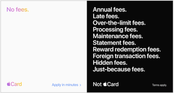
It does a great job of quickly highlighting the “no fees” message, and before continuing the same story narrative on this post-click Apple landing page:

- What is the page offering? -- Immediately, the story is continued through the eye-catching page headline, reiterating that the card has zero fees. The subheadline supports the “no fees” message by listing fees that many other companies have (annual, late, foreign) but Apple doesn’t:

- Why should prospects apply? -- The entire page conveys that the main benefit of Apple Card is that it positively stands apart from other credit cards.
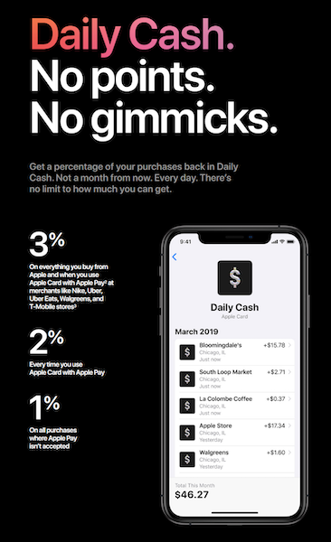
For example, there’s information about Apple’s cash back system and how it offers daily cash back compared to other companies who typically offer it monthly. The app image helps to demonstrate this and prove that it’s legitimate:
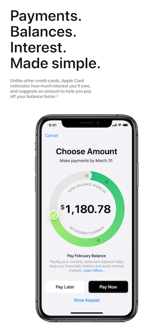
Next, is information about how Apple Card estimates how much interest users owe, and suggests an amount to help them pay off the balance faster -- something most other credit cards don’t do. The image helps demonstrate how the feature works:
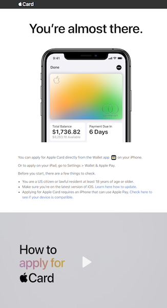
- How to apply? -- By clicking the blue “Apply now” CTA button at the top of the page, or at any point during their visit by clicking the sticky bar button. Doing so, takes them to this page for further instructions:
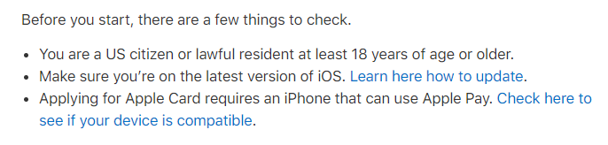
- Who is the offer for? -- This part of the story is told on the second page after visitors click through. Although the campaign isn’t only aimed at a certain audience segment, there are some qualifications to meet:
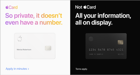
Example 2: Privacy display ad
This display ad design is similar to the previous one (Apple Card vs. not Apple Card), but delivers a different message:
Clicking the ad takes prospects to this post-click landing page where the privacy story continues:
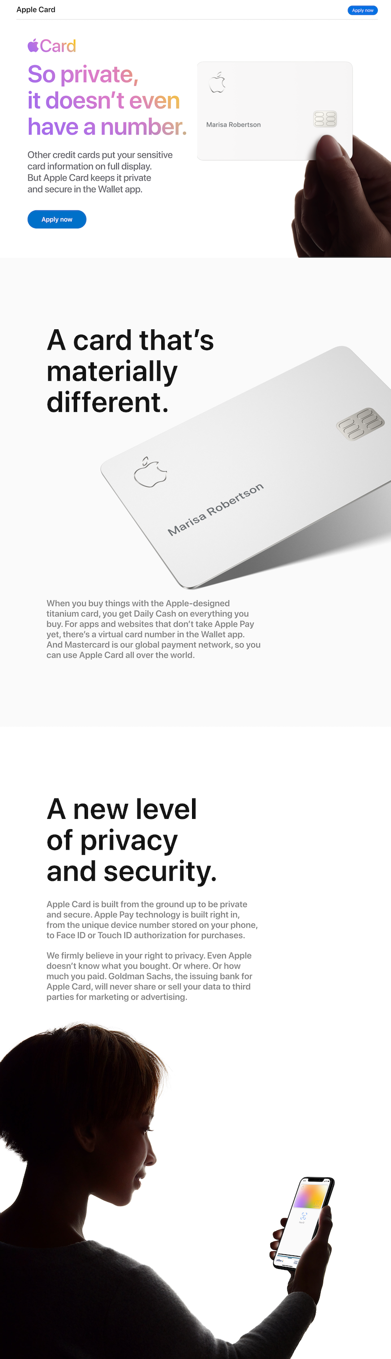
- What is this page offering? -- The headline continues the story narrative immediately so visitors aren’t confused when they arrive. It repeats the same headline from the ad, and the subheadline explains it further:
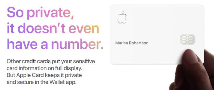
The card image next to the headline highlights the high level of privacy Apple offers its cardholders as well.
- Why should people apply? -- This story narrative as a whole explains why people should apply for Apple Card: because of the extreme privacy it offers. Specifically, the message starts at the top of the page with the headline and continues into the next section that highlights “a new level of privacy and security:”
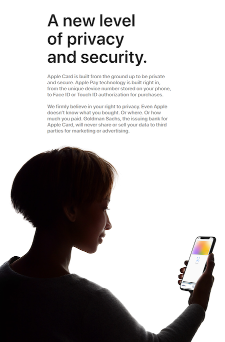
It describes the secure Apple Pay technology (the unique device number stored on users’ phones and Face/Touch ID for purchase authorization). It also explains that Apple doesn’t store detailed purchase information, and Goldman Sachs doesn’t share or sell data for third party marketing or advertising.
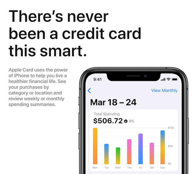
Further down is content about Apple Card being a smart credit card, allowing users to see their purchases by category or location, and review weekly/monthly spending summaries. The app image also helps demonstrate how the feature works:
-
- How to apply for the card? -- Similar to Example 1, people interested can click the blue “Apply now” CTA button at the top of the page or on the sticky bar button.
- Who is the offer for? -- After visitors click through to the second page, they see the list of prerequisites they must meet.
Compare these examples to the Apple homepage
Apple has the right idea not sending its Apple Card ad traffic to a homepage because homepages don’t typically deliver a unique, personalized post-click landing page to a segmented audience. Instead, homepages are designed as browsing experiences, providing an overview of services.
Look at the Apple homepage, for example:
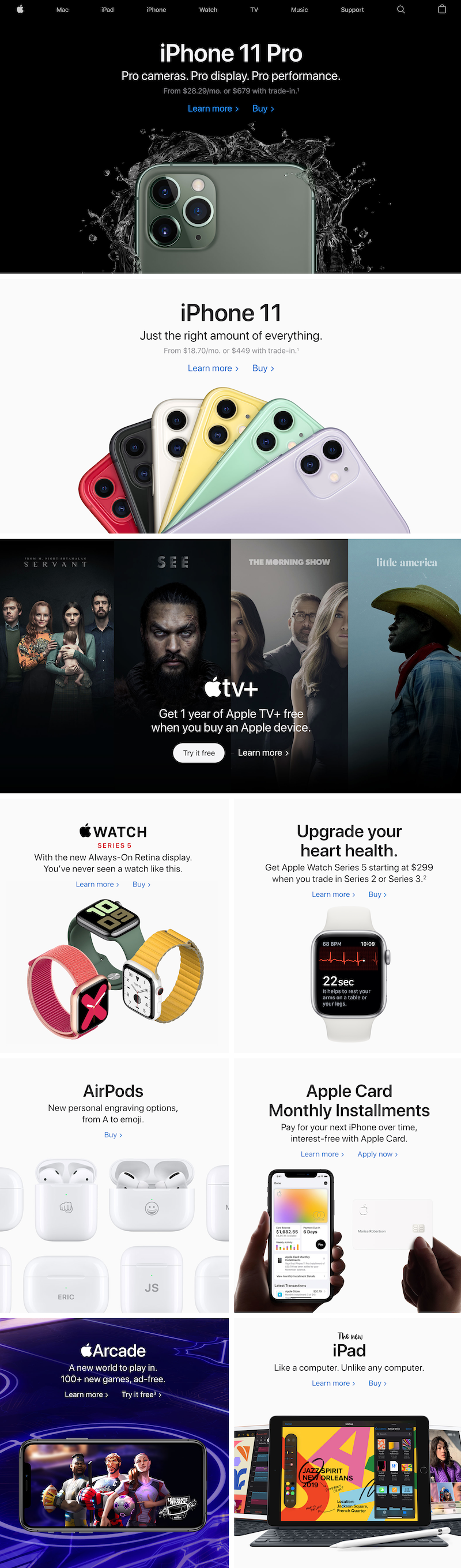
- A full header navigation gives visitors access to all of Apple’s other web pages.
- Multiple offers for all of Apple’s newest products (iPhone 11 Pro, iPhone 11, Apple TV+, Apple Watch Series 5, AirPods, Apple Card, Apple Arcade, and the new iPad) might overwhelm visitors and prevent them from taking any action.
- Competing links and CTA buttons with every scroll provide visitors with many escape routes to other web pages, continuing to demonstrate a browsing experience.
- A full-sized footer provides a whole new section of external links, allowing visitors to bounce from the page without any conversion.
It’s clear the Apple homepage is designed to be a comprehensive browsing experience for all visitors, unlike the post-click landing page above that both provide a 1:1 conversion ratio for segmented audiences.
Create your own post-click landing pages
Personalizing ads is absolutely necessary. However, it’s equally necessary to personalize the pages they direct traffic to and create one cohesive experience like Apple Card does. Not doing so will likely waste your ad clicks and budget.
Follow the Apple Card examples above to start designing your own segmented and personalized ad-to-post-click landing pages.

See the Instapage Enterprise Plan in Action.
Demo includes AdMap™, Personalization, AMP,
Global Blocks, heatmaps & more.
