
Nine out of ten marketing agencies generate new business from an unreliable source: referrals.
If you’re earning all your clients through word of mouth, you could be unknowingly sabotaging your agency’s growth. Prospects referred to you aren’t always the right fit, and even worse, they don’t come consistently.
To scale your business, you need a replicable process for acquiring new customers, which is why more agencies are getting aggressive about running advertising campaigns to generate leads.
And no advertising campaign can perform to its potential without a compelling landing page designed to convert. Here’s how agencies are using them to generate new business.
10 Examples to inspire your next agency landing page
(Keep in mind, for shorter agency landing pages, we’ve shown the entire page. However, for longer pages, we only displayed above the fold. You may need to click through to each landing page to see some of the points we discuss. Also, some of these agencies may be A/B testing their page with an alternate version than the one displayed below.)
1. Yodle

What this agency landing page does well:
- The logo in the upper left isn’t linked to the homepage, which means visitors can’t escape through it.
- The click-to-call phone number in the upper right makes contacting the business easy.
- The headline conveys a clear benefit: Get more customers while working less.
- Bulleted copy quickly and easily conveys the benefits using Yodle.
- The brightly colored CTA button draws visitor attention.
- The detailed testimonial from Lisa Wolfe highlights a job well-done by Yodle.
- Persuasive words and phrases like “personalized” and “easy-to-use” make it more likely visitors convert.
- Badges below the fold showcase awards won by the company.
- The minimalistic footer keeps visitors from escaping through a sitemap.
What to A/B test:
- The subheadline here is no doubt an attempt at social proof, but it’s a little confusing. “55,000 customers have found a better way?” What does that mean? Likely, it means they’ve found a better way to market their business, but it’s a little vague. “55,000 customers have found a better way to market their business with Yodle,” would’ve been more clear.
- “Request consultation” doesn’t get visitors excited to claim the offer. Why not
2. Softline Solutions
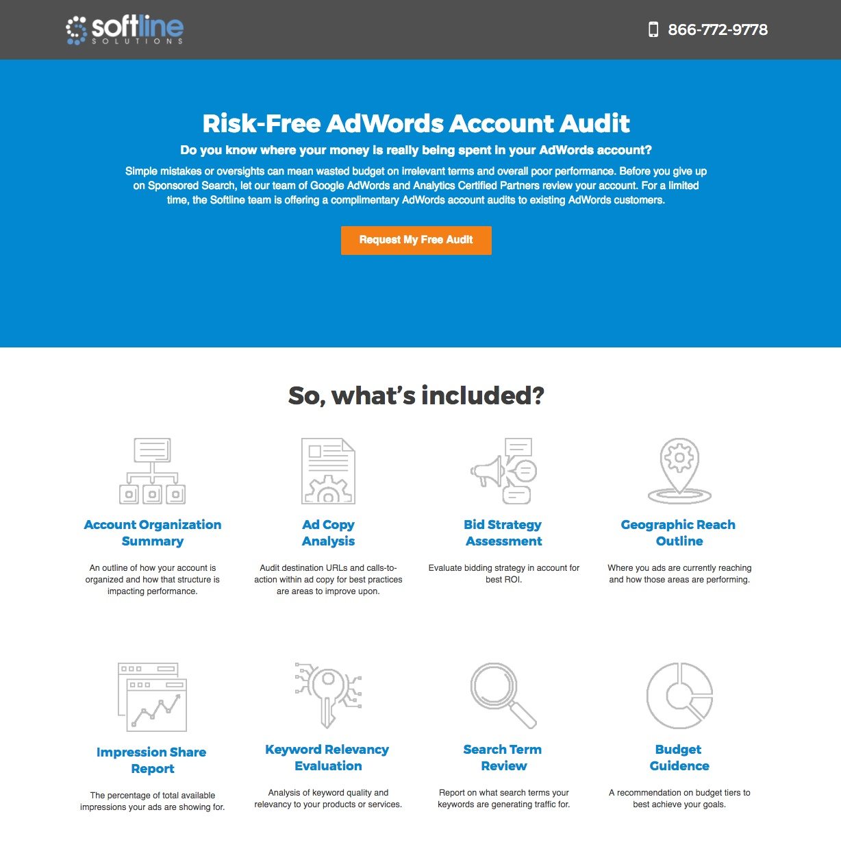
What this agency landing page does well:
- The brightly colored button makes this call-to-action unmissable.
- The phone number in the upper right of the page makes it easy to contact the agency, though if it were click-to-call, it’s be even easier.
- The call-to-action is Fin first person.
- The word “free” is one of the most persuasive in all of copywriting.
- Bulleted icons quickly convey the benefits of hiring Softline.
- Cooperative CTAs work to convert the visitor in two different places.
What to A/B test:
- The logo hyperlinked to the homepage is an easy escape route for visitors.
- The paragraph of text below the headline could be better expressed with bullet points. As is, it’s borderline intimidating to read. Instead the bullets could read, “Are you ready to give up on sponsored search?” “Are you wasting money on irrelevant search terms?”
- Where’s the branded favicon? Displaying one is an easy way to make your business look more professional, so why skip it?
- A header below the foldcontains a misspelling of the brand name as “Sofline.” It’s an inexcusable mistake for a PPC agency to make. Who’s to say they won’t waste your budget on misspelled keywords?
- The call-to-action could better emphasize the benefit to claiming the offer. Why not something like, “Find My Google Ads Weaknesses” or “Find My Wasted Ad Spend”?
3. 360 Media
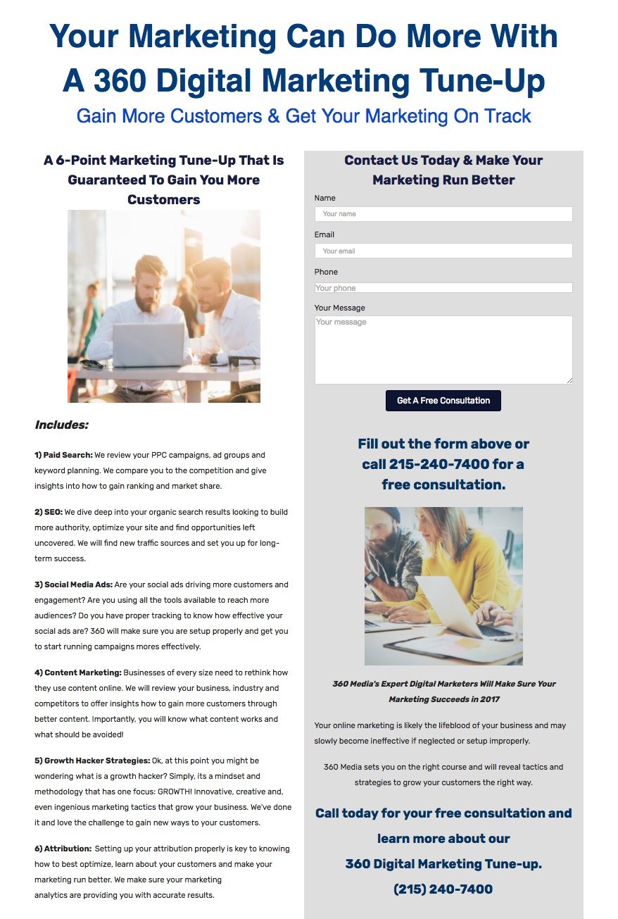
What this agency landing page does well:
- The word “your” in the headline speaks directly to the visitor.
- A non-existent navigation menu keeps visible escape routes to a minimum.
- A guarantee promises customers after visitors claim the 6-point tune-up. It’s powerful, but only if the business can follow through.
- Subheadings describe each component of the digital marketing tune-up.
- Company logos showcase the well-known brands that the agency has worked with.
What to A/B test:
- A logo linked to the homepage provides visitors with an easy escape route.
- The headline attempts to be benefit-oriented, but the benefit is too vague to be effective.
- The copy is a little verbose. As is, it’s tough to get through, even in small chunks.
- The “message” field on this form is unnecessary.
- The CTA button color doesn’t stand out on this page at all.
4. Launch Module

What this agency landing page does well:
- The copy reading “Our startup and fund management clients have raised over $650 million” uses a specific statistic to prove the agency is successful.
- Company logos showcase the well-known clients that Launch Module has worked with.
- The text “write us for an immediate reply” lets visitors know they’ll hear back instantly once they click that CTA button.
What to A/B test:
- With a logo hyperlinked to the homepage and a navigation menu, as well as outbound links in the content and the footer, this page makes it way too easy for visitors to escape.
- This headline isn’t benefit focused at all.
- The CTA button blends in with the background of this page.
- The “tell us about your opportunity” field is unnecessary on this form.
5. WebMO

What this agency landing page does well:
- The words “Google Partner” in the headline align WebMO with one of the world’s most well-known and trusted brands.
- The free report is a valuable offer that visitors are likely to claim since it only requires name and phone number.
- Logos of well-known companies align the business with trustworthy brands.
What to A/B test:
- The navigation menu makes it easy for visitors to leave this page.
- The stock image in the right sidebar serves no purpose for the visitor.
- A testimonial from a “San Diego Law Firm” isn’t detailed enough to be persuasive. WebMO’s team has “made a huge difference in the number of leads we get from our website”? How big of a difference? What’s the name of the San Diego law firm?
- If email and website aren’t required fields, then why include them at all?
- This CTA button is easily missable.
- The case study uses a specific result to prove the agency is up to the task, but a link to the full PDF drives people off the page.
6. Metric Theory

What this agency landing page does well:
- The headline “Free PPC Audit” offers a valuable resource at no cost.
- Bulleted copy emphasizes the benefits of claiming the resource.
- The unchecked opt-in box reading “sign up for newsletter with valuable PPC tips” ensures that only leads that truly want to be on the email list sign up for it.
- Company logos align the the agency with trustworthy brands.
- Badges showcase the awards Metric Theory has won.
What to A/B test:
- A navigation menu provides visitors with several escape routes.
- The testimonial from Jason Yang isn’t specific enough to be persuasive.
- This CTA button blends in with the rest of the page. Blue is already used on much of this page.
- The call-to-action “request audit” doesn’t put any emphasis on the benefits of claiming the offer.
7. StubGroup

What this agency landing page does well:
- This headline communicates a clear benefit: Make more money from Google AdWords.
- A numbered list quickly conveys the benefit of choosing StubGroup.
- The image uses text to let visitors know that “Google ranks StubGroup in the top 3% of Google’s Partners worldwide.” Recognition from a company like Google adds to the business’s trustworthiness.
- Glowing testimonials with full name, company, and photo are definitely real.
- The CTA orange button draws visitor attention immediately.
- Multiple CTAs work together to convert the visitor.
- The bold text in each testimonial highlights key information StubGroup wants to draw visitors’ attention to.
What to A/B test:
- White space is lacking on this page, making it look cluttered to visitors.
- A click-to-call phone number would be even more helpful to prospects than a simple one in the upper right corner.
- A form requesting an unneeded piece of information — “website” — makes itself look more intimidating than it needs to. If a personal piece of information isn’t required, then don’t ask for it. The shorter your form, the more likely visitors are to fill it out.
8. Simple Machines Marketing

What this agency landing page does well:
- A logo not hyperlinked to the homepage doesn’t give visitors an easy way off the page.
- The phone number in the upper right corner of the page gives visitors a straightforward way to contact the agency.
- Badges from Google and HubSpot align the agency with powerful and trustworthy brands.
- A bright orange color makes the CTA button noticeable.
What to A/B test:
- A benefit-oriented headline isn’t used.
- 3 CTAs reading “Learn More” have the potential to detract from this page’s conversion rate.
- The call-to-action “Submit” won’t convince visitors to click.
- A link to read “More Testimonials,” drives visitors off the page.
9. JLSA

What this agency landing page does well:
- A non-existent navigation gives visitors no obvious route off this page.
- A short paragraph lets visitors know a few services JSLA offers.
- Contact information at the bottom of the page gives prospects an easy way to contact the agency.
- Up-to-date copyright information gives the impression that the information on this page is accurate.
What to A/B test:
- The headline doesn’t convey any benefit to the visitor. “Johnny Lightning Strikes Again” is the brand name, which should be in the upper left as a logo. Right now it’s taking up the page’s most important real estate. The space it occupies should be for the visitor, not to the advertiser.
- This page uses a lot of text to say very little. Why should a visitor choose JLSA? What sets them apart?
- The “message” field is unnecessary on this form.
- This CTA button at the bottom of the page blends in with the the rest and doesn’t attract attention.
- The call-to-action “Send” is unremarkable and unlikely to compel the visitor to click.
- A link to the homepage just below the form offers visitors a way out. They shouldn’t need to leave the page to “learn more.”
- The image at the bottom of the page cuts the heads off its subjects. If the goal was to give visitors an idea of who they’d be working with, why only display employees from the neck down?
10. Cibo

What this agency landing page does well:
- No navigation means no obvious way off this page.
- This form doesn’t require the visitor divulge any overly sensitive information — only name, email, and company.
- The orange button grabs visitor attention on this white page.
- Three case studies align the brand with powerful names, thereby boosting trustworthiness, while proving the company’s effectiveness at the same time.
- A minimalistic footer keeps prospects focused on the page’s content.
What to A/B test:
- The logo in the upper-left corner of the page is missing. “Cibo” is the name of the agency, so why does it say “Brand Experience Agency” in the upper left? It’s very possible visitors to this page thinks the name of the agency is “Brand Experience.”
- This headline isn’t benefit-oriented at all.
- Block text on this page makes it intimidating to read. It’s unlikely visitors get all the way through it.
- Long case studies formatted in columns make them even more intimidating to read.
- The “what’s on your mind” field is unnecessary here.
- The “Contact Us” button does nothing when you click it.
How do your agency landing pages stack up?
Referrals are a great source of new business, but they shouldn’t be your only one. If you’re like 90% of agencies, you’re risking your company’s future by relying on word of mouth.
With an advertising campaign, start targeting your ideal prospects on their favorite platforms, then convince them to come aboard with a professional landing page. Build yours in minutes and sign up for an Instapage 14-day free trial today.

Try the world's most advanced landing page platform with a risk-free trial.
