We are inquisitive creatures — we just aren’t content by being somewhere, we want to know how we got there. This characteristic is what led Socrates to prison and Galileo to be tried for heresy. Why did he feel the need to see whether the earth revolved around the sun or if the planets all danced to hey Macarena?
Simple, curiosity!
We just aren’t happy knowing that our conversion rate will increase once we build a kick ass landing page, we want to know why and how we get conversions?
Why are visitors prompted to click on the CTA button of one landing page and not the other?
Are conversions solely related to product quality and nothing else?
And if there are other factors that are responsible for conversion rates what exactly are they?
Our landing page psychology ebook can help you understand what persuades people to act and how you can implement some simple techniques to increase your conversion rate:
The Psychological Guide to Landing Page Conversions
How your visitor behaves on your landing page is directly related to how his mind and body responds to the combination of design and copy (landing page) that you’ve put in front of him – hence, the title.
What we’re about to embark upon right now is an interesting journey – a guide into the psychology of conversions; a write up that’s going to let you in on all the psychological secrets to conversions – what is that makes your visitors tick and click your CTA button and why does that button being red factors into anything.
For your ease and mine, I have divided the guide into two main parts. The first will shed some light on the actual psychological phenomena that guide customer behavior while the second will teach you how to use this knowledge and practically apply it into your landing pages to score conversions – really high conversions!
The Theory
Online marketing has evolved and so have the consumers, a shiny banner ad may have worked a few years ago but it no longer does the same trick – why? Because the average consumer that’s surfing the web has become much smarter, with years of research they have now become immune to a lot of BS marketing tactics like giving away free mp3 players and email spam.
And while flashy ads don’t work anymore and email filters protect us from spam, there’s one thing that hasn’t changed and won’t really change for all the years to come – human or in this case customer psychology – the triggers that cause your customer to behave in a certain way.
Human actions aren’t arbitrary, we don’t just do something just because, there’s a whole set of brain and body functions that go behind any decision that we make – whether that’s batting our eyelashes or filling up a lead capture form.
The knowledge of what drives or triggers customer behavior is pure gold if used in your marketing tactics, whether that’s designing your landing page or setting up your entire content marketing strategy.
So, without further ado let’s just see what exactly these psychological phenomena are.
The Deictic Gaze
Look at the picture below and tell me where your gaze goes?
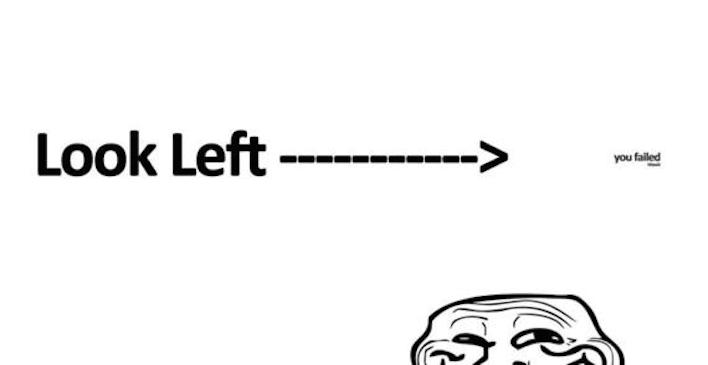
To the right? Of course, it did – because your brain is just wired that way. When we see someone, anyone looking at something our brain acts reflexively and starts looking at that thing too.
Whether that’s looking at gunk stuck on the side of the road or a CTA button that this woman is looking at:

The Primacy Effect
The primacy effect dictates that when given the choice between a list of things, our brains are hardwired to remember the first few things, more than the later things.
Also, our brain regards things at the beginning to be of more importance than the things that come later on. One major reason why the primacy effect works is because an individual or in this case your customer pays more attention likely at the start and then they start drifting off because their brain gets bored or gets tired later on.
In other words, positive reinforcement works great as far as your landing page campaigns are concerned.
The Von Restorff Effect
Customers tend to remember things that stand out, things that are different than the rest.

The burnt one caught your attention didn’t it?
Why? Because it’s different from the red ones, because it contrasts and because it stands out and attracts you.
Basically you remember items that are different from the rest of the bunch in size, color and other characteristics.
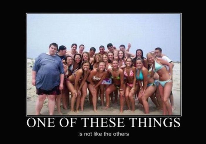
See what I mean?
Informational Social Influence
Informational social influence aka social proof is a phenomenon that dictates that people adopt the actions of others in order to conform to their choices or the “right choices.”
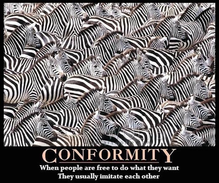
Social proof has very much to do with herd behavior. Our brain goes where other people are going, the brain’s decision making center, the pre-frontal cortex has a direct link to the area responsible for rewards and social learning, seeing someone else’s choice activates that center and causes us to follow their lead.
So, basically monkey see monkey do but in a much more elegant way.
Loss Aversion
We are scared to lose something, so basically we value not losing something more over actually gaining something. And because we are so scared of losing something we do anything in our power to stop this.
Maybe even subscribe to a white paper just because we couldn’t afford losing any more of our “valuable time and money”.
The Practical
The aforementioned theory would really be of no help to you if you don’t have in front you a practical pathway to help put these theories to test and milk all the benefits that you can from them.
Let’s start with them one by one like we did before and as an added advantage let’s sprinkle in some real life examples of the theories’ success right alongside.
Directional cues for your landing pages
The deictic gaze theory explicitly states that our eyes immediately go to where someone else is looking, so using directional cues on your landing pages to point to the sweet spots on the pages really help.
With the help of a directional cue like an arrow or a pathway or even a human’s line of sight you as a marketer are essentially able to take your visitor by the hand and guide them towards your CTA button, towards the conversions that you need, that you deserve.
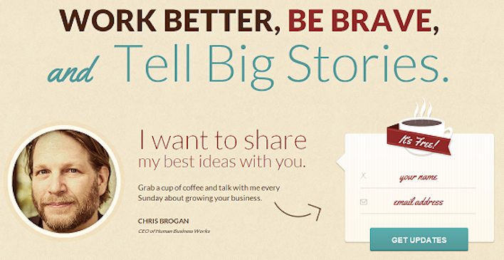
You look at the lead capture form and CTA button, don’t you.
A study performed UsableWorld used an image of a baby and his gaze to see whether or not this would impact where a visitor would look upon arriving on the page, the study was done using 106 people.
The first picture is of a heat map of the page where the baby is looking straight ahead, the red spots show how much time a visitor spent on a particular spot.
![]()
Now look at the heat map when the baby is facing the copy, where the website owner wanted to get his visitors’ attention.
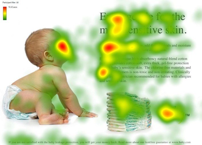
See the difference?
A sensational headline
Your landing page headline needs to rock your visitors’ world, why? Because primacy effect clearly states that the first thing that your visitor sees which is of course your headline needs to be memorable and attractive, or else they’ll simply lose interest and move along without even bothering with the rest of your page; copy, form and all.
The headline that you choose to put on your landing page should really pop. It should be able to grab the attention of your visitors within a millisecond.
Take the unique selling point of your respective service or product and nail it perfectly on your landing page to get the most out of your headline. Using your keywords in the headline also helps you attract your target audience.
Try taking inspiration from this.
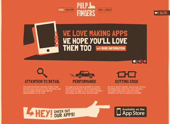
A contrasting call to action button
Your CTA button is the star of your landing page; if it’s not placed in a prominent position well then what’s the point of you even building a landing page because according to the Von Restorff Effect your visitors are only going to pay attention if it stands out for them.
Your CTA needs to be prominent, it needs to leap off from the page so that your visitors know exactly where they have to click to get what you’re offering.
You need to make it noticeable, make it clear and make it attractive.
Like so,
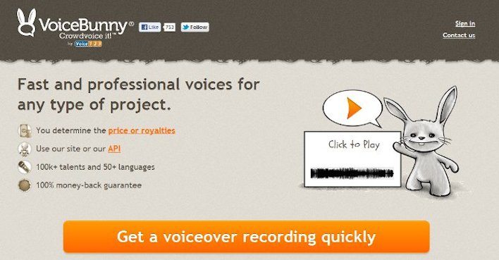
Testing is very important here, you need to test the your CTA button; try varying positions, different colors, different sizes and shapes and select the one that pulls in the most conversions.
Powerful testimonials
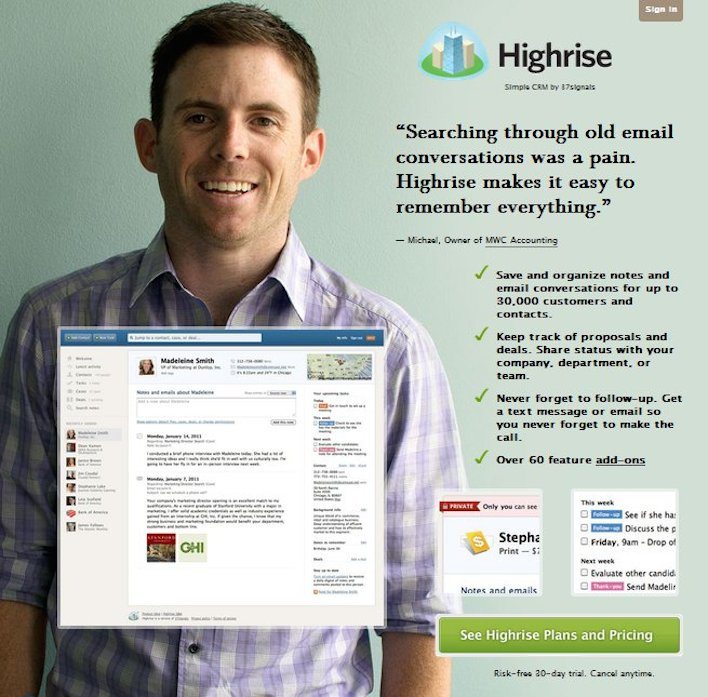
Nothing sells a product better than a loyal customer who’s all praises about your amazing product. Factoring in the whole social proof theory this is simply because customers often think alike, which is why they trust each other’s opinion.
Including legit testimonials on your landing page really helps get conversions, make sure that the testimonials are honest and descriptive, simply including a customer quote saying “Amazing Service” doesn’t really persuade your visitors.
Social media likes and tweets hits the bulls eye with the whole herd behaviour thing and makes your new prospects more likely to sign up for your service or buy your product.
Loss Aversion
Try telling your customers what they’ll be losing if they don’t sign up for your service and see the conversions flood in.
We hate losing stuff and we love free stuff – combine both these factors and come up with copy that doesn’t simply give your visitors something for free but has some value attached with it.

Say “We’ll take care of shipping” instead of “free shipping” on your CTA button and see how your visitors respond.
Armed with these psychological triggers and their practical implementation there is no chance that your landing page will ever strike out.
Always connect all your ads to personalized post-click landing pages to lower your cost per customer acquisition. Start creating your dedicated post-click pages by signing up for an Instapage Enterprise demo today.

See the Instapage Enterprise Plan in Action.
Demo includes AdMap™, Personalization, AMP,
Global Blocks, heatmaps & more.
