You’ve probably heard from a million marketers that, today, everybody’s obsessed with video content. But do you really understand just how much?
Here are a few stats to illustrate:
- In 2015, average Americans spent more time watching video than they did working.
- More video content is uploaded in 30 days to the internet than all 3 major US TV networks have created in the last 30 years.
- By 2019, Cisco expects more than 80% of internet traffic to be to online video.
Makes you want to grab a camera and start recording, doesn’t it?
The good news is, with so many online video networks and do-it-yourself tools, it’s easier than ever to start creating video content for your brand. At the same time, it’s also more confusing than ever.
Snapchat, Periscope, Instagram, Facebook, and Twitter — to name a few — all offer brands the ability to capitalize on video in some way. But, while newer trendy networks grab headlines, it’s the original video network that continues to grab users and video views.
YouTube
YouTube now counts over 1 billion users, nearly a third of the internet. And every day, web users watch hundreds of millions of hours of video, each for an average of 40 minutes on mobile (up more than 50% from 2014), while generating billions of views on the network.
According to Google CEO Sundar Pichai:
“In video, YouTube continues to shine... “Nearly half of U.S. adults between the ages of 18 and 54 say that at least once a month, YouTube helps them in making a decision about buying something."
And, increasingly, the videos they’re watching aren’t the viral ones of adventure-seekers and stunt drivers that we think of when we imagine entertaining branded video. “How to” searches on YouTube are increasing 70% year over year, and research from Ascend2 shows that marketers are actually finding more success with less glamorous types of video (ranked in order from most to least effective):
- Customer testimonials
- On-demand product demonstration videos
- Explainer and tutorial videos
- Thought leader interviews
- Project reviews and case studies
- Live and on-demand webinars
- Video blogs
- Event videos
To capitalize on video views on the network, marketers are using the power of YouTube post-click landing pages to drive user action.
What is a YouTube post-click landing page?
A YouTube post-click landing page is a standalone web page that uses persuasive elements like testimonials, social proof, and benefit-oriented copy to convince its visitors to convert on an offer (buy a product, download an ebook, sign up for a newsletter, etc). Those visitors land on the page after clicking a promotional link in YouTube.
As the popularity of video marketing has increased along with the need for post-click landing pages to drive user action, so has the need for YouTube post-click landing pages.
Driving traffic from YouTube
To reach a post-click landing page, a prospect first needs to click a promotional link created by your team. So where are marketers putting those CTA links on YouTube?
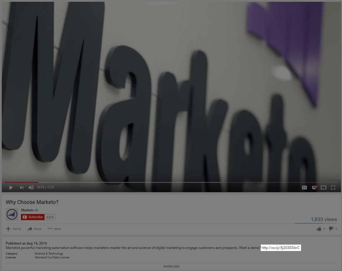
1. In the video description
YouTube allows users to post a description with each video, and in it is a perfect place to drop a link to your post-click landing page, the way Marketo does below:
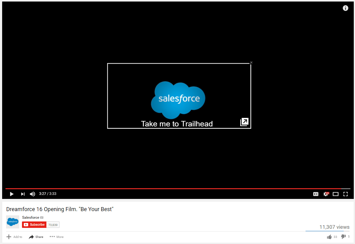
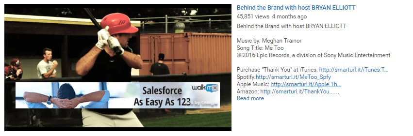
2. YouTube annotations
Annotations allow you to create clickable areas within your actual video that users can use to navigate to your post-click landing pages, like this one below that takes watchers to Salesforce’s Trailhead page:
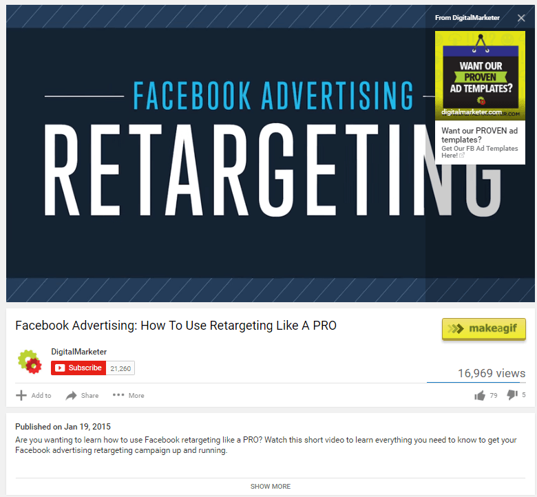
A newer offering similar to annotations, YouTube Cards, allow you to create a small image card within your video instead of just a translucent clickable area. DigitalMarketer uses one in the video below:
3. YouTube ads
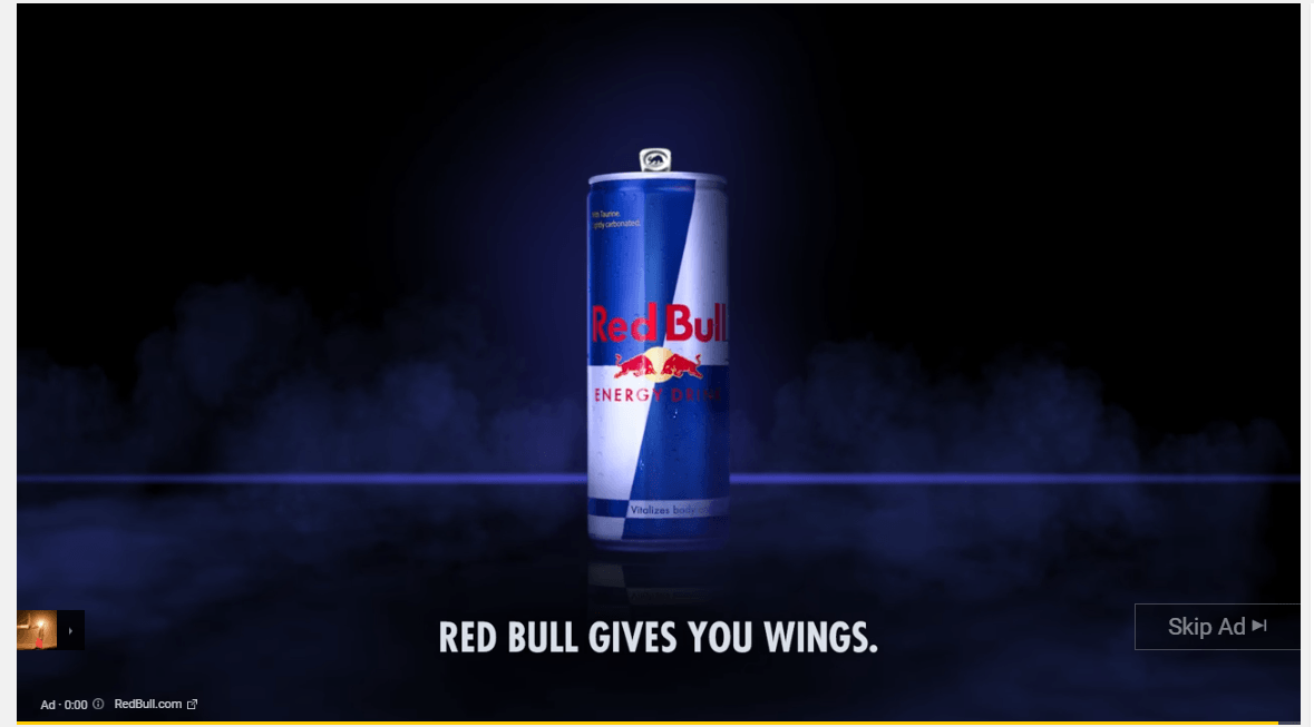
As audiences shift their attention to online video, advertisers are shifting more of their budget to YouTube. Today, the network owns a 38% share of online video ad spend, and by 2017, businesses are projected to spend nearly $2 billion to serve video ads on the platform.
Most of us are familiar with pre-roll ads (the ones you have to watch before your video starts), but there are also banners, bumpers, and more, that you can use to drive traffic to your post-click landing page.
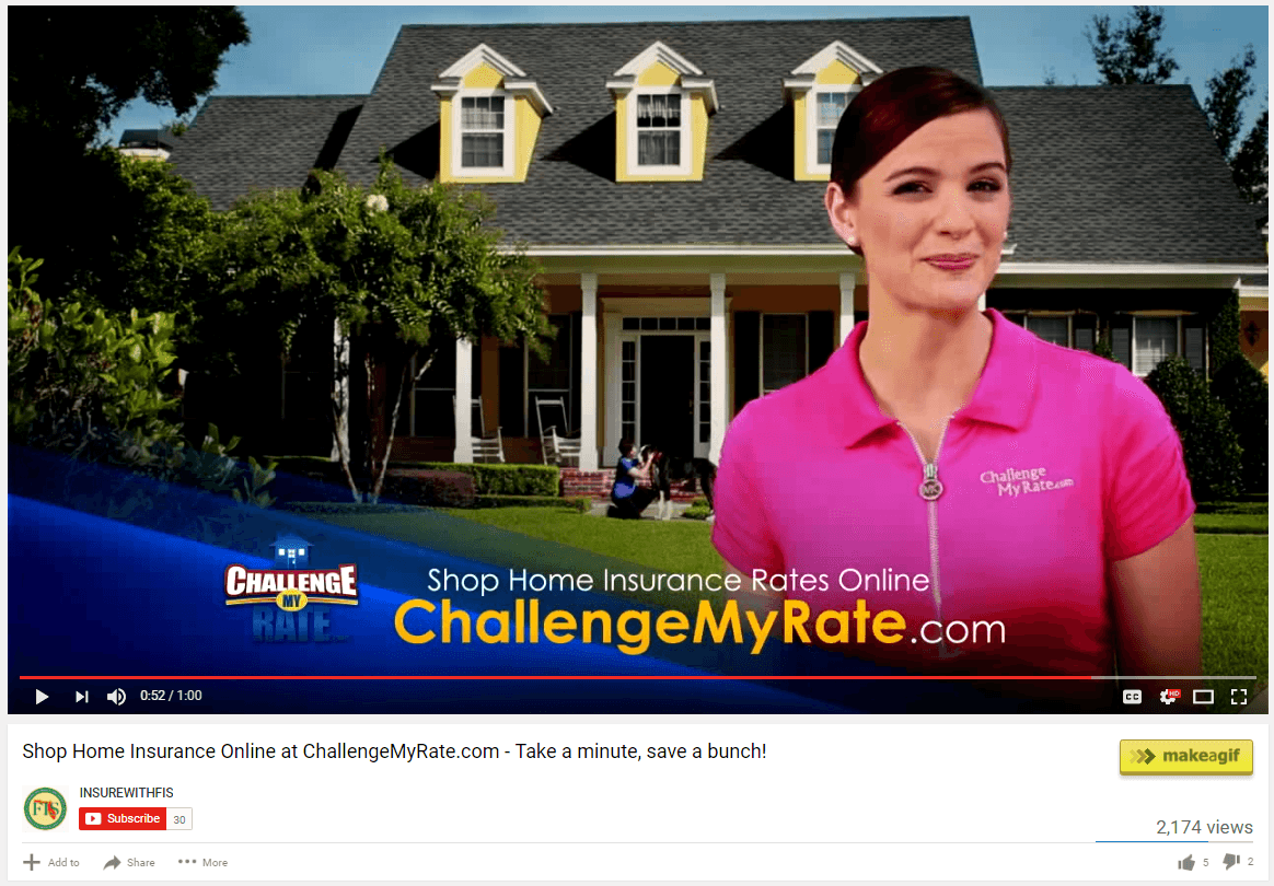
4. Display URLs
Links like these aren’t clickable, but adding them to your video at key moments remind users where they can claim your offer. ChallengeMyRate.com displays theirs at the bottom of this video about shopping for home insurance:
How to create a YouTube post-click landing page
YouTube post-click landing pages should all be standalone — not connected to your website via navigation links in a menu, a footer, or in the page’s content. They should also feature…
- A headline that conveys your unique selling proposition: Communicate what your audience will gain by converting on your offer. Don’t emphasize your actual product or service, but more so the benefit it provides.
- Engaging media to grab user attention: Show prospects how your product or service will transform their life with a hero image, or teach them how it works with a short video.
- Bulleted, benefit-oriented text to concisely explain your offer: Your prospects aren’t reading your post-click landing page for pleasure, so explain the benefits of your offer using bulleted lists and short paragraphs, and do it quickly.
- Testimonials that boost trust: Who has used your product, and what positive things do they have to say about it? Get quotes, full names, titles, and company names. The more personal information you have, the more real and trustworthy your testimonials become.
- Social proof to showcase your popularity: Use authority badges to prove you’re an expert in your field, company logos to showcase the well-known clients you’ve worked with, and counters that display how many people use your product or service.
- A compelling call-to-action to drive them to click: Don’t settle for “Submit,” “Download,” or “Get started.” Use something unique, action-oriented, and write it in the first person. To make it even more compelling, consider making even this benefit-oriented. If your newsletter promises to give them marketing tips from experts, instead of using “Sign Me Up” try “Send Me Expert Tips.”
- Contact information in case your prospects need to reach you: What’s the address of your tech support teaml? How about your phone number? Is it click-to-call?
- A minimalist footer that won’t distract your visitors: If you put anything at all here, it should be nothing more than terms & conditions and copyright information.
5 YouTube post-click landing pages to model your next page after
(Note: For shorter pages, we’ve shown the entire page. For longer pages, we only displayed above the fold. You may need to click through to each YouTube post-click landing page to see some of the points we discuss. Additionally, many sites A/B test their pages, meaning you may be served an alternate version.)
1. Marketo
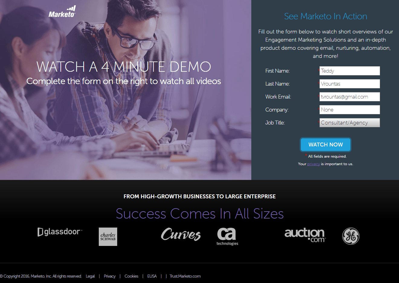
What the page does well:
- Minimal copy makes getting through this post-click landing page effortless.
- Company logos showcase the big names that do business with Marketo, boosting the company’s authority and instilling trust in the prospect.
- A relatively short form makes it easy for visitors to convert without having to divulge too much information.
- The form title “See Marketo In Action” acts as a CTA of sorts because it directs their attention to the form.
What could be A/B tested:
- A hyperlinked logo that drives users to the homepage has the potential to detract from this page’s conversion rate.
- Benefit-oriented copy is nowhere to be seen on this post-click landing page. Why should we claim a demo?
- This CTA button color doesn’t grab maximum attention. A contrasting CTA button color would serve Marketo much better than this turquoise button.
- Navigation links in the footer don’t keep prospects focused on converting.
2. Quip
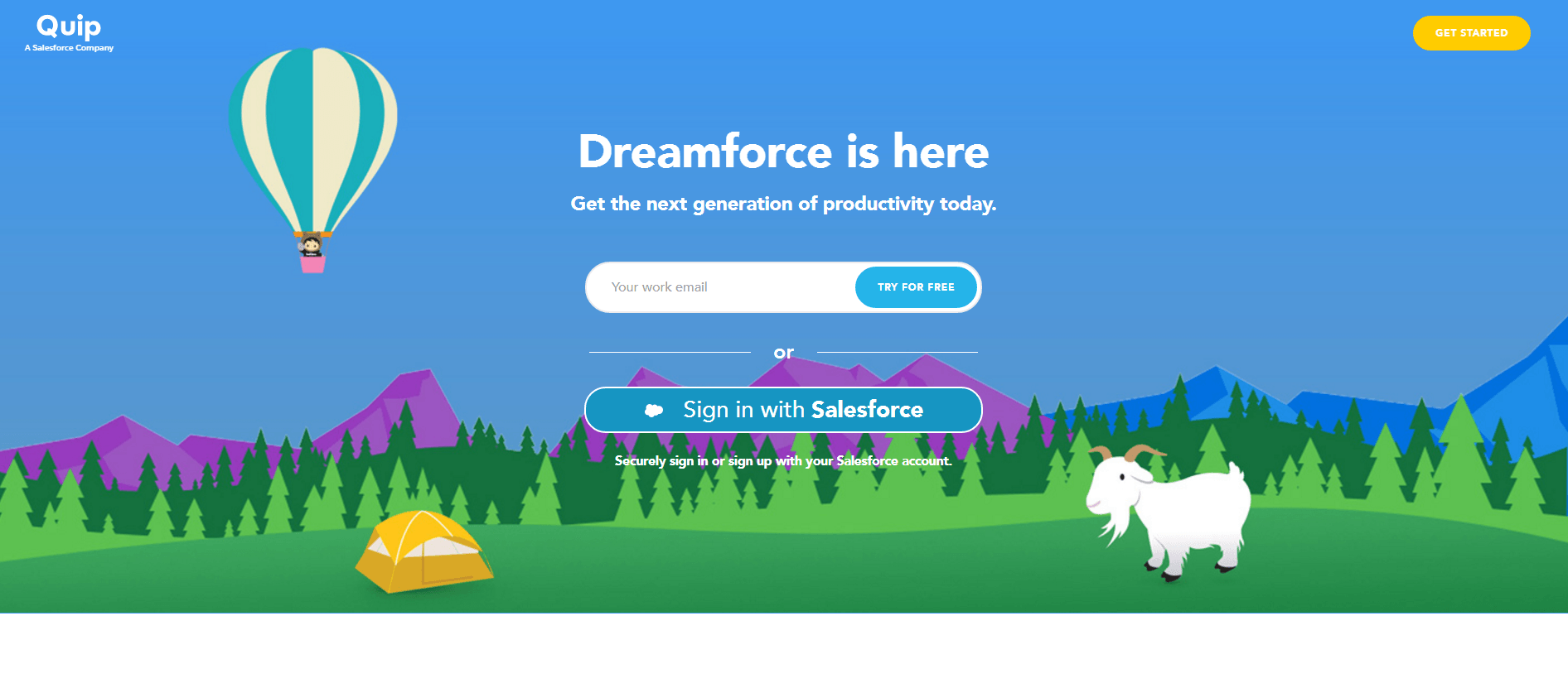
What the page does well:
- The headline matches the message of the referring video – a speech during Salesforce’s “Dreamforce” conference — letting users know they’re in the right place.
- Several cooperative CTAs work together to convert prospects in multiple locations on the page.
- The one-field form makes converting a breeze.
- The “Sign in with Salesforce” option allows existing customers to import their information in a single click to register.
- The word “Free” in the call-to-action entices users to claim the offer.
- Company logos showcase the big-name brands that use Quip.
- Minimal copy makes this page easy to read.
- Short chunks of text don’t exhaust the attention of the reader.
- Benefit-oriented messaging emphasizes what the prospect will get by using the tool.
- Screenshots from the tool give prospects a preview of Quip’s interface and its capabilities.
- A video testimonial from a marketing influencer, complete with name, title, and company, adds credibility to the offer.
- A minimalistic footer doesn’t distract visitors from converting.
What could be A/B tested:
- Clickable logos in the header and footer allow users to escape to the site’s homepage.
- The page’s bright background image steals attention from the CTA buttons, and it doesn’t add anything to the page.
3. Trump Campaign
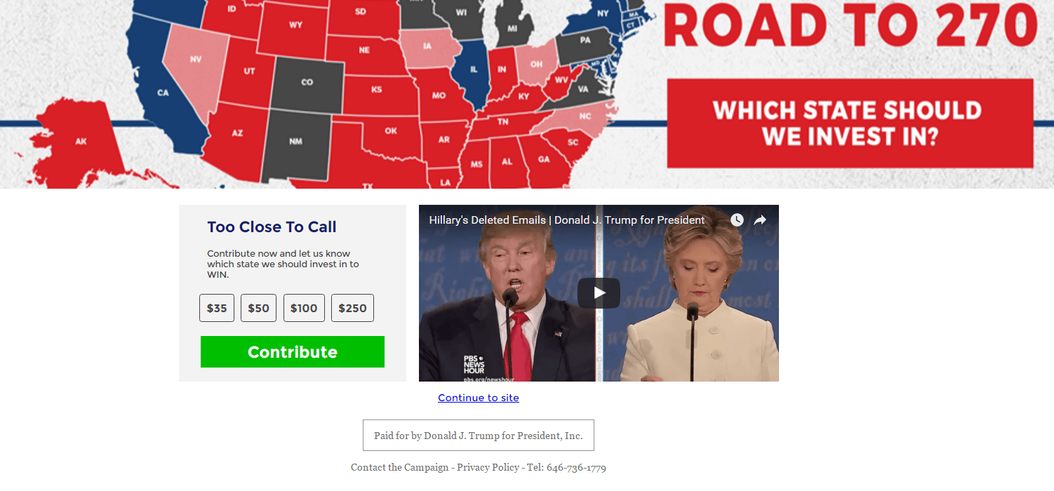
What the page does well:
- This CTA button color stands out on the page, which helps draw visitor attention.
- The benefit is better than most contribution post-click landing pages. Normally when you donate to a cause, you don’t get anything in return. But here, you get a chance to let Trump’s campaign know where you think they should invest the most time in the final hours of the election to win it. Will his marketing team actually take responses into account? Probably not, but it’s a good way to make people feel involved in the movement.
- The relatively short video (52 seconds) gets the campaign message across without boring users.
What could be A/B tested:
- Navigation links below the video give prospects more ways to escape than they should have. The “Continue to site” link is standard for splash pages like this one, but the “Contact the Campaign” link is unnecessary.
4. WalkMe
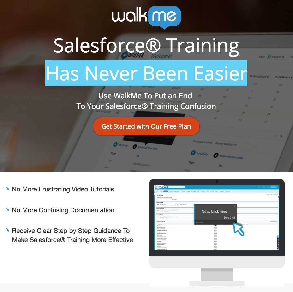
What the page does well:
- The WalkMe logo isn’t linked to the homepage, so it doesn’t drive users away before they convert. They have to click the “X” in the upper-right corner to leave.
- Bulleted text quickly communicates the benefits of claiming the free plan.
- The CTA button color draws visitors’ attention.
- The call-to-action highlights the free offer.
- A sticky header follows users as they scroll, as does the call-to-action button.
- Company logos showcase the well-known brands that WalkMe has worked with.
What could be A/B tested:
- Minimal copy is usually good to use on a post-click landing page, but in this case it might be too minimal. What about some descriptions of how the training works? And outside of copy, how about some screenshots? Testimonials?
5. Digital Marketer
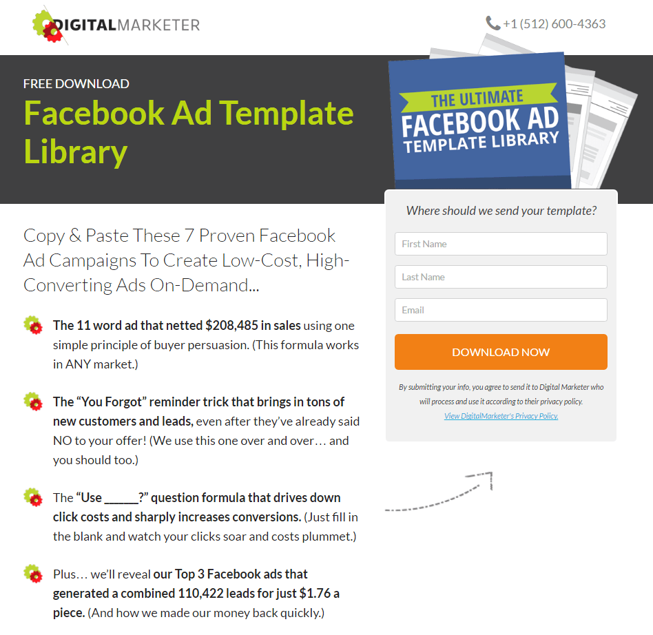
What the page does well:
- A logo not hyperlinked to the homepage keeps these prospects focused on converting.
- A phone number in the upper-right corner gives visitors a way to contact the company without using a “Contact Us” link that may drive people off the page.
- The word “Free” is used above the headline to draw attention to the no-cost offer.
- The offer is something the prospect can actually use. Instead of giving away an ebook that teaches visitors how to create great Facebook ads, templates make it even easier by allowing them to simply plug in their information.
- The headline is full of persuasive copy. Words like “Copy & Paste” imply ease of use, “Proven” imply they’ve worked before, “Low-Cost” communicates affordability, and “High-Converting” means “successful.”
- Bulleted text quickly communicates the benefits of the offer while teasing it well with great copywriting.
- A three-field form makes converting easy, and the message above it justifies the need for email address by asking, “Where should we send your template?”
- A visual aid in the form of an arrow guides visitors toward the form.
- Two cooperative CTA buttons work together to convert visitors, and they both draw attention with bold colors.
What could be A/B tested:
- A testimonial from the owner doesn’t exactly strengthen the offer. One from someone who has actually found success with the templates up for grabs would be more persuasive.
- Outbound links in the footer allow prospects to navigate away from the page before they convert, to pages like the blog, the “about us” page, and a “contact us” page.
What does your YouTube post-click landing page look like?
Have you created a YouTube post-click landing page to drive traffic to? Sign up for an Instapage Enterprise demo today.

See the Instapage Enterprise Plan in Action.
Demo includes AdMap™, Personalization, AMP,
Global Blocks, heatmaps & more.
