Since LinkedIn boasts itself as the world’s largest professional network, it makes sense they want to help foster connections between businesses and individuals.
And if your email inbox looks like mine, you receive the following types of emails from LinkedIn:
- People viewed your profile
- New connection requests
- New messages, endorsements, and recommendations
All of these emails are intended to get me back on their platform and engaging with my network. Sometimes it works and sometimes it doesn’t.
For marketers like you and I, there are 10 ways to build your brand and generate leads. But what about LinkedIn itself? How do they continue to build their brand and generate leads, signups, and sales?
Like you and I do: with post-click landing pages.
We’ve highlighted how Google, Shopify, Airbnb, Uber, and Salesforce use post-click landing pages for their respective marketing campaigns. Now it’s LinkedIn’s turn to take the spotlight.
Take a look at these 12 LinkedIn post-click landing pages and use them for inspiration when designing your next page.
(Keep in mind, for shorter pages, we’ve shown the entire page. However, for longer pages, we only displayed above the fold. You may need to click through to the page to see some of the points we discuss and some examples may be A/B testing their page with an alternate version than is displayed below.)
How LinkedIn pages drive user engagement
1. To accumulate blog subscribers
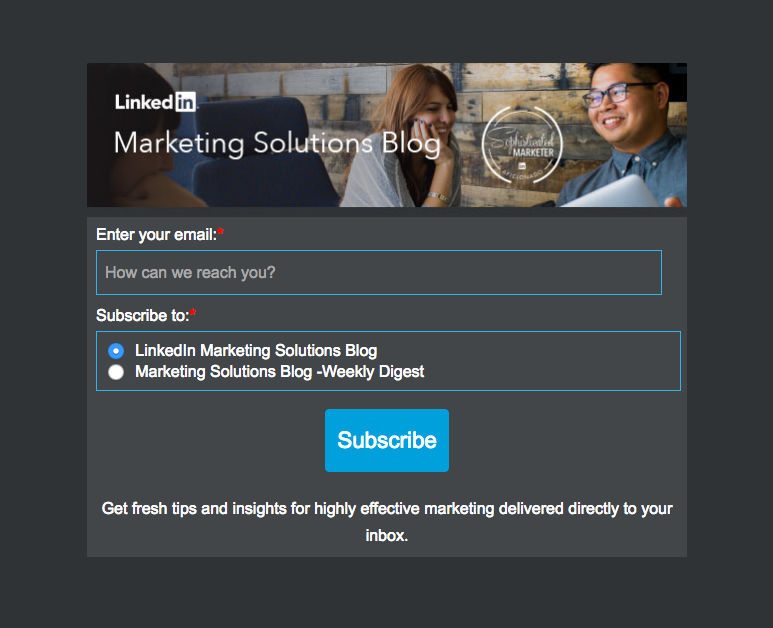
What they did well:
- The short form only asks for email without requesting unnecessary information like job title or company name.
- The two radio buttons make it easy for visitors to select exactly which content they would prefer to read.
- Zero extra links make it impossible for visitors to exit the page unless they either subscribe to the either blog or click the “X” in the browser’s tab.
- The blue CTA button contrasts well with the dark gray background, which makes it draw maximum attention.
What could be A/B tested:
- The image doesn’t really help explain what’s beneficial about subscribing to the Marketing Solutions blog.
- The CTA button copy is okay, not great. Using personalized copy could make the button even stronger with something like, “Subscribe Me” or “I Want to Subscribe.”
2. To generate ebook downloads
LinkedIn has a total of 433 million users, and just like many other business models, they want to monetize their platform. Since I am one of those users, they do their best to get me to advertise with them. This is an InMail message and related ad I received recently:
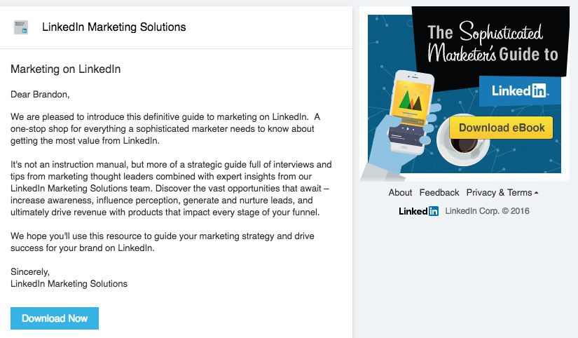
Both the “Download Now” CTA and the ad go to this post-click landing page:
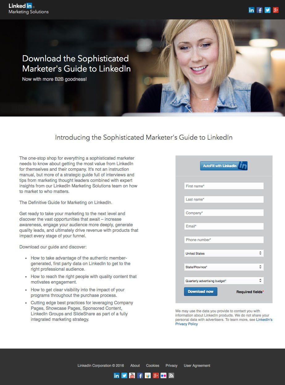
Just like any smart digital marketer, they A/B test the page. Here is the “B” variation:
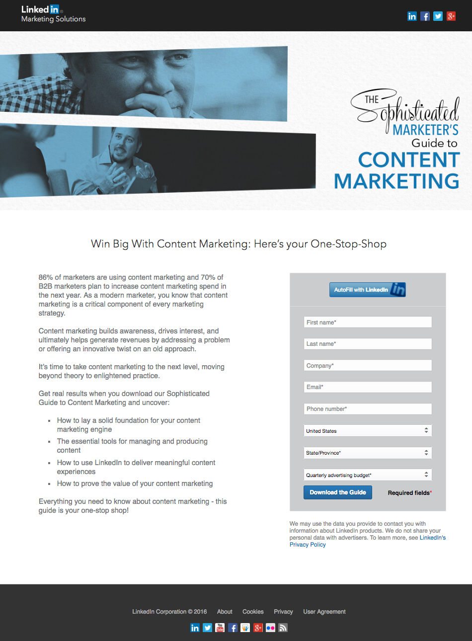
Although the page uses a different header image, headline, and copy. The form is the same (with a minor variation in CTA copy).
For both variations, LinkedIn sends prospects to a thank you page with the content and push them further down the funnel by requesting I speak with sales:
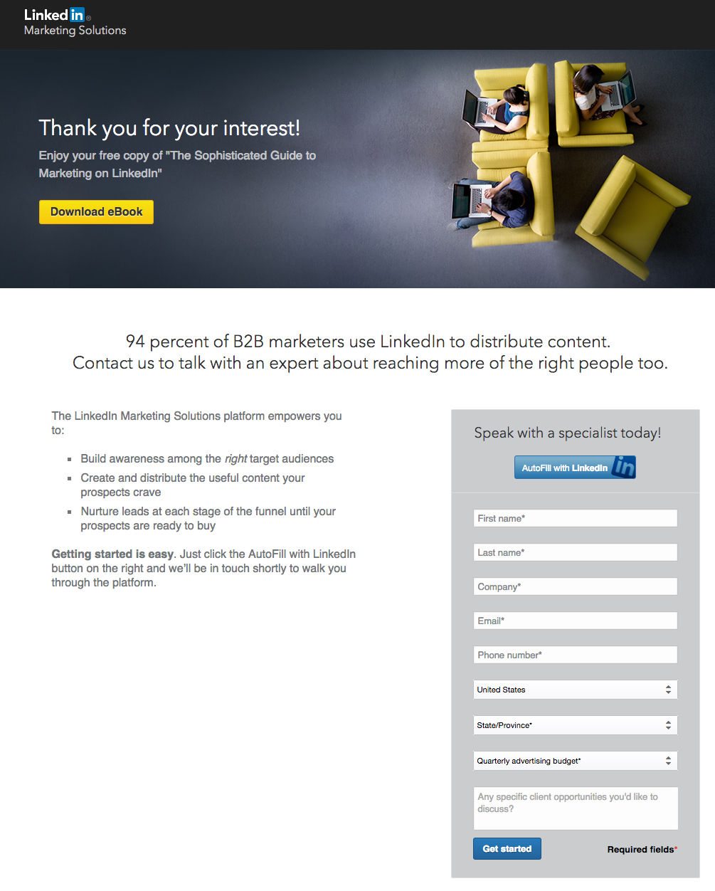
Granted, I didn’t submit this form to contact sales, but I would hope I get put into a different lead nurturing funnel than I was by downloading their ebook.
What they did well on their thank you page:
- The headline uses statistics to help incentivize visitors to convert on the form and speak to sales.
- Short, bulleted copy makes this page easy to read.
- The bolded text, “Getting started is easy” helps draw attention amongst the rest of the copy — to then click the AutoFill with LinkedIn button and speak to a specialist.
- The form’s headline reinforces the purpose of completing the form.
- The “AutoFill with LinkedIn button helps conversions because visitors can submit the form with a single click.
What could be A/B tested on their thank you page:
- The CTA button color has already been used on the page so it’s not immediately recognizable against the rest of the page’s colors.
- More white space between the headline and form would provide more visual hierarchy and give more breathing room to the respective post-click landing page elements.
- Including testimonials from marketers who have used LinkedIn’s Marketing Solutions platform could greatly improve this page’s conversion rate. It’s worth A/B testing!
3. To contact sales
Once I received the thank you email for downloading the ebook, I clicked on the “Get Started” with LinkedIn Marketing Solutions CTA, which directed me to this page:
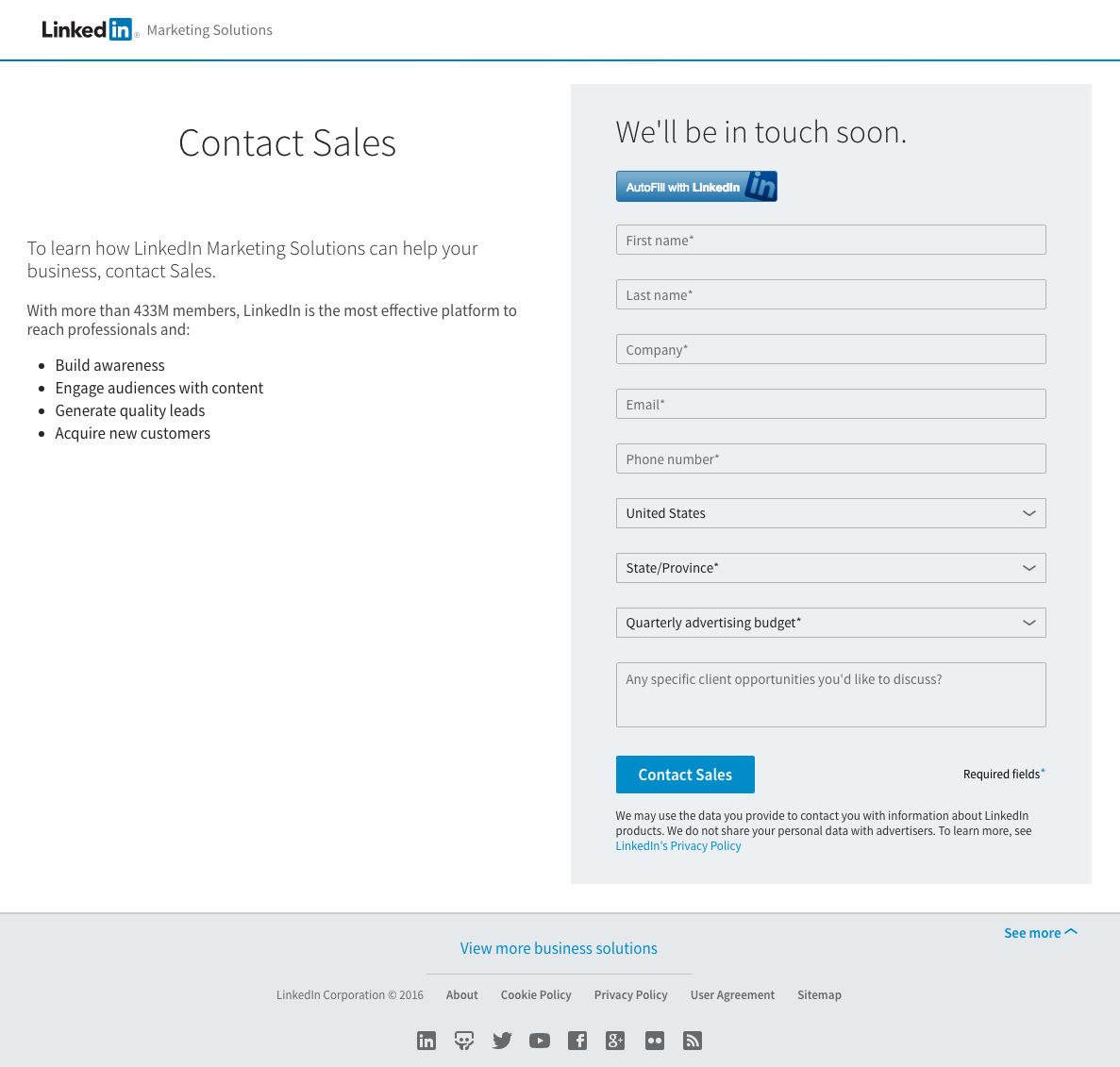
What they did well:
- AutoFill with LinkedIn button makes conversion easier than ever because prospects don’t have to complete this 9-field form.
- The open-ended text field allows prospects total freedom to ask detailed questions and/or be more specific in their requests. Bonus points for the text field being optional.
- Short, bulleted copy provide the value proposition of why prospects should talk with LinkedIn’s sales team.
- The CTA is tailored to the headline and the “offer” of this post-click landing page.
What could be A/B tested:
- The headline “Contact Sales” is straight-forward but doesn’t get prospects excited to speak with a sales representative. An alternative headline such as “Get more out of your marketing budget” could be a nice compliment to the page — considering the CTA button already has “Contact Sales.”
- A lack of visual cues, like an arrow pointing at the form, is potentially limiting the number of prospects reaching out to the sales team.
- A footer filled with outbound links gives prospects many excuses to leave the page instead of contacting sales.
4. To generate survey downloads
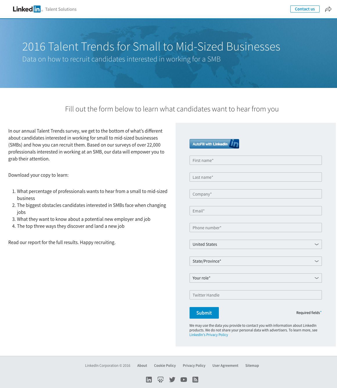
What they did well:
- The image of the globe makes it appear like the survey was conducted on a worldwide scale and not limited to the United States.
- The “AutoFill” button lets prospects complete the form with a single click, as opposed to filling out each individual field.
- Privacy policy link helps ensure prospects that their information will be held safe by LinkedIn without being sold or used for any other purposes than this survey report.
What could be A/B tested:
- The “Contact Us” button and arrow in the top right provide exit routes off the page — potentially reducing conversions.
- The CTA button color is the same as the header image and the autofill button. It’s best to use a contrasting color for CTA buttons to draw maximum attention and conversions.
- The CTA button copy “submit” is one of the most cringe-worthy words a marketer can use to generate conversions. Why not try something like, “Get Survey Results” instead?
- Footer links to an About page, Sitemap, and a multiple links to other social networking profiles give visitors other ways off the page and can reduce conversions.
5. To generate social selling ebook downloads
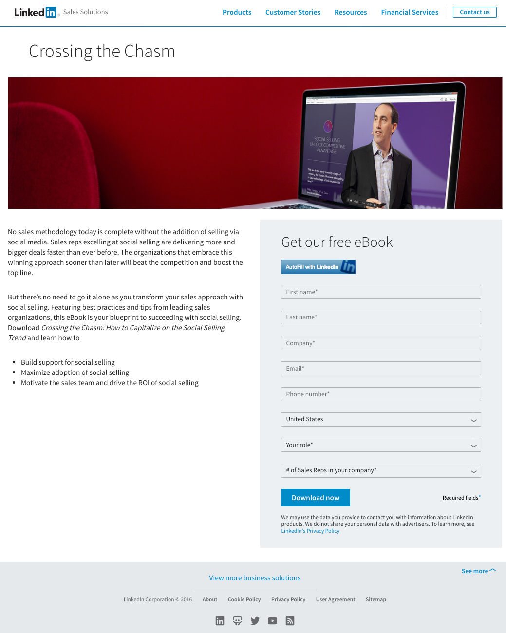
What they did well:
- Bite-sized copy and bulleted text helps visitors skim the page quickly to get the most important information needed to convert on the form.
- The form title “Get our free eBook” provides more page structure and helps draw attention to the form and CTA button.
- Privacy policy link is included below the form, providing reassurance to visitors that their information will be kept safe from third parties.
What could be A/B tested:
- Navigation links provide many ways off the page. This is especially concerning because people generally read online content in either an F or Z pattern, and their gaze will cross over these navigation links before even getting to the copy or form to convert on the offer.
- The headline “Crossing the Chasm” doesn’t invoke emotion in the visitor to continue reading the page, let alone convert on the form.
- The CTA button color has already been used on the page in the navigation links and the autofill button above the form.
- The “Download now” CTA copy could be improved and generate more conversions. Why not test, “Download My eBook”?
- The “See more” link opens up another full menu of links that can distract the visitor’s attention away from the CTA.
- Footer links offer too many options for visitors to click and leave the page without converting.
6. To prompt more referrals
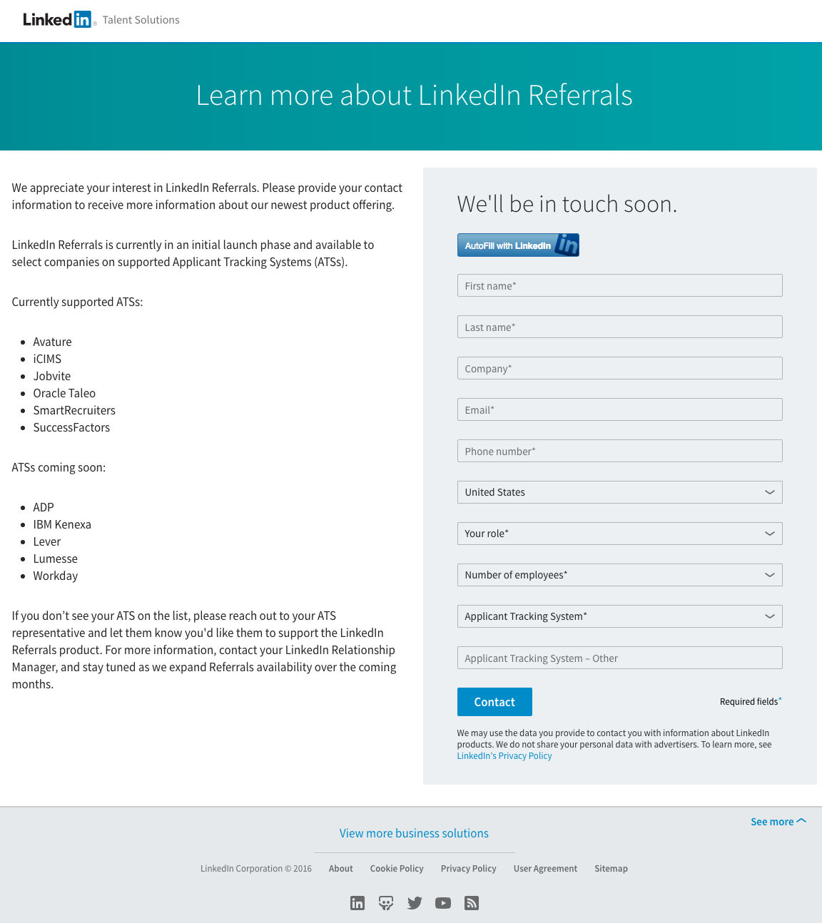
What they did well:
- No navigation links makes it a little more inviting for people to stay on the page and read the body copy and potentially convert on the form.
- Bulleted lists inform visitors exactly which ATSs are supported by LinkedIn and which ATSs are not supported.
- The autofill button helps reduce friction and lets people complete the form with a single click.
- Privacy policy is available for visitors to read if they’re worried about submitting their information to LinkedIn.
What could be A/B tested:
- The LinkedIn Talent Solutions logo is linked, providing visitors a way off the page instead of converting on the form.
- CTA button copy could be improved with personalization. “Contact Me” would likely produce more conversions than the button in its current form.
- The “See more” link opens up another menu of links and even covers the CTA button — reducing the chance that visitors will convert.
- Footer links distract the visitor’s attention away from the CTA button.
7. To promote their recruiting platform
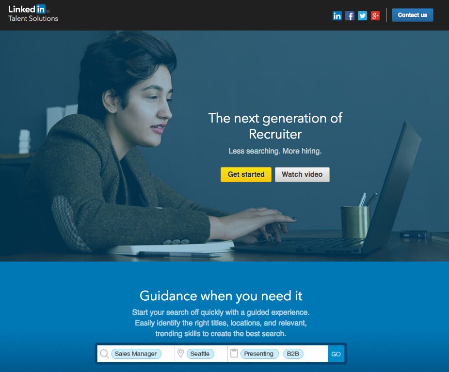
This page is actually a click-through page that directs visitors to LinkedIn Recruiter’s main site.
What they did well:
- The image could very well be a recruiter using LinkedIn’s recruiter tool to find qualified candidates for job openings.
- The headline and subheadline combination help convince visitors that the recruiting tool will find the most qualified candidates with less time searching.
- “Watch Video” CTA is an anchor tag that directs you further down the page to the video, not off the page.
- Segmented search field demonstrates how selective recruiters can be when looking for qualified candidates.
- Testimonial with name and title is great. The only thing that’s missing is Patricia McGoldrick’s headshot.
What could be A/B tested:
- LinkedIn Talent Solutions logo is linked to the main recruiting homepage. As we’ve said before, any extra links will provide exit paths off the page and can lower conversions.
- Removing header icons like Contact Us and social media icons would likely keep the visitor’s attention on more important parts of the page (e.g. image, headline, CTA, video).
- Are the footer links really necessary? While links like “Products”, “Webcasts”, “Tips & Insights” may be relevant to the recruiting platform, they provide exit points and multiple ways off the page.
8. To generate recruiting guide downloads
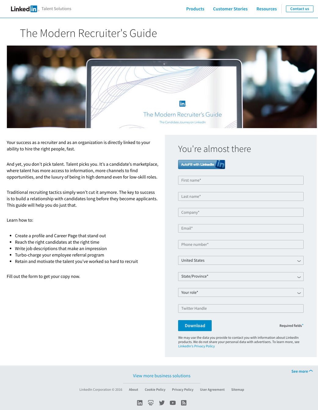
What they did well:
- Short paragraphs provide more background on current trends in the recruiting industry.
- Bulleted copy provide specific reasons what recruiters will learn by downloading the guide.
- AutoFill with LinkedIn makes it as easy as possible for visitors to download the Modern Recruiter’s Guide.
- The text “fill out the form to get your copy now” tells users exactly what they need to do to claim the offer.
What could be A/B tested:
- The image doesn’t totally pique interest and entice recruiters to continue reading the rest of the page. The image is simply a laptop with the screen highlighting the name of the guide and man in the background. Why not have someone scrolling through the guide on their laptop — giving the impression it’s a recruiter getting valuable tips from the guide?
- Navigation and footer links provide way too many excuses to leave the page without downloading the guide. If LinkedIn really wants to encourage guide downloads, they would be better off removing all of these options and only focus on the CTA button.
- “You’re almost there” form headline is okay, but could be improved. Something like, “Get your free guide here” would probably do better at increasing conversions.
- “Download” CTA button copy would do better as “Download my copy.”
9. To drive job posting toolkit downloads
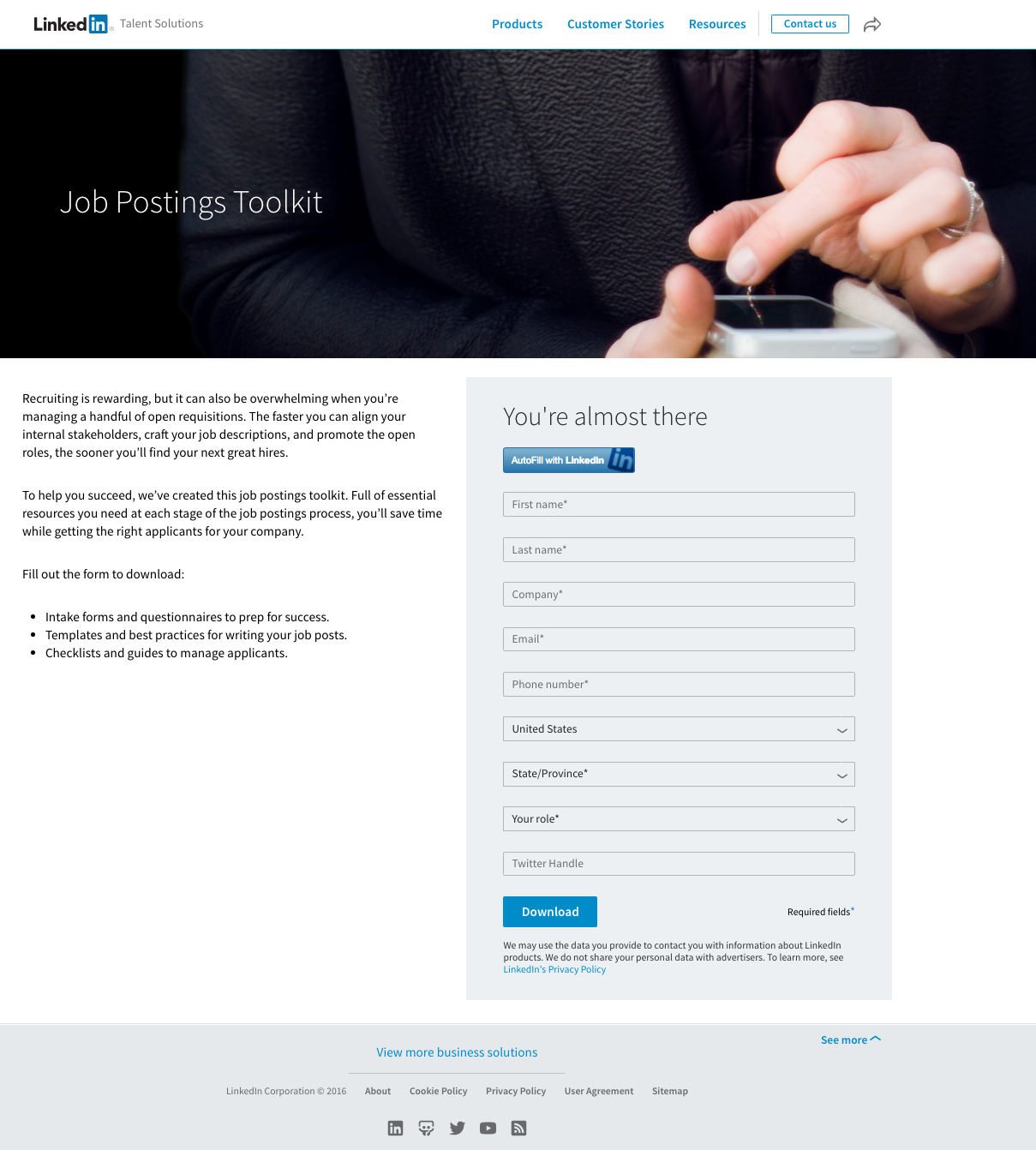
What they did well:
- Minimal copy that explains what the toolkit provides — resources at each stage of the job posting process to find more qualified candidates.
- Bulleted list expands on the paragraph copy and encourages recruiters to download the toolkit.
- AutoFill with LinkedIn makes completing the form a breeze.
- A privacy policy lets interested prospects know their information will only be used for downloading the toolkit, not to sell to any third parties.
What could be A/B tested:
- The image is uninspiring because it simply looks like someone scrolling through their phone — on Facebook, email, pretty much anything. A picture of the job postings toolkit showing what the content download is would be more beneficial to visitors of this page.
- Many exit points in the header and footer distract the visitor’s attention and away from the “download” button.
- Add more white space in between the header image, copy, and the form. This would give more breathing room so readers could focus on one thing at a time. LinkedIn could add white space by aligning the form justified right, similar to their examples above in this post.
- CTA button copy doesn’t get visitors excited to convert on the form. Using personalized copy such as “Get my toolkit” would be more descriptive and encourage more button clicks.
10. To generate downloads for global talent trends
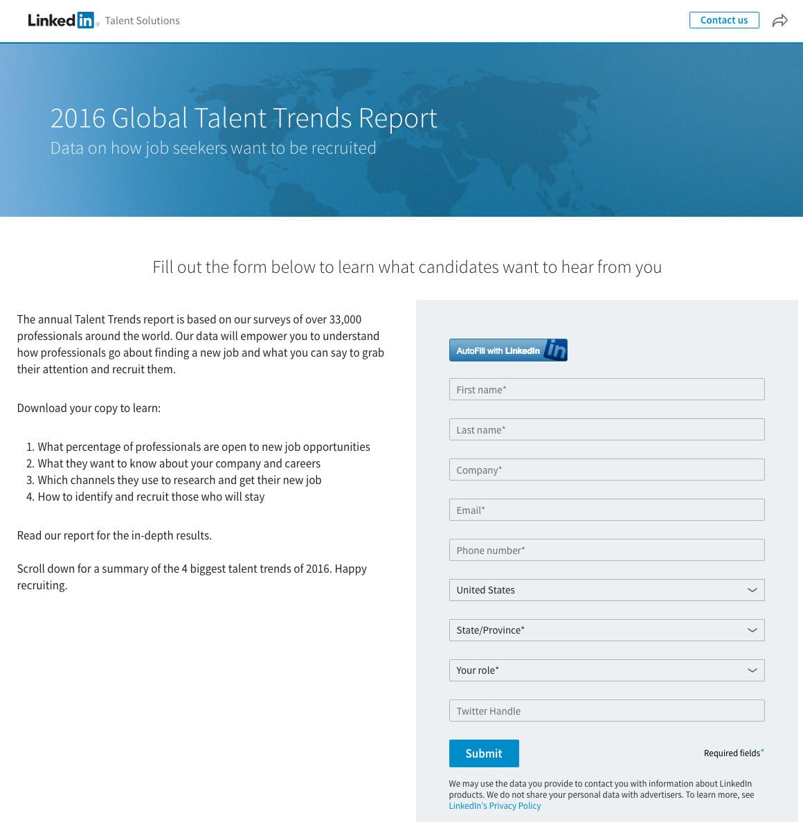
What they did well:
- The image of the world helps reinforce that the talent trends report was collected from professionals from all corners of the globe.
- The headline on the image (“Data on how job seekers want to be recruited”) is attractive and likely gets recruiters interested in reading the rest of the page copy and converting on the form.
- Short paragraph with details how the data was collected helps support the research methods LinkedIn performed to produce this report.
- Bulleted copy provides teaser information what recruiters will learn once they download the report.
- The summary of the 4 biggest talent trends expand on the bulleted copy but don’t provide all of the information to recruiters. To get complete details, you’ll need to convert on the page!
What could be A/B tested:
- “Contact Us” and an arrow serve as distractions from the page’s ultimate goal (guide downloads). Removing these options (and the full footer) would help LinkedIn focus visitor’s attention on the CTA button.
- CTA button color has already been used twice on the page. If LinkedIn wants recruiters to download their 2016 Talent Trends Report, we suggest one big optimization: use a contrasting color for the CTA button that hasn’t been used yet.
- CTA button copy is unremarkable. “Submit” is one of the worst words/phrases marketers can use on their button. Think about it, do you really want to “submit” to something?
- Including a data point from the report could potentially increase downloads. Something like X% of of job seekers prefer to receive InMail messages as a first touch point could really help LinkedIn demonstrate its thorough research practices in developing the report and make visitors think, “wow if LinkedIn went to the trouble of finding that information, what else do they know that I don’t?”
11. To help build your talent brand
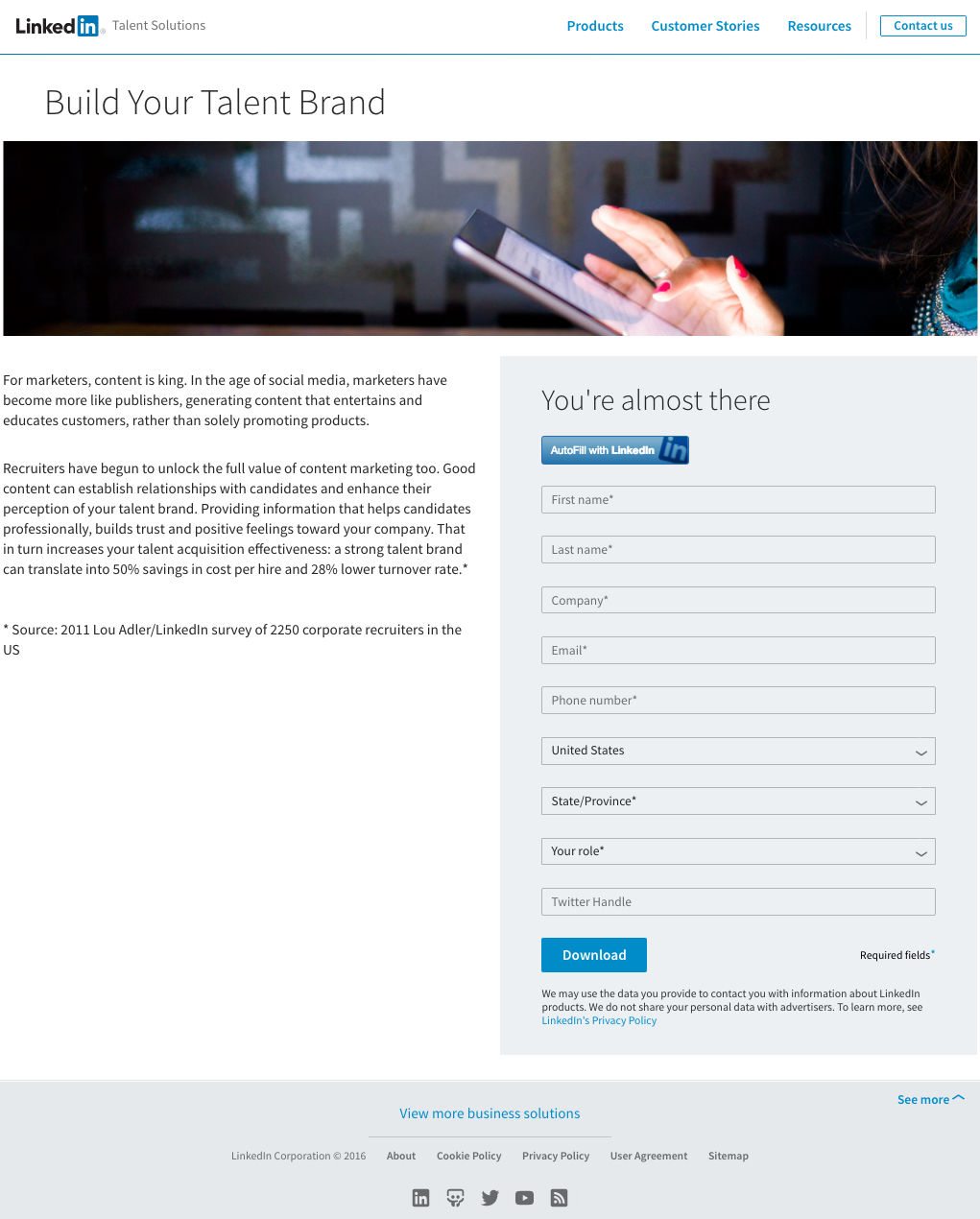
What they did well:
- AutoFill with LinkedIn button helps remove friction from submitting this form.
- Privacy policy provides reassurance that any visitor information will be kept safe by LinkedIn and not used for any other purpose than to send the prospect the content.
- This page is responsive, meaning the page will adjust to the screen size of the device it’s viewed on. Try it out… Open the post-click landing page link, grab the side of the browser window, and reduce the window size. What happens to the page? Does it hide the page contents or does it realign the page elements based on the window size?
What could be A/B tested:
- The image doesn’t add value to the page of “building your brand.” The woman could be scrolling her Facebook feed or reading the news for all we know.
- Bulleted copy instead of block text would make this page much more skimmable and eaiser to read. Multiple studies have shown that people look for bolded text, bulleted lists, and section headlines when skimming online content. Use block text and you run the risk of losing your visitor’s attention — and them converting on your post-click landing page goal.
- The 2011 statistic can be discouraging because it shows LinkedIn is using data that is at least five years old.
- Navigation and footer links provide conversion-killing options for visitors to click and move away from the page without converting.
12. To drive employee referral kit ebook downloads
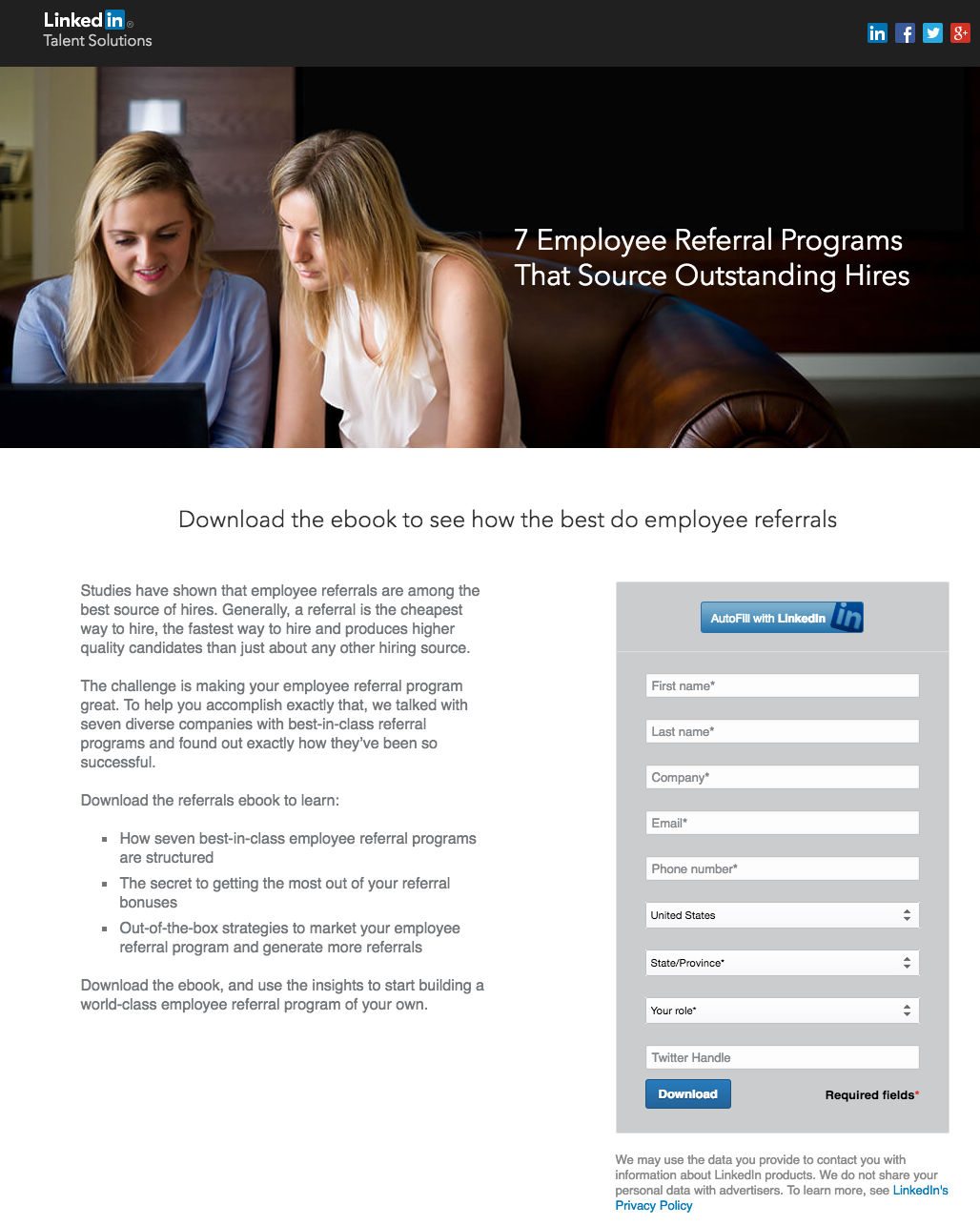
What they did well:
- The image is refreshing, mostly because they use a different image than the cookie-cutter banner type of previous examples. Plus, this picture could very well be a hiring manager explaining something to a new hire.
- The subheadline is attention grabbing because it’s action oriented (Download the ebook) and piques curiosity “how the best do employee referrals” because who doesn’t want to learn from the best?
- Bulleted copy that demonstrates the ebook’s contents.
- One-click AutoFill button makes completing the 9-field form easy.
What could be A/B tested:
- No testimonials from the seven companies featured hurts this post-click landing page’s credibility. At the very least, LinkedIn could list a few brands mentioned in the ebook.
- A visual cue beneath the copy pointing at the form could help draw more attention and drive more downloads.
- A logo linked to the homepage is one of the most overlooked details marketers fail to pay attention to. Linking the logo serves as an exit point instead of a successful post-click landing page conversion.
- A busy footer is unnecessary and serves as a big distraction away from the ebook download page goal.
- Social media buttons are okay to include on a thank you page, but here on the post-click landing page, these buttons could lead visitors to share the page without first converting.
Which LinkedIn pages inspired you?
LinkedIn definitely understands the power of post-click landing pages. Even though many on this list above are for recruiters or to promote LinkedIn’s recruiting service, they do so by offering many different types of content (ebooks, toolkits, reports, etc.)
The main thing to keep in mind is that LinkedIn pages are used to promote a variety of different things, which are separate from their main website.
Some other key takeaways from LinkedIn’s post-click landing pages are:
- Eliminate any navigation and footer links (except privacy policy or terms of agreement).
- Use a compelling headline that gets visitors to act.
- Keep your page copy to a minimum and use bulleted text whenever possible.
- Don’t use the same color for your CTA button as used anywhere else on the page. Contrasting colors work best because they draw attention and encourage action.
- Use benefit-oriented CTA copy.
- Include testimonials from satisfied customers who highlight different aspects of your product or service.
Now that you know some best practices, what is your next offer going to be? Whatever you decide, make sure to create a professional post-click landing page, sign-up for an Instapage Enterprise demo today.

See the Instapage Enterprise Plan in Action.
Demo includes AdMap™, Personalization, AMP,
Global Blocks, heatmaps & more.
