
Social and digital marketers who have been in the game for awhile will remember a Facebook rule called the “20% rule” or “20% text rule.”
Facebook’s 20% rule stated that no more than 20% of an ad’s image could be occupied by text. While it’s still a guideline today, it’s no longer enforced or a reason that ads get outright rejected.
Much to marketers’ delight, the social network decided to do away with the “20% text rule” in 2021. However, marketers can’t just throw out the 20% text threshold—it remains an important consideration. Before we dig into the legacy of the 20%, let’s revisit the reasons for it in the first place.
The history of the 20% rule
Facebook developed the 20% rule to address issues imagery noisiness and news feed saturation. When any of Facebook’s 1.96 billion daily active users log into the platform, their networks share an average of 1 billion stories each day. That’s 1 billion posts the social network’s algorithm has to prioritize in your news feed.
Do you want to see the sonogram of your coworker’s baby or the video of your cousin surfing the waves of San Diego? Would you rather read your mom’s politically charged status update or marvel at the watercolor self-portrait your friend just finished?
You don’t get to decide; Facebook’s algorithm prioritizes how content is served based on engagement. And somewhere in there, the algorithm has to account for advertisers. That’s when text overlay on ad images comes into play.
Pre-2021, Facebook advertisers could cover their ad images with no more than 20% text to preserve the visual-driven nature and quality of content users expect on the platform. To adhere to guidelines, those who paid for reach on the platform were forced to use a Facebook tool that divided ad images with a 25-rectangle grid (it’s since been replaced with a different tool, but more on that later). Ad image text that took up more than 20% of the rectangles wasn’t allowed to run.
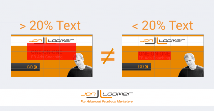
Though developed with good intentions, the tool was largely ineffective and depended on the position of the text more than it did the amount of text. These images, though they have the same font size, illustrate how subjective the rule was:
The guideline caused advertisers on the platform headaches and additional work (so much so that people devised ways to beat the system).
Marketers rejoiced when Facebook abandoned the 20% rule
In a blog post, Facebook marketer Mike Gingerich said the following say about the rule:
I’m not able to print 20% of the bad words I’ve said while trying to create Facebook Ads without using Facebook image representations. Using the word ‘Facebook,’ and making sure the text stays under that percentage.
Industry insider Jon Loomer isn’t a big fan of the 20% text guideline either:
First of all, Facebook’s 20% rule that applies to the amount of text that can appear within images of News Feed ads is stupid and poorly enforced, it's inconsistent and ridiculous that it applies to link thumbnail images. Did I mention that I hate it?
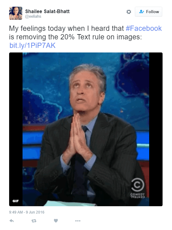
And then there were the tweets.
Still, the reason behind the rule in the first place is VERY relevant today—to protect the quality of content on their platform so that users will actually click on ads.
Why advertisers use text on Facebook ad images
The rationale is simple: If you want people to interact with your ad, you first have to get them to notice it. As we scroll through our Facebook feeds, quickly scanning for posts we want to consume, it’s the ones containing bright, colorful imagery that stop our index finger in its tracks.
This should come as no surprise, considering research conducted almost 40 years ago indicates that we tend to notice images and headlines on a page first. Then read bolded words after that, and consume block text last.
To take advantage of our natural attraction to images, many Facebook advertisers add CTAs to their ad photos, and compelling words like “free,” “you,” and “limited-time offer,” knowing they’ll be read more often than the actual post text.
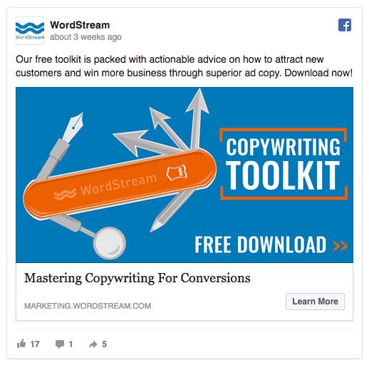
Here’s an example from WordStream:
The ability of posts like these to grab users’ attention is more important now than ever following Facebook’s announcement that its news feed algorithm will be changed yet again to favor friends’ content over advertisers.’
The catch 22: Ad text isn’t a silver bullet
While many industry authorities cite using text overlay as a great way to draw social media users to a Facebook ad (including ourselves), the team over at SketchDeck, say that more text on an ad image actually plummets CTR.
After testing 48 Facebook ads to bust 6 marketing myths, here’s what they found:
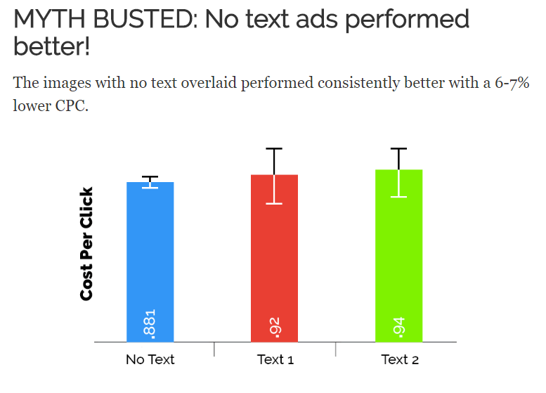
The results go against everything industry insiders tell us. An ad that didn’t clearly display its value proposition using text overlay should perform better than one that did. Similarly, flashy text that reads “Free” or “Limited-time offer” should turn us off.
The SketchDeck team has a guess:
“We think the ads with text overlaid looked, well, like ads. Users saw the text or call to action, registered it as an ad, and then moved on. One of Facebook’s tips is that an ad image should not look out of place in the news feed, many users are plastering text across the images that they posts.”
Maybe that’s the reason.
However, that doesn’t mean they’re altogether worthless. In fact, a recent update from a Facebook representative suggests the complete opposite.
The current Facebook text overlay rule
Facebook Product Marketing Manager, Afsheen Ali, reached out to Jon Loomer to officially address the 20% text rule:
Our research has shown that people demonstrate a preference for ads with less text. Previously, if 20% of an ad image’s area was text, it was not approved to run on Facebook, Instagram, or the Audience Network. Some advertisers think this can be confusing, as it’s not always clear that an ad does not meet the policy requirements until after creative has been submitted. Facebook is shifting to a new solution to improve this experience which allows advertisers more flexibility while still allowing us to maintain an enjoyable experience for people.
This looked like a win-win at first glance. But, in reality, the 20% rule hasn’t changed that much at all.
While Facebook no longer outright rejects ads that have more than 20% text, they do limit their reach—in some cases significantly.
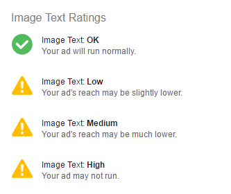
Instead of using a “run or reject” system, Facebook categorizes your ad according to the following ratings:
With Facebook’s new text overlay tool, you can upload an image to see what the chances are it will have its reach restricted. We put a couple of our own images to the test…
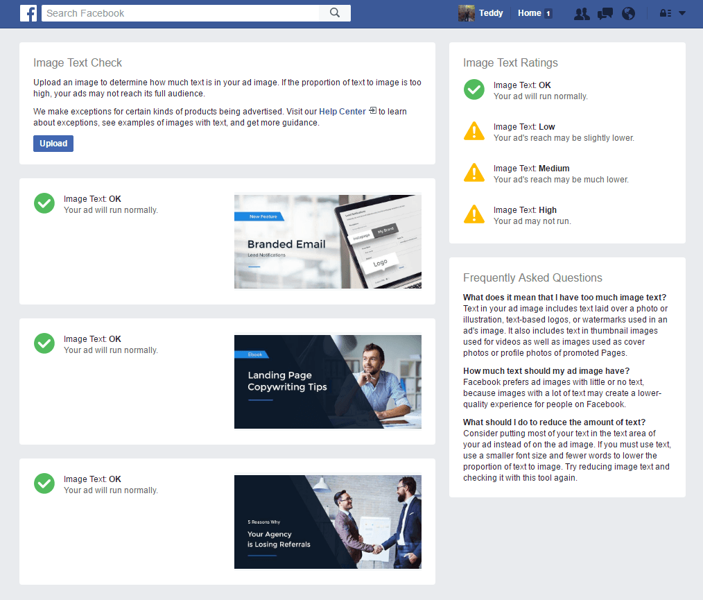
They passed with flying colors.
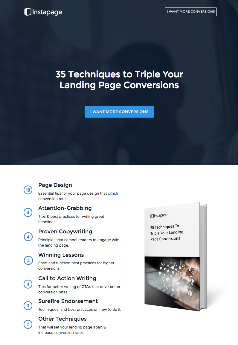
Determined to find out, we took a screenshot of one of our landing pages and uploaded it. It’s almost entirely text:
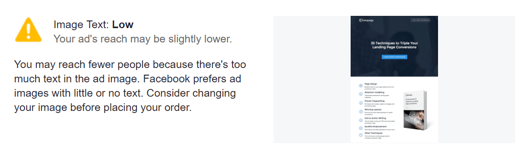
Still, we only managed to reach Facebook’s “Low” text rating:
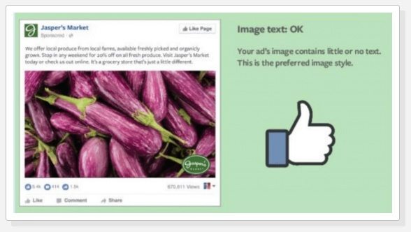
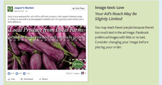
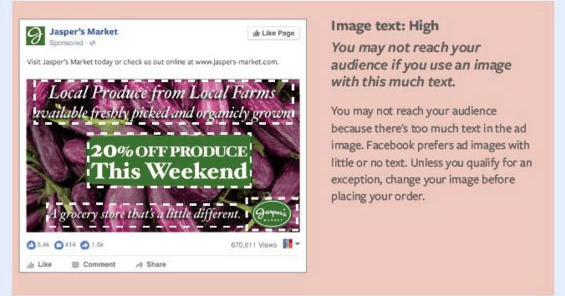
These examples showcase what will and will not come under the new rule:
OK Image Text
Low Image Text
Medium Image Text
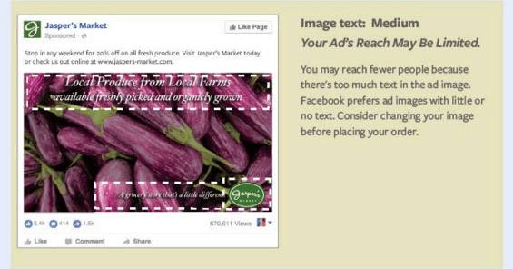
Image Text: High
The following are exceptions, and DO NOT count as text on your ad image:
- Infographics
- Book/Album covers
- Full Product images
- Posters for movies, festivals, sporting events, and shows
- Legal text
- App screenshots
- Cartoon and comic strips
- Text-based business calligraphy
These, on the other hand, DO count as text on your image:
- Numbers
- Text-based logos
- Watermarks, regardless of whether or not their usage is mandatory
So, should you still limit your image ad text?
In short, yes. Facebook says their users prefer ads with little to no text. Since Facebook controls ad reach and campaign cost on its platform, it’s wise to follow the new rule. That doesn’t offer as much flexibility as they’d have you believe.
Another important consideration is not just how much text you want to display, but your message itself. Think about your unique selling proposition—What’s going to draw your users in? Overlaying text like “free,” “you,” “new,” and “instantly” may not. Use these words wisely and sparingly, and your ads will continue to run with maximum reach and at minimum CPC.
Always connect all your ads to personalized landing pages to increase your conversion rates. That way you can control the message, and have plenty of space to tell your audiences about special offers that connect to the ad that got them there. Start creating your own dedicated landing pages by signing up for an Instapage 14-day trial today.

Try the world's most advanced landing page platform with a risk-free trial.
