
As one of the leading marketing automation vendors, Pardot joined forces with Salesforce in 2012 to help marketers build and deploy marketing campaigns from the cloud. Together, both platforms empower every rep to act in the moment of engagement, and every marketer to drive greater results from their campaigns.
To generate great results and capture as many qualified leads as possible, Pardot creates post-click landing pages so they can nurture leads down their sales funnel.
post-click landing pages are standalone pages that use persuasive elements like compelling copy, relevant imagery, social proof, and optimized CTAs to convince visitors to take an action. That action could be to download an ebook or whitepaper, register for a webinar, sign up for a product demo, etc.
Let’s evaluate several Pardot post-click landing pages and take a look at how well they persuade visitors to take action.
7 Pardot post-click landing pages to inspire your next page design
(Keep in mind, for shorter pages, we’ve shown the entire page. However, for longer pages, we only displayed above the fold. You may need to click through to the page to see some of the points we discuss and some pages may be undergoing A/B testing with an alternate version than is displayed below.)
1. To get visitors to watch their demo video

What the page does well:
- The secondary headline clearly explains that the value provided: boosting your sales through marketing automation.
- The “1-minute overview” in the copy tells visitors how much of a commitment they must invest with the demo video.
- Bulleted copy helps visitors to quickly understand the results Pardot helps customers achieve.
- The “Trusted by top marketers” section lists badges of brand names who use the Pardot service, which builds credibility with visitors.
- The form title is very descriptive of what to do next to watch the demo video.
- The “CRM system” form field helps Pardot qualify leads better when they talk to them on the phone.
What the page could change or A/B test:
- The Pardot logo links back to their homepage, which gives visitors an opportunity to leave the post-click landing page easily.
- The header CTA takes visitors to another post-click landing page with a separate offer. This reduces focus on the demo video offer.
- The CTA color has already been used twice on the page so it’s not as noticeable as it could be.
- The CTA copy could be improved. The “Watch Demo Video,” copy is bland, and could be better personalized for visitors.
2. To generate downloads of their lead nurturing guide
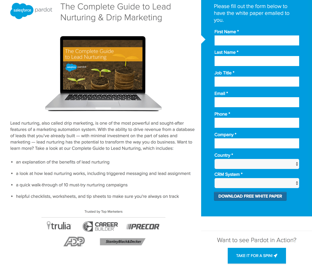
What the page does well:
- No header navigation keeps visitors focused on the white paper offer and doesn’t provide a way off the page.
- The computer screen image shows what the lead nurturing offer looks like once they download.
- Bulleted copy quickly highlights the main takeaways of the lead nurturing offer.
- “10 Must-try nurturing campaigns” teases visitors into downloading the offer because Pardot will showcase real examples.
- Customer badges demonstrate some big-name companies that have found success with Pardot.
- No footer links means visitors can’t be distracted with social media icons, sitemap, etc.
What the page could change or A/B test:
- Inconsistent messaging could confuse the visitor. Is the offer a white paper or a guide? Both have different expectations: White papers are usually longer and thoroughly researched with a lot of meaningful content. Guides, on the other hand are usually shorter and not focused on in-depth research and analysis.
- The Pardot logo is hyperlinked to their homepage, which detracts from the white paper on this post-click landing page.
- Every form field is required. Whether the offer is a guide or a white paper, these are generally higher in the funnel and probably don’t warrant eight fields, let alone all being required.
- The CTA button color doesn’t “pop” off the page because it’s nearly the same blue as the form background.
- The CTA copy is bland. Instead of “Download free white paper” it could be more personalized for visitors.
- The “Take it for a spin” CTA competes with the white paper CTA because, when clicked, it sends visitors to another post-click landing page. This takes the focus off of the lead nurturing offer.
3. To register for their customer journey webinar

What the page does well:
- No navigation links distract visitors away from the post-click landing page and this customer journey webinar.
- Bulleted copy details what visitors will learn from the webinar.
- The form’s blue outline draws immediate attention as the most important element on this page. This is known as encapsulation and is a directional cue.
- The privacy statement link in the footer gives prospects more information how their data will be shared.
What the page could change or A/B test:
- Pardot’s logo is linked, yet again, to their homepage.
- The photo is of the presenter and not completely relevant to the offer. Her headshot would likely provide more value below the form (with a short bio) and not the main image on this post-click landing page.
- The phone number in the header and footer could be click-to-call, which gives prospects another opportunity to directly interact with Pardot.
- The “Register Now” CTA copy be improved and inspire more action. Alternative CTA copy could be more personalized.
- The CTA color is similar to surrounding elements which makes it harder to notice.
- Footer links such as sitemap and social media channels encourage visitors to leave the page.
- The lack of testimonials who have used Pardot could add significant value to the page.
4. To provide user experience feedback
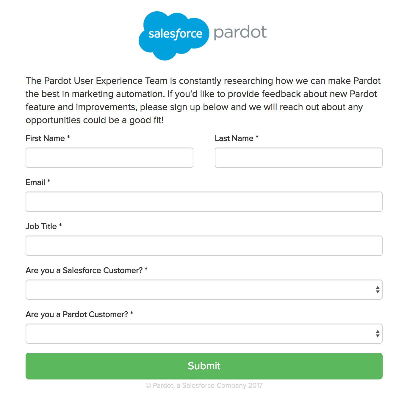
What the page does well:
- No header or footer navigation. This keeps visitors focused on providing feedback instead of being distracted by other links.
- The logo is not hyperlinked so visitors cannot escape this page. The only ways to leave are to close the browser window or complete the form.
- The dropdown fields allow the User Experience team gain more insight from respondents whether they are Salesforce and/or Pardot customers.
- The CTA button is a distinct color so it “pops” off the page.
What the page could change or A/B test:
- There’s no header. A header could immediately give visitors an idea of what they are looking at. Something like, “Send us your feedback” or “How are we doing?” could provide a good starting point for visitors to understand what the page
- The copy could explain more about how prior feedback has helped Pardot improve its services.
- The “Submit” CTA copy is rather weak when instead it could say something like, “I Want to Provide Feedback.”
5. To generate downloads of their lead scoring white paper
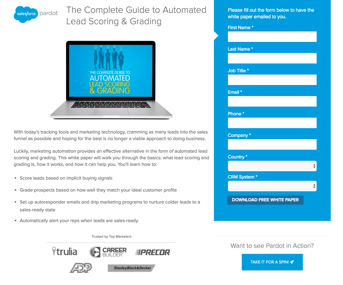
What the page does well:
- The header clearly states the offer because visitors instantly understand they’re being offered a lead scoring and grading guide.
- Bulleted copy points out the main takeaways visitors will learn from the lead scoring guide.
- The copy above the form tells visitors how the guide will be delivered.
- “Free” is used on the CTA button, which helps persuade visitors to complete the form.
- Customer logos demonstrate what high-profile brands use Pardot for marketing automation and lead scoring.
- The absence of a footer keeps all attention focused on the white paper.
What the page could change or A/B test:
- The logo in the header links back to the main website.
- Having 8 form fields increases friction and decreases the likelihood that visitors will complete the form. Also, do all fields need to be required for this white paper?
- The CTA button color is barely visible because it’s the same color as the form background. Changing the color to green or orange, however, would attract more attention.
- The “Take it for a spin” CTA competes for attention and is unnecessary since this post-click landing page is supposed to be dedicated for the lead scoring white paper.
6. To convince visitors to take a guided tour

What the page does well:
- The arrow visual cue points visitors towards the form and suggests they complete it to receive a Pardot guided tour.
- Minimal copy helps visitors scan the page and evaluate the offer quickly.
- Impressive statistics help demonstrate how Pardot has helped other companies improve their marketing campaigns.
- Customer badges add credibility to the page because if big brands like Trulia and Career Builder trust Pardot, then their software must be good.
- Security logos from TRUSTe and Norton help ease visitors’ concern their information will be kept safe.
What the page could change or A/B test:
- The Salesforce logo is linked back to Salesforce’s homepage, which acts as an exit point away from this offer.
- The page lacks a relevant image. An image could give the page more balance and help prospects visualize the offer.
- The phone number in the header could be click-to-call, which gives prospects another opportunity to convert.
- Footer links that include access to a “Contact” and “Careers” page as well as multiple social media channels and a site map all provide easy exit routes off the page.
7. To sign up for Pardot updates

What the page does well:
- No header navigation keeps visitors on the page without leaving for the main site.
- The header immediately lets visitors know that the post-click landing page is about staying in touch with Pardot.
- The bulleted copy does a good job at describing the different ways that Pardot can stay in contact with prospects, such as newsletters and event invites. Select phrases are bold, which draw more attention than all other copy.
- The CTA copy is personalized to the visitor — “Sign me up!”
What the page could change or A/B test:
- The page is unbalanced. The large, open space looks out of place, and it doesn’t seem to flow well with the rest of the page. An image, video, or testimonial could go here.
- The form fields are too long. Company, city, state, and country are not required inputs, but they are still included. Those could be removed to shorten the form and reduce friction.
- The CTA button could be designed larger so it draws even more attention.
- The CTA color is too similar to surrounding elements and doesn’t stand out enough. Changing the color to green or orange would help it jump off the page.
- The “Take It For a Spin” footer CTA takes visitors to another post-click landing page which is unrelated to the offer.
Which Pardot post-click landing pages stood out the most?
Pardot understands that its customers are seasoned online marketers, so they need to have professional post-click landing pages that leave a lasting impression. Pardot has found success by optimizing their post-click landing pages that appeal to their target audience and persuading visitors to take action.
Regardless of your offer, create your best first impression by building a professional post-click landing page with Instapage. Sign up for an Instapage Enterprise demo today.

See the Instapage Enterprise Plan in Action.
Demo includes AdMap™, Personalization, AMP,
Global Blocks, heatmaps & more.