
A lot of articles relating to color in marketing attempt to dissect how certain hues make customers feel. They try to turn us, as marketers, into somewhat of a “Sigmund Freud, Web Designer” character, capable of subliminally converting our prospects with complicated color combinations.
This is not one of those articles.
We’re not going to divulge any shortcuts to landing page success, because there aren’t any. There’s no one call-to-action button color that will produce a conversion lift for every landing page. There’s no particular hue that will hypnotize your prospect into progressing further down your conversion funnel.
Many of the pieces you read about color as it relates to conversion on web pages are unreliable. And that’s because most of them are rooted in psychology.
Now, I’m not knocking psychology in any way. In fact, I was a psychology major myself in college, and I use psychological principles in landing page design all the time. However, there’s a major problem with using so-called “color psychology” to drive people to convert.
Our reactions to colors are too dependent on personal experience.
For example: When we write headlines, body copy, and CTAs that appeal to our sense of greed (learn how to become a millionaire), our desire for quick fixes (lose weight fast), or our overall laziness (the one easy shortcut to whiter teeth), these are all things that apply to everyone.
We all want more money, we all want immediate solutions to our problems, and we all want the benefit of something without having to work for it. Psychologically these are all things we long for.
Color psychology is different, though. If I ask you what color you associate a feeling of jealousy with, what would you say?
Probably green, as seen in the phrase “green with envy,” right?
Well, in France they associate the color yellow with jealousy. In the US, if we were to tie yellow to a particular feeling, it would probably be cowardice — as seen in the archaic insult “yellow-belly:”

“Nobody calls me ‘yellow’”
See what we’re getting at?
Much of the psychology of color can’t be applied to everyone in the world, because we all experience it differently. The feelings invoked by certain hues are tied to meanings deeply rooted in our culture.
So today you won’t get any advice like “use blue on your landing page to seem more trustworthy,” or “a red CTA button will make your prospects urgently click.”
What we will give you is some practical guidance rooted in color theory that you can use to boost conversions on any web page.
It’s time to throw out everything you think you know about landing page colors and start with us from the top, with a quick crash course in color theory 101.
Primary, secondary, and tertiary colors
Remember in middle school, when you used to ask your art teacher, “What’s the point of knowing this? When am I even going to use the color wheel in the real world?
… If only he were here to say “I told you so.”
Assuming you need a refresher, below is a basic image of the color wheel.
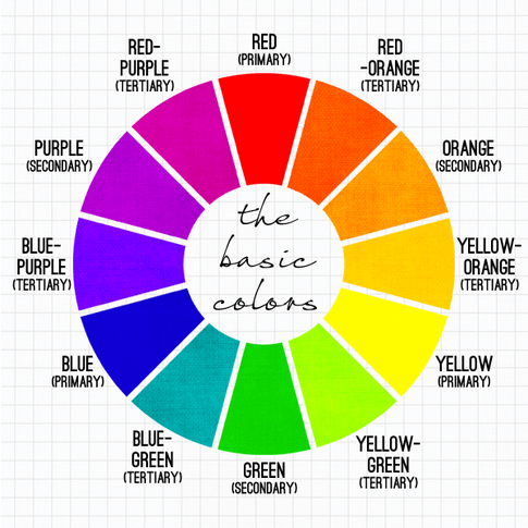
Primary colors — red, blue, and yellow — can be combined to create secondary colors on the wheel. These are purple green and orange.
Blue and yellow together make green, red and yellow combine to make orange, and blue mixed with red makes purple.
Tertiary colors, the next level on the wheel, are hybrids with hyphenated names like “red-purple” and “red-orange.” They’re created by mixing a primary and a secondary color.
Take blue for instance. Look two spaces counter-clockwise and you’ll see the secondary color, green. When you combine the two, you get what’s in between them on the wheel: blue-green.
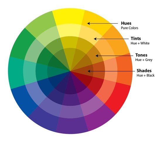
Now, what happens when we add black and white into the mix?
Hues, tints, shades, and tones
Black and white aren’t on the color wheel. In the visible spectrum, black is defined as the absence of color, and white is the presence of all colors. Combining these with any colors on the wheel can produce tints, shades, and tones.
Any primary, secondary, or tertiary colors that aren’t mixed with black or white are known as “pure” colors or “hues.” They’re bold, bright, and attention-grabbing.
By combining any color on the wheel with white, you create a “tint,” or what many people refer to as “pastel” colors. They’re lighter and more subdued than pure colors.
A “shade” is created by adding black to a chosen hue. This darkens them considerably.
Mixing both black and white (grey) with anything on the color wheel creates a calmer, less in-your-face, “tone.” Doing this will significantly lower its boldness.
Here’s what a full color wheel looks like, complete with hues, tints, tones, and shades.
Got all that?
Luckily for you, there’s no test at the end of this short course. And, yes, before you ask, we’re going to teach you how to use all this in the real world — specifically on your landing pages. But first we’re going to need to delve a little bit deeper into the world of color. Bear with us.
Complementary, monochromatic, and analogous colors
Now that you understand the color wheel in its complete form, it’s time to figure out how to combine colors that look good together.
When picking colors you’re going to use on your landing page, it’s best to stick to two or three. And we’re not just pulling that number out of thin air, either. A study from the University of Toronto found that people actually prefer simpler color schemes.
But before you cover your eyes and play “Wheel of Fortune” with the color wheel, arbitrarily choosing any three hues, it’s important to know about analogous, complementary, and monochromatic colors.
Complementary colors are located opposite of each other on the color wheel. Because of that opposition, using them on your landing page will make elements stand out. These are color combinations like yellow and purple (no wonder the Los Angeles Lakers’ jerseys are so attention-grabbing).
Analogous colors are neighbors on the color wheel. Analogous schemes feature combinations like red and red-purple, or red and red-orange. There is no visual opposition between these colors so they won’t make your page elements stand out like complementary colors will, but they’re much easier on the eyes.
Monochromatic colors are all the tints, shades, and tones, of one particular hue. They’re found on the same pie-piece-looking section of the color wheel. Because they’re so similar to each other, as is also the case with analogous colors, they’re often paired with a single complementary color to make page elements pop.
Now, before you start combining colors, there’s one more trick you should know about.
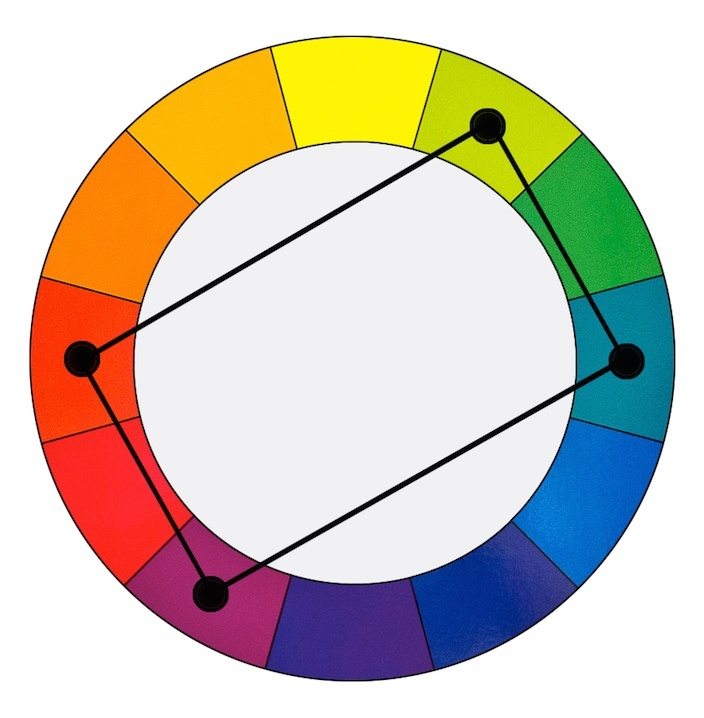
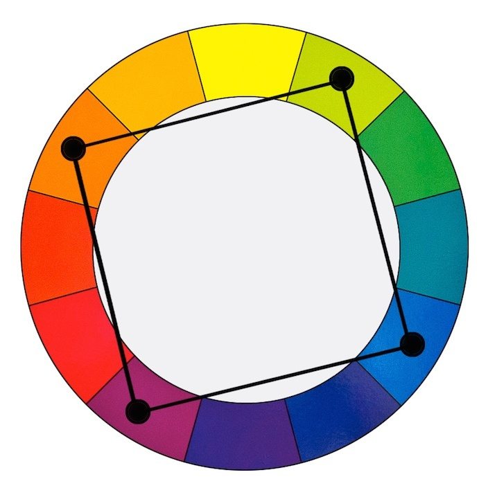
Tetradic, square, and triadic color combinations
We know we’ve already tested your middle school memory recall, but allow us to push it one step further by adding a little basic geometry into the mix (we promise it will make things easier).
By drawing shapes inside the color wheel, you can create even more complex, visually appealing color combinations.
Tetradic color schemes are formed by connecting four colors arranged in two complementary pairs. For example, red and green are two complementary colors. A tetradic color scheme using those two complementary colors would include red-purple, red-orange, blue-green, yellow-green:
A square color scheme is similar to a tetradic one, except its two pairs are equally spaced on the color wheel. An example would be orange, purple, yellow-green and blue:
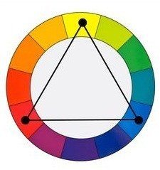
A triadic color scheme also incorporates colors evenly spaced around the color wheel, but only three instead of four. For example: yellow, red and blue:
Okay! We’re done with color theory. We promise. Now let’s talk about how to use these colors on your landing pages.
Background, base, and accent
Your landing page color components can be broken down into three parts: background, base, and accent. When it comes to distributing colors amongst them, pro designers like Jared Christopherson of Yellowhammer suggest that you choose three, and follow the 60-30-10 rule.
Your background takes up the most visual space on your landing page, so of the three colors you choose, this will be the dominant one. Dedicate 60% of color to your background, and stay away from bright, bold, pure hues. These are best used on your CTA buttons. Instead, opt for duller tones, more subtle tints, or darker shades to create contrast between your page elements (for many landing pages, this color is white).
Your base, the second-most prevalent color on your landing page, should take up 30% of visual space. When you choose this color, remember the theories we outlined above. Use the triadic technique or try picking split complementary colors. This color is going to be used in your header, on your form, and on a minimalist footer if you have one.
The accent of your landing page is the most important – it’s the color of your CTA button. This is where you want a bright, bold, hue. Scientifically, we’re wired to remember things that stand out, so pick something complementary, on the opposite side of the wheel from your other two colors in your scheme.
For example, let’s say you’re using white as your background and blue-purple as your base. Because your form is likely to be your base color, and your CTA button is going to be on your form, you’ll want to pick something on the color wheel opposite of blue-purple to make your CTA stand out. In this case, that would be yellow-orange.
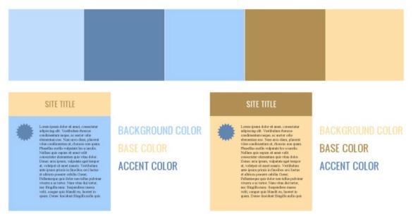
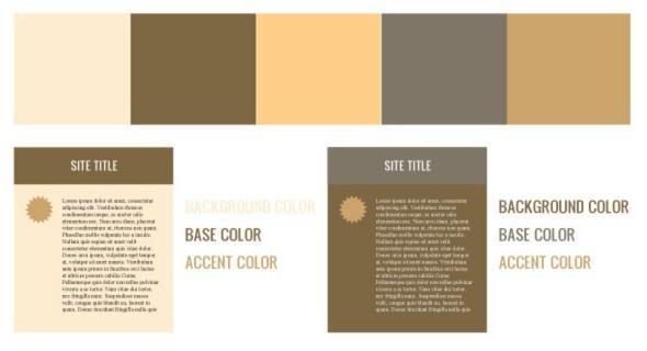
Here are some great examples from media specialist, Josh Byer, of different types of color schemes based on color theory:
Analogous
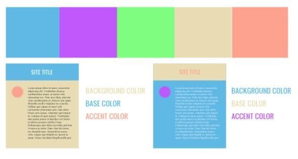
Complementary
Monochromatic
“Okay, okay. Enough with the diagrams,” you say. “How about some real-life examples?” Alright, first let’s look at an example of how not to color your web pages for conversion.
Here’s a post-click landing page from Salesforce Pardot:

Let’s break down the background, base, and accent of this page.
Background: White
Base (form, logo): Blue
Accent (CTA): Blue shade
At first glance, we didn’t even see the call-to-action button. Did you? Probably not, because Salesforce used a monochromatic scheme for this landing page.
Remember what color theory says about monochromatic color combinations? They’re easy on the eyes, but they’re not great at making page elements stand out; and that’s exactly the opposite of what you want for your CTA button.
Now, this Campaign Monitor landing page, on the other hand, is spot on:

Background: Blue
Base (footer, badges): Grey
Accent (CTA): Green
Why does this page work better than the last one? Because the team at Campaign Monitor used colors from a square scheme to make their CTA button stand out.
In fact, it’s the same exact square we used in our example above.
Keep in mind, when using a square color scheme, you should also pay attention to the balance between warm and cool colors. Warm ones tend to stand out while cooler colors tend to recede into the background.
In this scheme, only the cooler half of the square is represented on the page in the colors blue and green-yellow. An orange or red-purple button might be worth A/B testing against this control to see if it produces a lift in conversion rate.
If all this is true, what about all of the blog posts that claim to know the best colors for conversions?
For a long time, some marketers were under the impression that there was one color, or scheme, that would produce the most conversions. Today we know that’s not the case.
But, hindsight is 20/20.
If you come across a post that says otherwise, disregard it. There are a number of reasons one color could produce more conversions than another.
Take, for instance, maybe the most widely circulated case study on button color, from HubSpot:

They found that the red button outperformed the green one by 21%.
Marketers quick to act and slow to think started changing all their button colors to red. They were so thrilled by the potential impact of an easy fix on their bottom line that they didn’t bother to look at the rest of Performable’s page.
So, take a second and look.
What do you see?
On the left, we see a lot of green, don’t you? A green logo, a green icon on near the fold, and both a tint and a shade of green in the photo on the page.
What about on the right?
Still a lot of green — but on this version, the button jumps out at you, doesn’t it?
That’s the result of a wisely chosen accent color, not just an arbitrary change in hue.
This is all really overwhelming. Where do I start?
You’re having a hard time choosing a color to start with, are you?
If that’s the case, take a look at your logo.
Research has shown that consumers tend to gravitate toward recognizable brands, so by using a color scheme that’s reflected in your logo and sticking to it, you’re making customers more familiar with your brand.
Not only that, but you’ll also train your site visitors to look for your CTA button color. If you pick red for an accent, stick to it. When they want to convert, they’ll look for the red button on all your post-click landing pages.
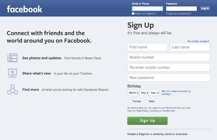
Anyway, back to your logo. Since it will almost always be displayed in the upper left-hand corner of your post-click landing page (it doesn’t have to be, but that’s where we’ll look for it), it’ll most likely end up on your header.
If you refer to Josh Byer’s diagrams above, you’ll notice that your header should be your base color. That means your logo is going to have to sit on that base color. So, pick one that showcases your logo well, like Facebook has:
Then, use color theory to pick a background (we recommend white because it’s easy, and displays most text well) and an accent based on your logo and base color.
Or, if you want a nifty little shortcut, head over to Adobe Kuler to use their interactive color wheel. It’ll help you choose a scheme based on the color rule of your choosing:
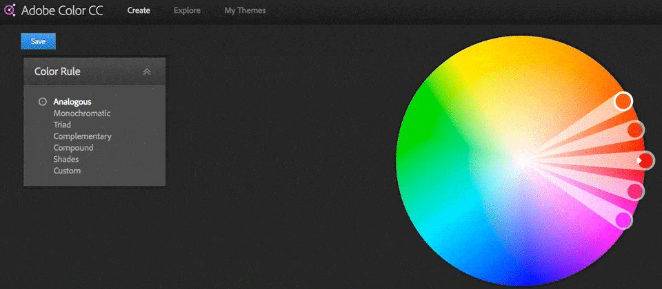
Here’s a tutorial to get you started.
Summary
We covered a lot in this post, so let’s briefly review to make sure you’ve absorbed it all.
The color wheel
- Primary colors are red, blue, and yellow. They can’t be made by combining any other colors, and they combine to make secondary colors.
- Secondary colors are orange, green and purple. They combine with primary colors to make tertiary colors.
- There are 9 tertiary colors. Whenever a primary color is combined with a secondary one, the tertiary it produces has predominantly characteristics of the primary one it comes from, and some from the secondary. Red combines with orange to make red-orange, and red combines with purple to make red-purple.
Adding black and white
- Hues are pure colors, without any black or white added.
- Adding white to a hue creates a lighter, more subtle color called a “tint.”
- Pure colors with black added to them form a darker version of hues, called a “shade.”
- To create a “tone,” a less bold version of a hue, combine it with black and white (grey).
Creating color schemes
- Monochromatic schemes use the shades, tints, and tones of a hue. These create a relaxed feel on a website.
- Complementary color schemes use colors on the opposite each other on the color wheel. They’ll make page elements stand out.
- Analogous color schemes use colors next to each other on the color wheel. Using them on your web page won’t make any particular element stand out without the use of a complementary color.
More advanced color combinations
- A triadic color scheme is created by drawing an imaginary equilateral triangle in the middle of the color wheel to link three hues.
- A tetradic color combination can be made by linking two sets of complementary hues with a rectangular shape.
- A square color scheme can be produced by drawing an imaginary square in the middle of the color wheel, linking four different hues.
Background, base, and accent
- Your background is visually the biggest part of your landing page. 60% of the colors you choose should be dedicated to it.
- On your landing page, your base color takes up the second most visual space. It covers your header, footer, and your form. 30% of color in your scheme should be dedicated to it.
- An accent color is meant to be used on the most important elements of your page to make them stand out. It should only cover 10% of your page.
Creating your own color scheme
- Use the colors in your logo as a starting point to create a color scheme true to your brand.
- Next create a base color by figuring out what your logo displays well on.
- Lastly, use color theory to decide on a background and an accent that will make your most important page elements stand out.
Which landing page colors will you choose?
Use color theory to make your most important elements stand out, but remember, never stop testing. The color combination you’re using today might be better than yesterday’s, but it still may not be the best.
Start boosting conversions with the power of color theory by building your first landing page, sign up for an Instapage 14-day free trial.

Try the world's most advanced landing page platform with a risk-free trial.
