HubSpot. You’ve heard the name, read their blog, downloaded an ebook; you may have even attended their annual conference.
HubSpot delivers a lot of content but, when you search HubSpot, you will notice that they don’t identify themselves as a content creation company. Instead, they bill themselves as an inbound marketing software company.
Which is, of course, exactly what they are:

Like most businesses today, HubSpot understands the best way to build their inbound marketing software company is to use post-click landing pages. They even offer a post-click landing page tool in their marketing suite of products, but it’s safe to say, HubSpot does not specialize in post-click landing page software. (As a former HubSpot customer and someone who was a regular user of their post-click landing page tool, I struggled with its limited functionality when creating post-click landing pages of my own.)
While not the most robust post-click landing page builder, HubSpot does clearly “get it” when comes to successfully implementing lead generation techniques that work; like frequently posting to social media, sending emails, and writing blog articles, etc. that feature a call-to-action that leads to a post-click landing page.
HubSpot does this quite well. So well that we thought it would be a good exercise to examine some of HubSpot’s post-click landing pages to see how they use these dedicated pages to generate leads from a variety of gated content.
15 Ways HubSpot post-click landing pages generate leads and sales
Before launching into our assessment, it’s important to point out two things. First, while HubSpot’s post-click landing pages are great for lead nurturing purposes, it is best to create your dedicated post-click landing pages on a platform that offers full design, customization, and integration capabilities.
Second, keep in mind for shorter post-click landing pages, we’ve shown the entire page. For longer pages, we have only displayed above the fold. If this is the case, you may need to click through to each HubSpot post-click landing page to see some of the points discussed. Some examples may be in A/B testing so you may encounter an alternate version of that page and not the one that is displayed in this article.
1. Annual report

What the page does well:
- The video sound is off by default. If visitors wish to listen to the video, they simply need to click play. Also, the 1:35 run time is not too overwhelming.
- The subheadline helps reinforce HubSpot’s authority with inbound marketing because this is their 8th annual edition of the report.
- The CTA uses an anchor tag which, when clicked, directs visitors below the fold to the form to download the 2016 State of Inbound report.
- Six statistics from the report act as teasers to get visitors to download the full report.
- The Facebook Live video shows that HubSpot is using one of the recent marketing trends and showcases a variety of marketers discussing inbound marketing techniques. However, this could also be seen as something to consider removing (see below).
- The form’s headline,”Get the data,” tells post-click landing page visitors exactly what they’ll be doing by submitting their information.
What could be A/B tested:
- Too much going on. Among the primary post-click landing page elements (image, headline, copy, form, and CTA; the page includes a Twitter widget, Facebook Live feed, video, and more. Including too many bells and whistles can do more harm than good and since post-click landing pages shouldn’t contain unnecessary elements, A/B testing a variation of this page without these elements is worthy of an experiment.
- The “Add to Calendar” button is essentially a CTA with a different goal from the main goal of the page (to download the report). HubSpot should decide what’s more important for this page: To download the 2016 State of Inbound report, or to set a calendar reminder for the Facebook Live interview series. (Clearly, the main goal is to generate report downloads so they should remove this “add to calendar” button to limit distractions and focus the attention on the “Download Now” button).
- CTA button copy (“Download Now”) is unremarkable. This annual report is meant to be packed with information, comprehensive, and establish HubSpot as an authority in the marketing field. Don’t waste the opportunity to generate more leads by writing poor CTA copy.
2. Increase event attendees
What the page does well:
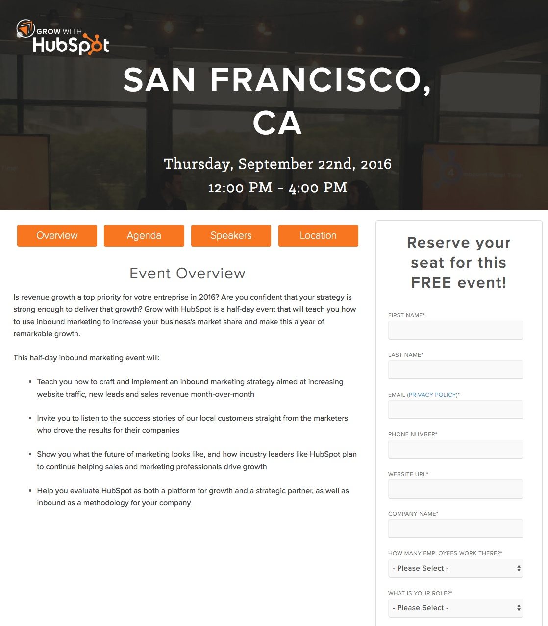
- Orange buttons provide more information about the event, complete with the full agenda and scheduled speakers. What’s even better is the links open on the same page without redirecting you off this post-click landing page.
- “Relationship to HubSpot” field allows HubSpot to segment registrations based on if the person is a HubSpot customer or partner, or considering HubSpot. This information can then be used for different lead nurturing campaigns based on the selection.
- The form headline makes it very clear to visitors that this event is free.
- Privacy policy is next to the email field, which makes it very easy for concerned prospects to visit HubSpot’s privacy policy. Many other post-click landing pages usually have this at the bottom of the page (if at all) so the fact they put the link next to email makes it known they want prospects to
- CTA button color is contrasting with the white background and the turquoise color has not been used anywhere else on the page.
- CTA copy is personalized and relevant to this event, stating “I want to attend.”
What could be A/B tested:
- The event speakers could include detailed information about each HubSpot representative. Only name, headshot, and title are included at present.
- Location is not specific because it does not specify where in San Francisco the event will take place. We assume those details will be included in the thank you email, but a little more information on the tab would be beneficial.
3. Free trial

What the page does well:
- Multiple screenshots provide a sneak peek of their marketing software.
- The form layout is appropriate given the page structure. Listing the fields side by side makes the form appear shorter than it actually is (6 fields).
- The button shows what step you’re currently at in the registration process.
- The button color is contrasting with everything else on the page.
- Chat with Sales module allows prospects to send HubSpot’s sales department any question before registering for a free trial.
- No credit card required makes the offer more appealing.
What could be A/B tested:
- Too many form fields (and this is only step 1 of 3) can be overwhelming for the visitor, causing them to think, “if HubSpot requires 6 pieces of information from me at the beginning, what else are they going to require of me in later steps?”
- Including testimonials could boost the trustworthiness of the software. If HubSpot were to include a testimonial from a previous trial user who found great success during their trial — and later upgraded to a paid subscription — HubSpot may generate even more conversions.
- Missing customer badges (similar to missing testimonials) detracts from the trustworthiness of this page. Which big name companies are HubSpot customers? The answers to that question could be highlighted on the page persuading prospects to convert.
4. Free stock photos
What the page does well:
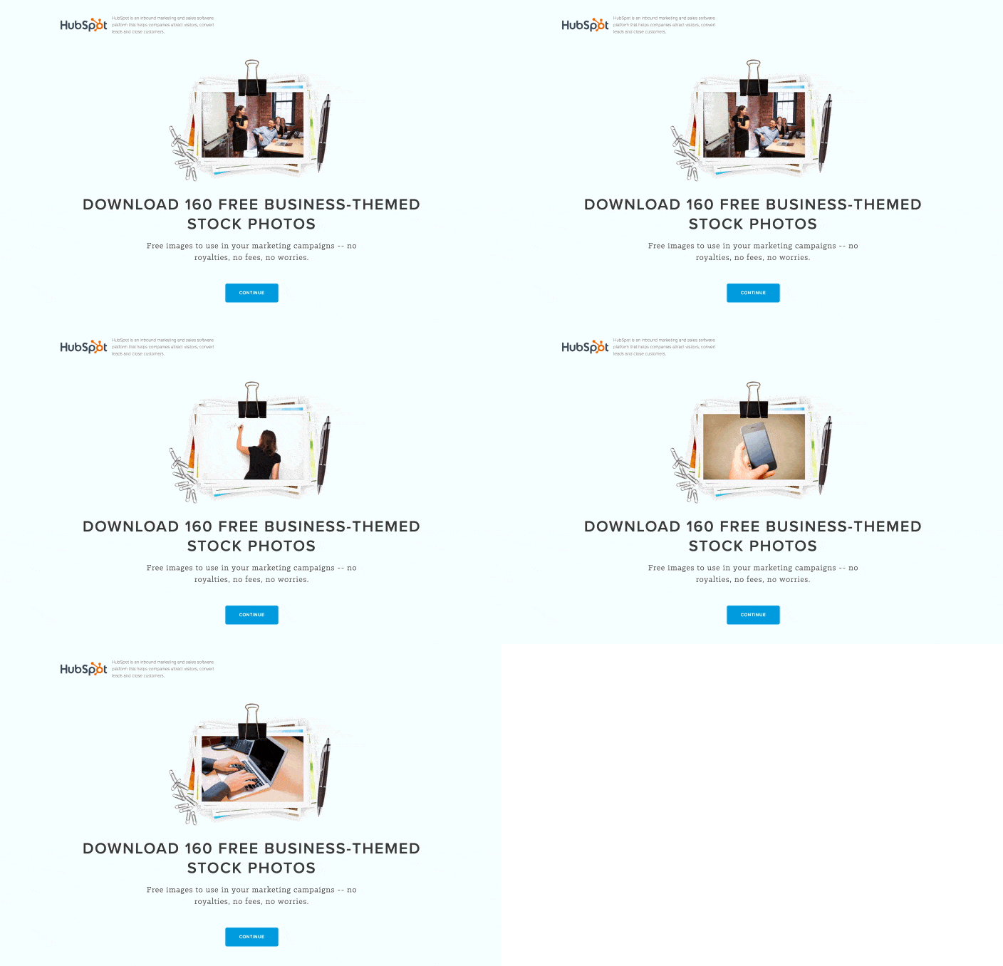
- The gif adds more life to the page than simply adding a photo. Having it cycle through a sampling of photos allows visitors to preview what they’ll be downloading.
- The headline is very explicit telling visitors the photos are free, how many are included, and what theme the stock photos are classified.
- The subheadline reinforces the free-cost offer and that visitors are not required to pay royalties, fees, or worry about anything when using the photos in marketing campaigns.
- The CTA includes an anchor tag that sends people below the fold to the form where visitors can download the stock photos.
- Bulleted copy identifies the six categories the images are a part of.
What could be A/B tested:
- The “Continue” CTA copy is not as intriguing as it could be. Changing the copy to “I Want the Photos” or “Send Me the Photos” could help persuade visitors further down the page and fill out the form.
- The slider of images shows some photos that are very staged and don’t look natural. If these are the images chosen to help persuade visitors to convert, how many other photos in the collection are worth using? An alternative option (for Instapage users) is to use Bigstock photos, which provides access to over 31 million photos and is already integrated with our post-click landing page platform.
- The social share buttons act as distractions and exit links, which can prevent visitors from downloading the stock photo collection.
- The form blends in with the cityscape background outline. Speaking of the cityscape, what does it have to do with these 160 stock photos?
5. Free CRM signups

What the page does well:
- Play video button opens in a lightbox, keeping you on the page.
- The video is short and is a case study on how HubSpot’s CRM helped a ski equipment manufacturing company grow sales and keep track of all their customer data efficiently.
- White space allows all page elements below the fold to draw maximum attention.
- Minimal copy (even if it’s block text as opposed to bullets) makes the page easily scannable for the most important information.
What could be A/B tested:
- The headline is intriguing, but could be strengthened. Including a quote from the case study video on this post-click landing page could persuade visitors to get started with the CRM
- The image doesn’t sell the power of HubSpot’s CRM. For all we know, this guy could be writing an email or a blog — not managing his business’ contacts in HubSpot’s CRM.
- White space between the headline, subheadline, and buttons could really help each element “pop” off the page better. This is especially important for visitors who neglect to scroll down the page.
6. Visual design templates
What the page does well:
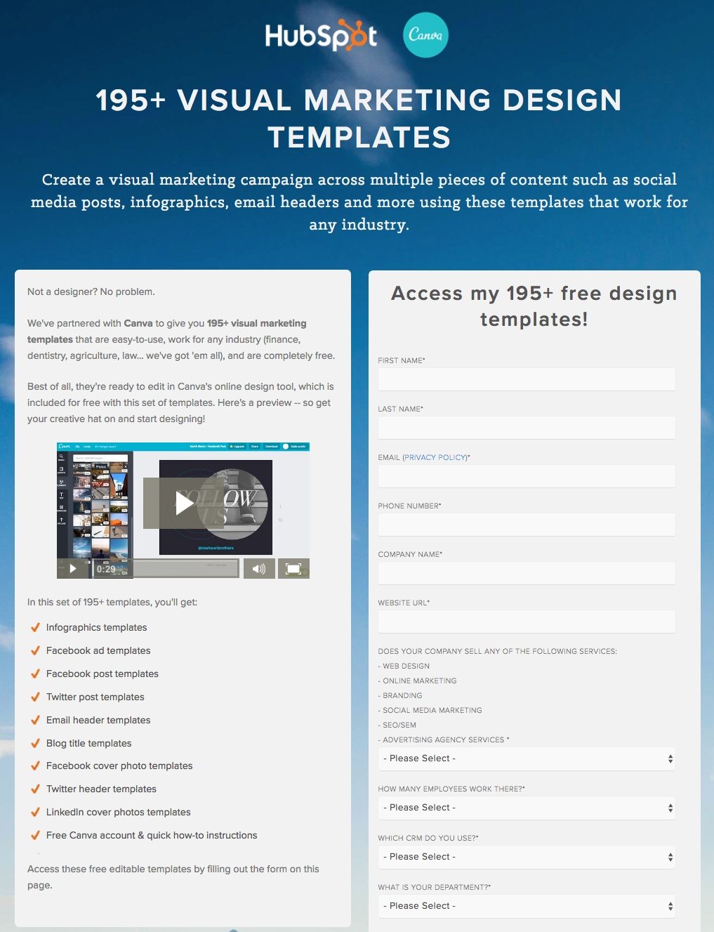
- Including Canva’s logo at the top align HubSpot with a highly reputable design brand.
- The video plays on the same page without sending you to a different page to watch.
- The bulleted list of templates makes it very clear exactly what you’re downloading.
- The form headline uses personalized copy and mentions the word “free.”
- The radio buttons at the bottom of the form allow visitors to manually select any additional information they would like to receive by submitting the form.
What could be A/B tested:
- Making the video larger and having it open and play in a lightbox would demonstrate the power of Canva’s online design tool much better.
- The form is 12 fields long every field is required. Is that necessary?
- CTA button copy “Download Now” is very uninspiring. “I Want the Templates” or “Send Me the Templates” would likely perform better. Only A/B testing would determine the better CTA copy.
7. Email marketing box

What the page does well:
- HubSpot’s logo makes it very clear from the start this is an offer from them so visitors are not wondering who is providing this “Marketing Box.”
- Minimal copy and bulleted text makes the page easier to read.
- The subheadline sells the benefit of downloading the Marketing Box. By downloading the offer, you’ll have “everything you need to send the perfect email.”
What could be A/B tested:
- Removing the footer would eliminate many exit points and likely increase HubSpot’s chances to convert more visitors on the form.
- The hyperlink below the slideshow is unnecessary because it sends visitors off the page to Slideshare (and they may not return to convert). Plus, that link houses the same slideshow that’s on this post-click landing page so there is no real benefit of including the hyperlink.
- “Download Now” does not inspire much action. Using personalized copy and making the copy more relevant to the offer (using “email” or “box”) would make it more compelling and worthy of being clicked.
- The copyright is outdated (2015). If that’s the case, what else is outdated? Does the Marketing Box still offer the most updated tips and tools to send the perfect email?
8. Infographic templates
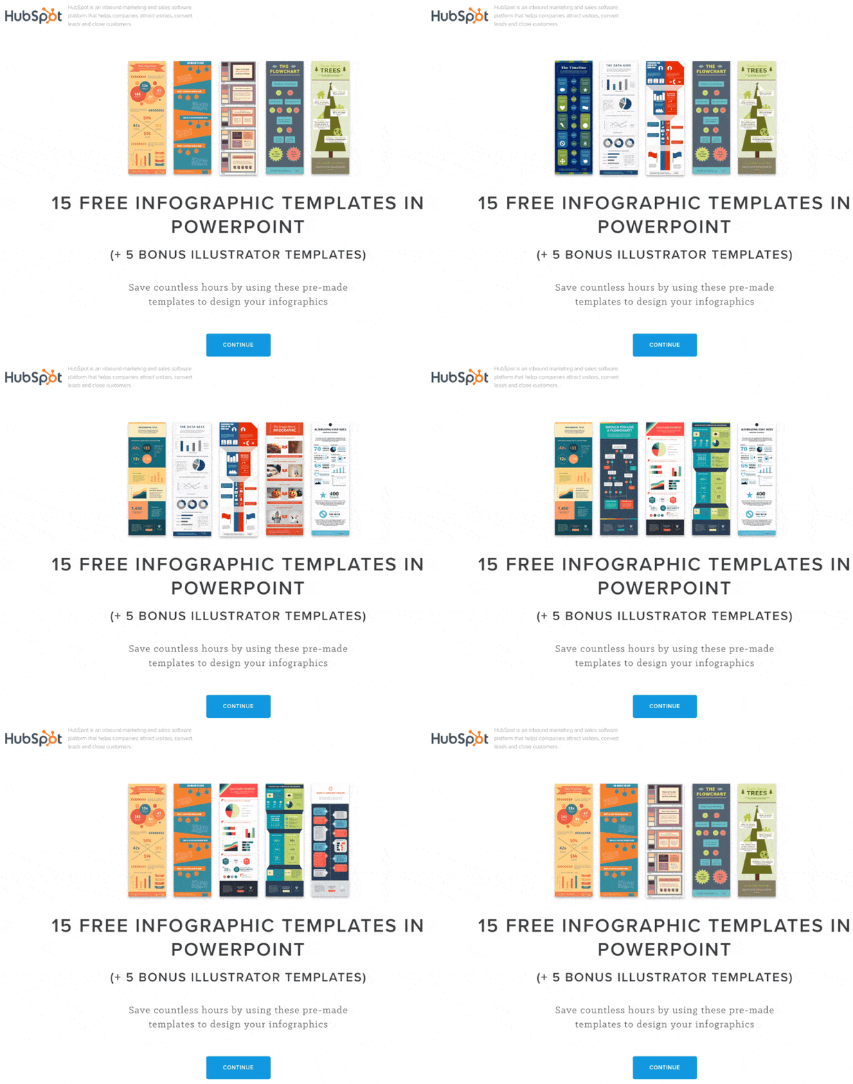
What the page does well:
- HubSpot’s logo is not linked to the homepage or anywhere else. This unlinked logo keeps limits the visitor’s ability to escape this page without downloading the infographic templates.
- The gif cycles through a variety of infographic templates giving prospects a sneak peek into what they’ll be downloading.
- The subheadline “save countless hours…” explains the biggest advantage of downloading these infographic templates.
- The CTA uses an anchor tag that, when clicked, directs prospects below the fold where they can convert on the form.
- White space helps prospects read and understand the benefits of these infographic templates without getting lost.
- The FAQ section helps answer the two most important questions before converting on the form, which helps put prospects’ minds at ease.
What could be A/B tested:
- The CTA button copy “continue” is boring. “Get the templates” or “Send Me the Templates” inspires more action.
- The social media buttons in the middle of the page act as distractions and exit links off this post-click landing page.
- The gif showing one of the templates in PowerPoint being edited is too small and the transitions are too fast.
- This 12-field form makes converting on the offer a chore. Not to mention only one field is optional.
9. Live webinars
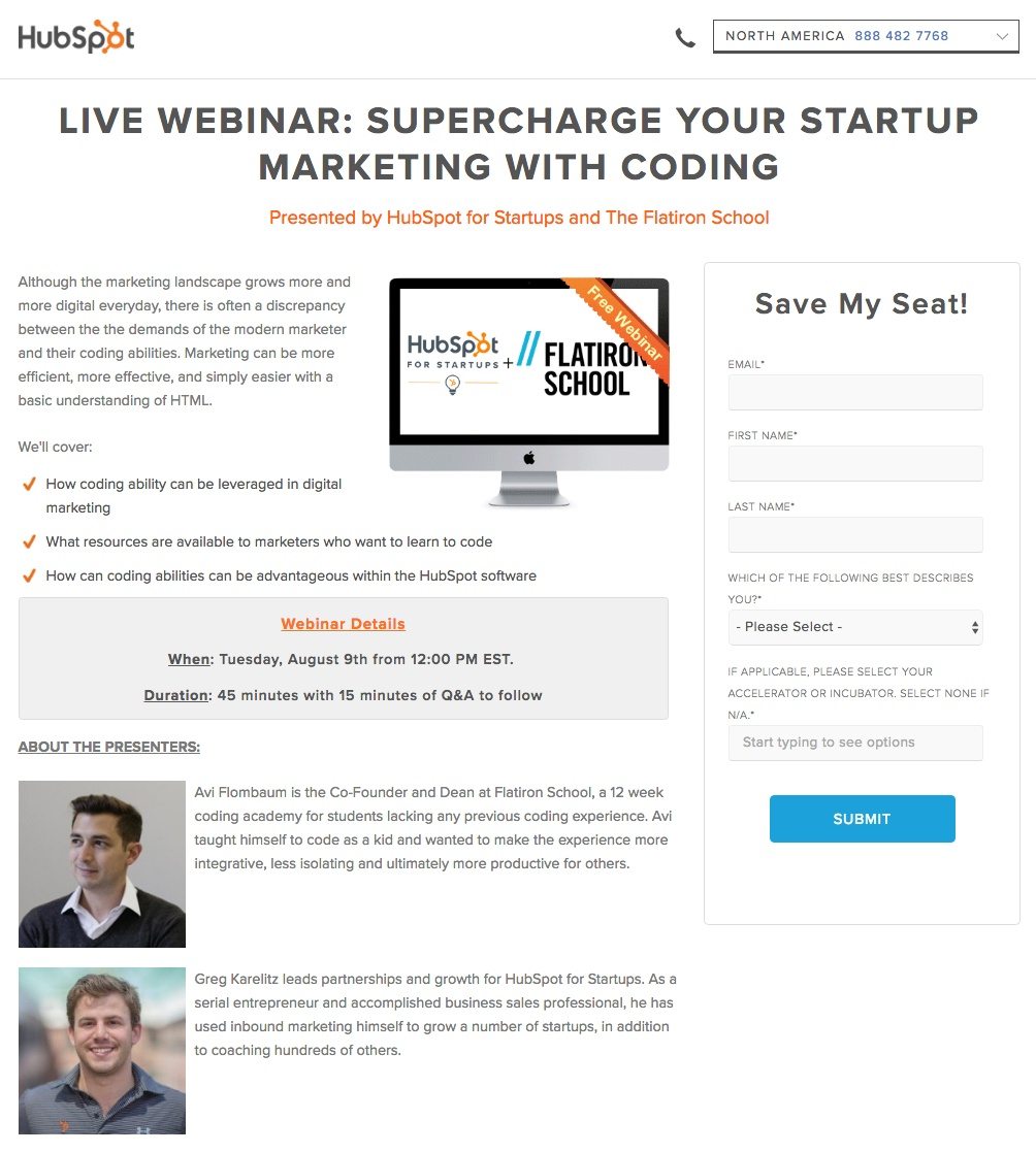
What the page does well:
- The phone number is click-to-call, which provides the easiest way for visitors to contact HubSpot straight from desktop or mobile devices.
- The headline states the webinar is live, and not recorded, which may encourage more attendees to register.
- The picture mentions the word free, emphasizing the no-cost nature of this webinar.
- Bulleted copy makes it easy for prospects to scan this post-click landing page and learn the three main points of attending the coding webinar.
- Presenter headshots and background information for Avi and Greg let prospects know their expertise and help explain what makes them qualified to present during the webinar.
- The form headline draws visitor’s attention to the form, pushing them that much closer to registering for the webinar.
What could be A/B tested:
- HubSpot’s logo is linked to their homepage, which acts as an exit link and possibly limits webinar registrations.
- The “email” field is listed first in the form, as opposed to first name.
- CTA button copy… How many times must we say it? “Submit” is possibly the worst action-inspiring copy to write on CTA buttons.
- Adding white space between the copy, the webinar details box, and the presenter information would make it easier for prospects to scan and read this post-click landing page.
10. On-demand webinars

What the page does well:
- “Free” is mentioned in the headline along with
- The headline makes it known immediately that this webinar has been recorded and is on-demand. This lets visitors know they don’t have to set a calendar reminder to view this webinar at a specified date and time because they can watch it at their leisure.
- Presenter headshots and background information let visitors know who Guy Kawasaki and Peg Fitzpatrick are and what makes them qualified to help people get 10 million social media followers.
- The CTA button color pops off the page because this turquoise color has not been used on this page.
- “Save My Spot” is a great phrase to A/B test on the CTA button because it uses personalized copy and is relevant to the webinar.
What could be A/B tested:
- The “GetMoreFollowers” linked hashtag is unnecessary because it’s an exit link off this post-click landing page to Twitter. It’s okay to list the hashtag on the post-click landing page, but linking it adds no value and most likely lowers conversions.
- Social media buttons serve as exit links (just like the hashtag link above).
- The Amazon link in Guy Kawasaki’s biography acts as a distraction. We understand both presenters want to sell more copies of their book, but including the Amazon link on the page is unnecessary.
- The form is too long in our opinion (and all but one field is required). Making the form shorter could increase conversions significantly and is worth A/B testing.
11. Free marketing report

What the page does well:
- “Free” is mentioned immediately in the headline so there is no confusion as to how much this report will cost prospects.
- The bolded text in the second paragraph demonstrates the total number of customers HubSpot surveyed for this in-depth report.
- The CTA button color contrasts with this white post-click landing page.
- The copyright is current at the time the report was released. If the copyright was not correct, prospects could question whether or not the marketing benchmarks in the report were updated and relevant.
What could be A/B tested:
- The subheadline is too broad and doesn’t further persuade prospects into downloading the report.
- The page is off-balance due to the lengthy form, creating too much white space.
- Including a few statistics from the report on the post-click landing page could really help “tease” visitors into downloading the report.
- HubSpot’s logo is linked to the homepage, which as stated many times before, is not recommended.
12. Podcast ebook

What the page does well:
- The headline explains the offer immediately and lets prospects know the ebook is free to download.
- Short paragraphs and bulleted copy make scanning this post-click landing page a breeze.
- The image provides visitors a glimpse of the podcast ebook.
- The phone number is click-to-call.
- The privacy policy link next to the email field provides prospects an easy access link instead of scrolling to the bottom of the page.
- The last form field is optional and write-in, which allow prospects to divulge what their biggest marketing or sales challenge is.
What could be A/B tested:
- The “Growth Show” hyperlink in the copy is unnecessary because it sends you off the page to iTunes, instead of converting and downloading the ebook.
- The form is too long (12 fields) for a top of the funnel ebook offer. Eliminating some fields like “Website URL,” “Advertising Agency Services,” and “Which CRM Do You Use” would make this form far less intimidating for prospects to complete.
- Adding white space could really draw more attention on the ebook’s image and persuade more visitors to download the offer.
13. Social media content calendar template

What the page does well:
- There are no navigation links that could lead people off this page.
- Including Buffer’s logo aligns HubSpot with a highly reputable brand in the social media industry.
- The image provides a sneak peek what the social media content calendar template looks like.
- The CTA button uses an anchor tag that, when clicked, directs visitors below the fold to complete the form and download the template.
- The clickable slider in the middle of the page provide a larger preview of the template.
What could be A/B tested:
- The CTA button copy “Continue” is unremarkable and doesn’t drive visitors to download the template as much as using personalized copy could.
- The subheadline is bland. How does the template help “manage and plan your social media content?” For starters, the bulleted copy below the fold would be better served in the subheadline.
- The social media buttons act as distractions and lead visitors off this post-click landing page, and potentially lowering conversions.
14. Blog subscriber guide

What the page does well:
- Bulleted copy allows visitors to quickly scan the page and learn the biggest benefits of downloading the free guide.
- The form headline uses personalized copy and is relevant to the offer.
- The image shows visitors what they get when they complete the form.
- “Free” is mentioned in the headline, which lets visitors know right away how much the offer costs.
- The radio buttons beneath the form are unchecked, which allow visitors to manually opt-in to receiving more information from HubSpot.
What could be A/B tested:
- The page is unbalanced, mostly due to the 12-field form.
- Removing the required asterisks from a few of the fields could encourage more visitors into downloading the free guide. Are “Advertising Agency Services,” “How Many Employees Work There?” and “Which CRM Do You Use” really required information on an offer like growing your blog subscriber list? Remember, the less work visitors must do to convert, and the less information they have to divulge, can greatly improve your conversion rate.
- The HubSpot logo is linked to their homepage.
15. Checklist

What the page does well:
- Bolded text in the copy helps reiterate the benefits of downloading the checklist.
- The orange CTA button contrasts with this post-click landing page because that color has not been used yet on the page.
- Free is mentioned above the form, emphasizing that the checklist is available at no-cost.
What could be A/B tested:
- The horizontal line at the top of the page is distracting.
- The “hamburger button” is misleading because it appears to be clickable with hidden options. However, the button is not clickable and there are no hidden options or information.
- The image does not add value to the page, it merely reiterates the name of the checklist.
- “Free” should be used in the post-click landing page headline, not the form headline, because the headline is read first before anything else on the page.
- Social media buttons can potentially lead visitors off the page without first downloading the checklist.
Have these HubSpot post-click landing pages inspired your next design?
The above is only a small sampling of the content HubSpot has produced. From free reports, free templates, how-to guides, live webinars, on-demand webinars, checklists, and everything in between, HubSpot offers a wide variety of gated content for lead generation and nurturing purposes.
You may have noticed that many of the post-click landing pages above use a standard three-column format (left to right): copy, image, and form. This type of format can become very predictable and for post-click landing page designers, a serious limitation.
To fully customize your next design, sign up for an Instapage Enterprise demo today.

See the Instapage Enterprise Plan in Action.
Demo includes AdMap™, Personalization, AMP,
Global Blocks, heatmaps & more.
