You know all about CRO and getting people to sign up for your product. But what do you know about the following page new users see?
Welcome pages mark a significant turn in your user’s journey. As soon as they move from your post-click landing page to your product, your needs shift from conversion focused to retention focused.
User retention is absolutely critical to your long-term success. By keeping users coming back for more, you’ll be able to not only keep them from churning, but gain upgrade revenue over time.
When it comes to your welcome page design, there are many patterns to choose from. You can launch your new users into a product tour, or create a personalized experience. You can have them populate their feed with relevant content or do something entirely unique.
Whatever your pattern, your user onboarding starts with your welcome message. Here are 12 design tips to optimize your welcome page:
1. Steer users towards your Aha moment
Welcome pages serve two purposes: They greet new users and they set their expectations for what is next to come.
Next to come is getting your users to their Aha moment as quickly as possible via a user onboarding experience. There are several different ways to onboard new users. Your welcome page should serve as step one in that process.
2. Show enthusiasm!
Nearly every welcome screen we looked at had their header text end with an exclamation mark. It’s almost uncanny until you think about it. Every person who worked on their product’s welcome page is genuinely excited to welcome each new user. The exclamation mark helps them feel that enthusiasm, which can carry over into their own excitement to use the product.
The larger this initial spark, the more motivation and momentum a user will have to continue moving through the product’s user onboarding process, which is critical to its success.
3. Reiterate your value proposition
Humans have a cognitive bias towards consistency. When someone has agreed with the messaging you’ve displayed on your post-click landing page enough to sign up for your product, reiterating that same value proposition can help them stay in accordance with their initial journey.
Let’s face it, there’s often a drastic jump in experience for a user when they go from your post-click landing page to inside of your application. That jump can land them in an awkward place if the copy and design of the welcome page greatly differs.
By keeping the language to describe your product’s value proposition consistent, you may harness their momentum enough to keep them clicking around in your app.
Let’s look at popular messaging app, Slack, for example. This is their homepage:
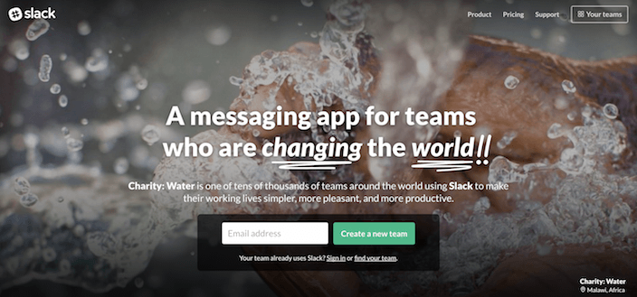
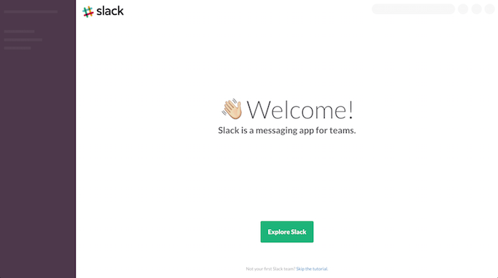
And their welcome page is consistent with this same value proposition that they are the best messaging app for teams:
D
4. When a product tour follows, make it obvious
Don’t be like Google Ads with their welcome screen. Their welcome message doesn’t properly set a new user’s expectation for what will happen next.
Will the message simply go away? Will it launch into a tour? It’s unclear.
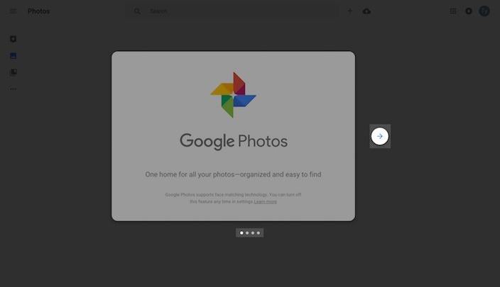
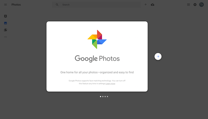
There are better designs to evoke a product tour. Some include elements like arrows or carousel dots, like Google Photos demonstrates:
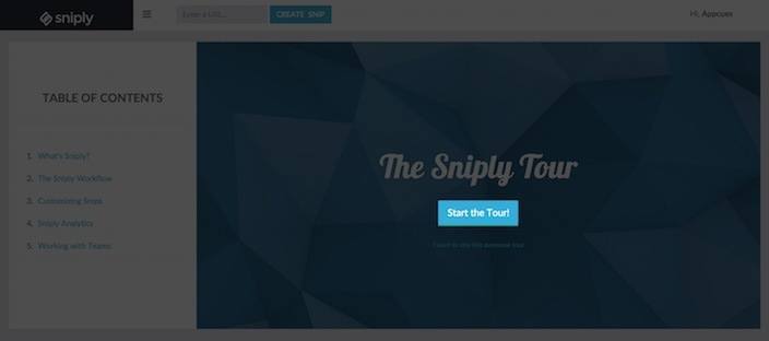
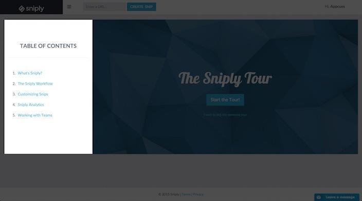
Others like Sniply include button text such as “Start The Tour!”
5. When asking for more information, give an option to skip
When building your post-click landing page form, don’t worry too much about placing it above the fold because everybody scrolls. And form length? That highly depends on their stage in your marketing funnel.
Now it’s likely that in the moment that a user signs up for your product, their interest in using it may be at an all-time high. Some products take advantage of this phenomenon by moving form fields from their post-click landing page to their user onboarding process.
For example, Buffer asks users to add social profiles on its welcome page:
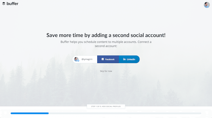
By linking multiple accounts a user gets more value out of the Buffer product. However, it’s likely that someone faced with linking all of their social profiles on a post-click landing page (as a prerequisite to using the product) would decrease conversion rates. This approach — to ask for more later — likely serves Buffer to better retain users.
For those that are ready to dive in and start using Buffer, there is a clear option to skip the additional linking step.
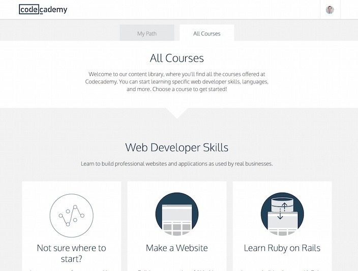
6. Follow the rule of 3 when personalizing new users’ experience
Many welcome screens prompt users to choose their own destiny. They offer options that lead into different first-run experiences, and almost every time we’ve seen this kind of experience branching, three options are provided.
Perhaps this is a coincidence. Perhaps three is arbitrary. Or perhaps three options is tested and proven to be successful.
SurveyMonkey provides three responses to new users about their preparedness in creating a survey:
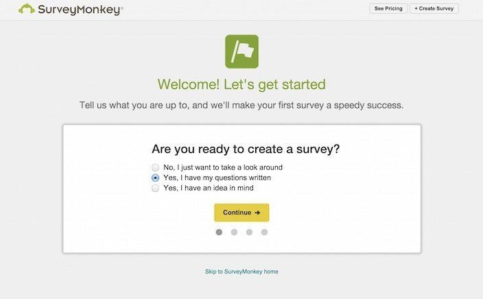
SurveyMonkey knows its end goal — it’s Aha moment — it’s value proposition to new users: to create awesome surveys easily.
They are, however, conscious of the fact that people come to them with different things in mind. And there’s an option here for each type of new user:
- Some have an idea only
- Some have signed up for the service with only loose plans to use it
- Others have a survey written out and are ready to publish it live
- Others have used the service before, have just created a new account and want to get right into it (see the option to skip below the white box).
No matter, SurveyMonkey’s welcome page sets up users with unique needs to get to their Aha moment faster.
Here are a few other products with branching welcome screens for personalization:
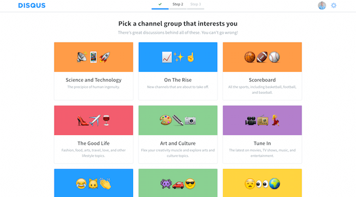
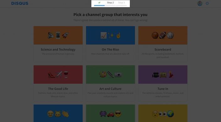
7. When customizing news feeds, images are essential
Many apps have discovery at their core value proposition. Sites like Quora, Tumblr, and Disqus are not only interesting to users for the purpose of creating questions, content or comments, they’re also interesting for content discovery.
In each case, their initial welcome screens are focused on creating a feed of information for personalized discovery. Furthermore, each service uses visuals to help a new user identify their topical content preferences.
Check them out:
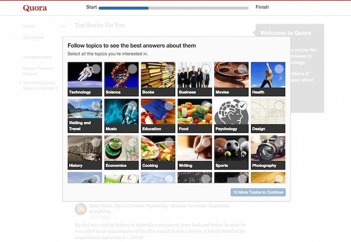
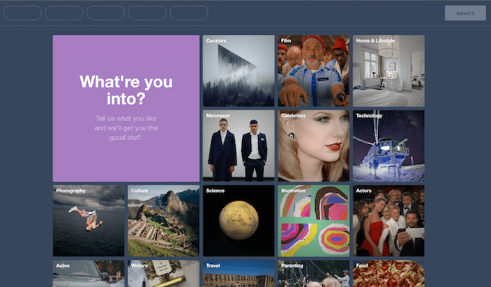
To some degree, each product’s success relies on new users finding content interesting to them. Their Aha moments likely come after this initial welcome screen when viewing their personalized feeds.
8. Place checklists on your page’s sidebar
Checklists are important UI elements that can help a user know what is expected of them to get onboarded. Checklists often appear to the side of a product’s welcome screen next to the message and primary action.
From what I’ve seen, checklists are never the primary content for a user onboarding flow. They simply compliment it. For that reason, if you’re using a checklist for your product, put it to the side of your initial welcome screen like Sniply:
9. Start progress bars with a percentage already filled
Humans are cognitively biased towards completing things. Many products use progress bars or checklists to encourage users to complete an initial user onboarding flow. One way to enhance both UI patterns is to start with a substantial percentage already filled out.
This helps a user feel like they are already underway instead of starting from scratch, and it increases a person’s desire to complete the task at hand.
If it’s weighing on your conscience that you’re tricking your users, you can attribute the initial progress to completing the form on your post-click landing page.
Check out these progress bars for examples:
10. Give new users a sneak peek
Welcome screens often appear as modal windows with transparent overlays. This user interface pattern is popular because it give your users a peek into your app — where they ultimately want to end up — while keeping them focused on the immediate action at hand.
This UI helps orient users when they complete your initial user onboarding flow. This can also reduce the number of relative unique user experiences from 3 to 2 (I’m counting the post-click landing page as one, a custom user onboarding experience as 2 and the product itself as 3).
Remember, the Google Photos example earlier? They use a modal window on their welcome screen:
11. Try a flat background
Sometimes it can be shocking for a user to move from a post-click landing page to inside an application. The navigation often changes, the page colors might change, and a user’s overall orientation is a bit turned around.
Like we outlined in the section above, placing your app in the background of a welcome screen can help build motivation to get to the next step, and it can contextualize a welcome modal for users.
An interesting way to further reduce initial stress on users adapting to your product is to ‘flatten’ your app’s content to a more simple design. This gives users an elementary visual introduction to your product. It helps them orient where to look without giving them words or hard images that may distract them from the initial task at hand provided on the welcome screen.
Slack recently updated their user onboarding to simply their UI on their welcome screen. See how nice and flat it is with lots of white space, a simple welcome message, and CTA to explore the app?
12. Don’t scroll down!
Welcome pages rarely ever call for scrolling. Because they are so focused on getting the user to take a single action, they don’t need to be longer than a visual page.
For the most part, the UI of a welcome page is contained within a modal window. When modal windows are aligned in a series of sliders, the scrolling happens through clicks to the right rather than scrolling up and down.
Even through an app’s tooltip-driven product tours, the user is encouraged not to scroll. This hand-holding is intended to orient a user towards success. Something he might not be able to do on his own.
Welcome pages are great and all…
But remember, they won’t experience your welcome page without completing the first step in the process: an optimized post-click landing page.
You can start from scratch or choose one of Instapage’s 200+ templates. Either way, the advanced fully customizable builder can get you on the fast track to generating more leads (and eventually customers).
Sign up for an Instapage Enterprise demo today.
About the Author
Ty Magnin is the Director of Marketing at Appcues. Appcues helps non-technical people build experiences for user onboarding with UI patterns like modal windows, tooltip-driven product tours and more. You can follow him here.

See the Instapage Enterprise Plan in Action.
Demo includes AdMap™, Personalization, AMP,
Global Blocks, heatmaps & more.