Ecommerce landing pages aren’t getting the job done. Compared to other landing pages, they’re converting fewer visitors and generating less revenue.
Why?
One theory holds they don’t contain all the information buyers need to make a decision. In a blog post, Monetate writes that visitors “may not see the information that higher-level pages including homepages and product category pages provide about the brand, making it difficult for visitors to quickly ascertain if the brand is a good fit and worth further engaging with.”
But the truth is, successful landing pages don’t need the help of higher-level pages. What they need is information specific to the offer.
That means, if the copy on a product category page is central to the conversion decision-making process, the landing page design should include it. If testimonials on the homepage might add credibility to the offer, they should be included in the design too.
So, do today’s ecommerce landing pages include that information? Do they contain all the elements needed to convert a visitor? Today we find out in these ecommerce landing page examples below…
What is an ecommerce landing page?
An ecommerce landing page is a web page designed strictly for the purpose of persuading visitors to act on an offer. Ecommerce landing pages primarily sell goods over services. They’re created by ecommerce businesses with the ultimate goal of selling a tangible, physical product.
Ecommerce landing page use elements like social proof, trust indicators, an optimized conversion ratio, a magnetic headline, and others, to compel visitors to click a CTA button. They contain everything a visitor needs to know to decide on an offer: to download or not, to buy or not, etc.
30 Ecommerce landing page examples critiqued
If it wants to stack up to other successful landing pages, what should an ecommerce landing page include? What should it exclude? Learn how to build your ecommerce landing page with help from the following critiques.
(Note: We’ve only screencaptured above the fold. You may need to click through and scroll to see some of the points discussed in the following critiques.)
1. Home Chef
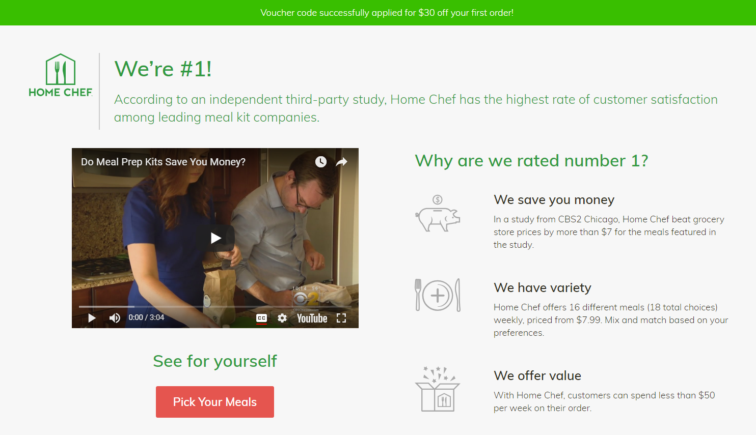
What this ecommerce landing page does well:
- The text “We’re #1” adds credibility with the help of text below, which indicates the accolade came from a third-party study. Calling yourself the best doesn’t work. But, quoting someone else who called you the best does.
- The short video gives a brief overview of meal prep kits.
- The bulleted content describes the benefits of claiming the offer quickly and easily.
- The icons make the content more easily understood at a glance.
- The CTA button is bright and attention-grabbing, and it’s related to the offer.
- The conversion ratio is 1:1, meaning there’s only one link to click on the page and one conversion goal. That link is in the CTA button. No other links distract from that button.
What this ecommerce landing page could improve:
- The text in the banner offering $30 off is really hard to see. If you’re offering a big discount, let people know front and center.
- This page could use more specificity. Was the “study” run by someone reputable?
2. Blue Apron

What this ecommerce landing page does well:
- The conversion ratio here is 1:1
- The CTA button is bright and noticeable
- The call-to-action includes a discount in a much better place than Home Chef’s.
- The featured photos makes the meals look appealing.
- Photos below the fold allow visitors to see the variety of potential meal options.
- Testimonials add credibility to the offer.
- Bulleted copy makes the benefits of ordering evident.
What this ecommerce landing page could improve:
- The $60 discount seems generous, but it also makes visitors wonder, “Just how high is the price of this service that they’re able to offer $60 off and make a profit? Probably too expensive…” Without another specific reference to price, they won’t know until they click through. They might, or they may opt simply to disqualify Blue Apron based on their assumption. A more specific reference like, “meals starting at…” may improve the odds of earning a click-through.
- Testimonials add credibility, but only if they’re believable. With bylines that only feature first name, these testimonials may not convince visitors that they’re real.
3. Verizon

What this ecommerce landing page does well:
- Ample white space allows elements to be noticed by visitors.
- An up-to-date copyright notice lets visitors know the information on the page is recent and accurate.
What this ecommerce landing page could improve:
- Message match is poor between ad and landing page here. The referring ad includes an image of a laptop above the message “Verizon’s network is built into select HP laptops,” giving the impression the landing page will offer laptops with the built-in Verizon network. However, that’s not the case. There’s mention of a laptop on the landing page, but the conversion goal is to get visitors to download a copy of Verizon’s Mobile Security Index Report. Best case, this is misleading. Worst case, your visitors suspect a deliberate bait and switch. It’s bad for your brand either way.
- This form (below the fold) features 9 fields, and every one is required to get the report. It’s important to collect the information your team needs to qualify a lead, but it’s also important that your ask doesn’t outweigh your offer. If a security report isn’t worth submitting 9 fields of information, then your visitors won’t.
- A logo linked to the homepage allows visitors an escape from the landing page.
- This CTA button is non-existent. Instead, barely noticeable text below the form reads “Get more info.”
- White text (below the fold) on black background makes the page hurts readability.
4. The Farmer’s Dog
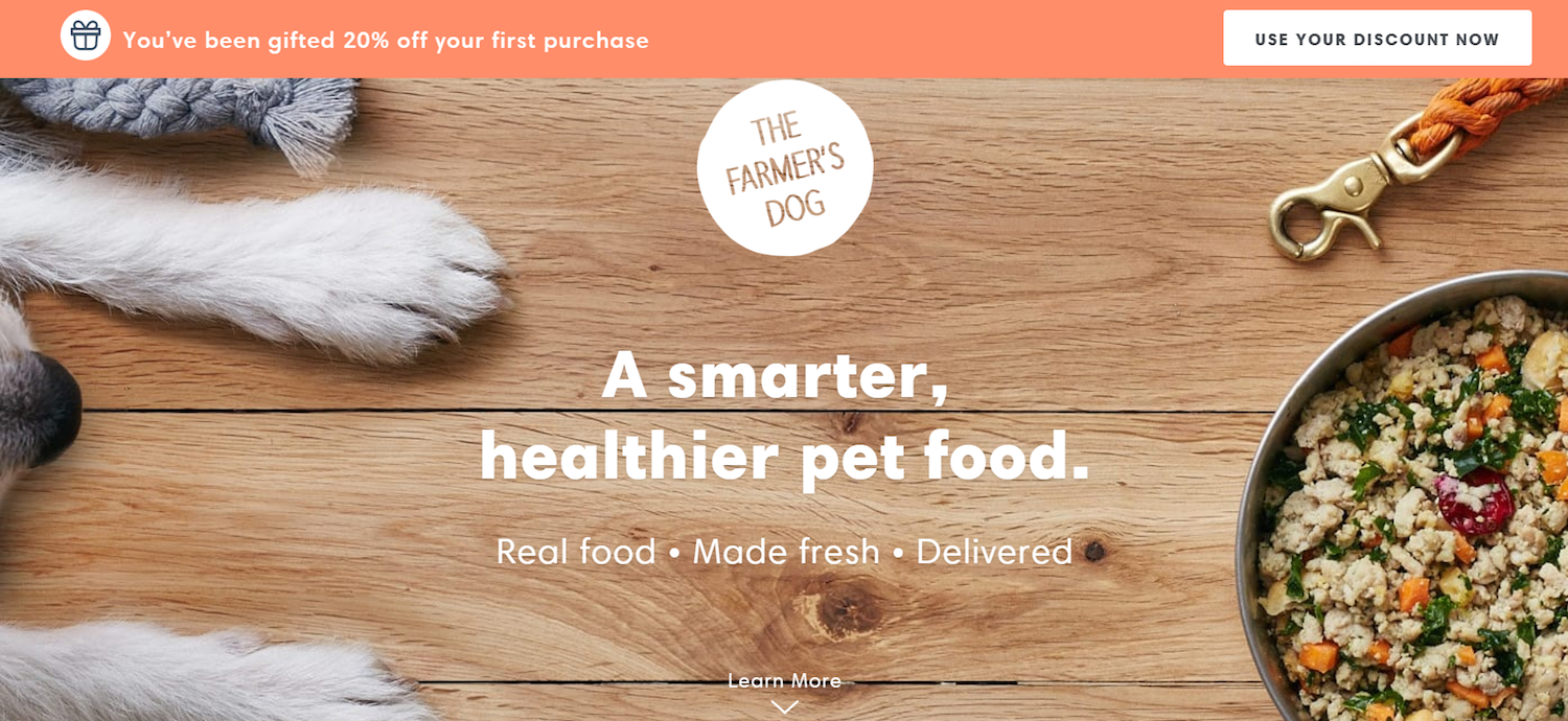
What this ecommerce landing page does well:
- This featured image is highly relevant to the product.
- The subheadline quickly conveys the benefits of the offer.
- Logos from big-name publications, in which the product has been featured, instill trust in the visitor.
- The text “Small dogs start at $3 a day” showcases the affordability of the product.
- Copy referencing “Human-grade USDA ingredients” communicates the quality of the product.
- References to personalization make the product appear as something more than cookie-cutter.
- Copy explains that food is “never frozen,” which communicates freshness.
- Copy that reads “delivered to your door” communicates ease of use.
- Testimonials from vets and customers add credibility to the offer.
What this ecommerce landing page could improve:
- This conversion ratio isn’t optimized. The page leaves lots of escape routes in the footer with navigation links and social media accounts.
- The banner discount isn’t highlighted as prominently as it should be.
5. Winc

What this ecommerce landing page does well:
- Small chunks of text, separated by icons, quickly convey the benefits of using Winc.
- The featured image shows the actual product in the hands of a customer.
- Photos of the wine display the variety of Winc boxes.
- Logos of well-known stores, where Winc’s wines are featured, adds credibility to the offer.
- Testimonials from happy customers and a quote from Forbes boost trust.
- Numbers increase social proof: 12 million glasses of wine enjoyed, 10 countries collaborated with to make wine, 400 locations serving the wine.
- The CTA button is bold and noticeable.
What this ecommerce landing page could improve:
- The text “Discover the #1 Personalized Wine Subscription” isn’t believable without a source to attribute the ranking to.
- The $20 discount referenced at the top of the page could be better highlighted.
- The CTA “Get Started” implies a long signup process. Something more immediate and tailored to the offer would be better here.
6. GoPro

What this ecommerce landing page does well:
- The headline here uses FOMO to draw the reader in. Sign up, or miss out.
- The subheadline describes what the visitor stands to miss out on if they don’t sign up.
- The fine print “We help share your stories, not your email address” inspires confidence in the visitor who may be hesitant to fill out the form for fear of adding more spam to his inbox.
- The CTA button stands out with a bright blue color against a white background.
What this ecommerce landing page could improve:
- This photo is a very strange one to choose to highlight the capability of GoPro. The angle is upward, between the legs of a hiker among some trees. It doesn’t even look like it was taken with a GoPro, as the subject’s feet seem to be supported on a clear plate of glass with a camera underneath.
- The call-to-action “Join up” is a strange combination of words, which seems like more of a mistake by the designer who forgot to delete “up” when changing the call-to-action from “sign up” to “join.”
7. Fabfitfun

What this ecommerce landing page does well:
- The box’s contents are highlighted in the featured image.
- Logos of a dozen well-known publications, which Fabfitfun has been featured in, add credibility to the offer.
- The CTA button is attention-grabbing.
- The subheadline conveys a lot of value for a lower price.
- The text “Limited quantities available” below the CTA button conveys scarcity.
- Short paragraphs separated by icons make the process of ordering the box easy to read and understand.
- Positive testimonials add credibility to the offer.
- A list of brand names lets visitors know what they’ll get by claiming the box.
- A slider of the products available in the box are showcased below the fold.
What this ecommerce landing page could improve:
- The headline contains a grammatical error. “Well lived” should be “Well-lived.”
- The form on the bottom of the page attempts the sale right away. This seems too big an ask a little too soon.
8. Quip

What this ecommerce landing page does well:
- The blog-post style of this landing page removes a lot of the friction that’s usually involved with selling a product.
- The 9 reasons provide a comprehensive look at the product.
- Each reason has a short subheader that summarizes the content below it, offering a quick and easy way to gather information about Quip.
- Photos supplement each of the 9 reasons well.
What this ecommerce landing page could improve:
- The length of this ecommerce landing page could be an issue. More visuals and less text may convert more visitors.
- Ambiguous buttons with numbers like “40,” “25,” etc, sit below the CTA button. Their purpose is unclear.
- The footer and header allow visitors several exits from the page.
- A second conversion goal, “Join our email list,” combats the first.
9. Axis
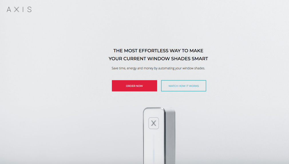
What this ecommerce landing page does well:
- The headline explains what the product is: An effortless way to make your current window shades smart. The headline introduces its benefits.
- A short video showcases the product’s uses very well.
- A hero shot showcases the product.
- The CTA button calls attention.
- Recognized publications, like CBS, cNet, and TechCrunch, that the product has been featured in boosts trust in the brand and value of the offer.
- Icons accompanied by short sentences quickly elaborate on the benefits of using the product.
- A conversion ratio of 1:1 ensures no one escapes this page without converting or closing the browser window.
- A chart at the bottom of the page better shows the size of the product.
What this ecommerce landing page could improve:
- The hero shot of this product doesn’t include any object of comparison, so right off, we don’t know if it’s the size of a space heater, a router, or a remote control.
- The page size is too big. At 100% zoom, you’ll need to scroll side to side to see all the text and photos. That makes for a bad user experience.
- The page length is too great. Much of the content could be condensed, like “Rounds of sales” at the bottom, possibly meant to convey exclusivity, but poorly at best.
- Testimonials could be brought up to a more prominent place on the page, and ones including more than first name would make them more credible.
10. Danielle World

What this ecommerce landing page does well:
- This headline speaks directly to the reader by asking an ambitious question that everyone has considered, even if only briefly, “Are you ready to change the world?” It implies Ray’s novel will give readers the tools they need to change the world.
- The copy elaborates on the headline, claiming the novel’s “companion books” will show the reader how to help solve the world’s greatest challenges.
- Testimonials from well-known celebrities like Stevie Wonder, Tony Robbins, and Suzanne Somers help boost the credibility of this offer.
- Videos offer visitors a more comprehensive look at Ray and his readers.
What this ecommerce landing page could improve:
- The author’s accolades aren’t mentioned until the bottom of the page. These are important to know first if you’re unfamiliar with all the author’s work. Why should you buy his book? He’s a NYT bestselling author, a Grammy Award winner, and he’s been honored by three presidents.
- Exit routes are high in number on this page. An imbalanced conversion ratio doesn’t keep visitors focused on the offer.
- The chunks of text are a little long. However, this audience is one of pleasure readers, so, in this case, they may be willing to sit through a two-paragraph synopsis of the book.
11. Casper

What this ecommerce landing page does well:
- Logos of well-known publications where Casper is featured boost trust in the brand.
- Icons quickly convey the benefits of the offer.
- Subheaders and bite-size copy elaborate on the benefits of the offer.
- Positive testimonials boost perceived value of these mattresses.
- A risk-free guarantee makes prospects more comfortable with purchasing.
- The text “Loved and trusted by over 1 million customers” uses social proof to increase buyer confidence.
What this ecommerce landing page could improve:
- The headline has an asterisk on the end of it. Asterisks are never a good look. They boost distrust of whatever they’re on the end of. Here, it’s not needed.
- The headline sounds like it comes from a bragging business. Instead, something like, “Named America’s #1 Rated Mattress brand” would communicate that the claim didn’t come from a business, but an outside source.
These are few more landing page examples from Casper.
12. John Henric

What this ecommerce landing page does well:
- The discount, 15% off, is a great trade for an email address.
- This featured image shows off the unique style, and several products, of John Henric.
- The CTA “Show My Coupon” is written in first person, and it’s tailored to the offer.
What this ecommerce landing page could improve:
- The white text against a white shirt is difficult to read.
13. Tabio USA

What this ecommerce landing page does well:
- A 15% discount is a great offer on a squeeze page.
What this ecommerce landing page could improve:
- The messaging here is confusing. “Free shipping,” “Get 15% off your order”…What are you getting by entering your email address here? Is it just promotional emails, or do you get free shipping and 15% off your order too? Or, do all customers get free shipping and 15% off their first order?
- The call-to-action “submit” is the least compelling of all options.
- The CTA button is the same color as the header section so it doesn’t stand out very well.
14. Flaviar

What this ecommerce landing page does well:
- The headline communicates secret, sophistication with the words “From the Vault,” and the subheadline uses the word “rare” to reinforce it.
- The countdown timer instills a sense of urgency in the prospect. The deal won’t be available long.
- The letter below the fold addresses the reader directly, and makes reference to prestigious and critically acclaimed whiskeys available for purchase.
What this ecommerce landing page could improve:
- The description of each bottle is very sparse — just a few words. Short is good, but “One incredibly rare bird” doesn’t say much about the taste of the drink.
- A link in the logo provides an escape route for visitors.
15. Hemel

What this ecommerce landing page does well:
- A unique headline invites visitors to join an exclusive club.
- The featured image shows off the variety and style of Hemel watches.
What this ecommerce landing page could improve:
- The photo, while displaying variety, appears to be thrown together a bit haphazardly for a brand that seems to be speaking a high-fashion language.
- The call-to-action “Subscribe” is nearly as bad as “Submit.” Something more tailored to the offer would be better here.
16. Causebox

What this ecommerce landing page does well:
- The offer is certainly worth the ask.
- This engaging slider displays the variety of S’well bottles visitors visitors will receive for inputting their email address.
- The “$35 value” text lets visitors know they’re getting a quality product and not some cheap water bottle worth $5.
What this ecommerce landing page could improve:
- The “No thanks” text isn’t necessary if there’s already an “X” in the corner of the pop-up.
- The CTA copy could be more personalized to the offer. “Send My Code” is more specific and personalized.
17. Robert Graham
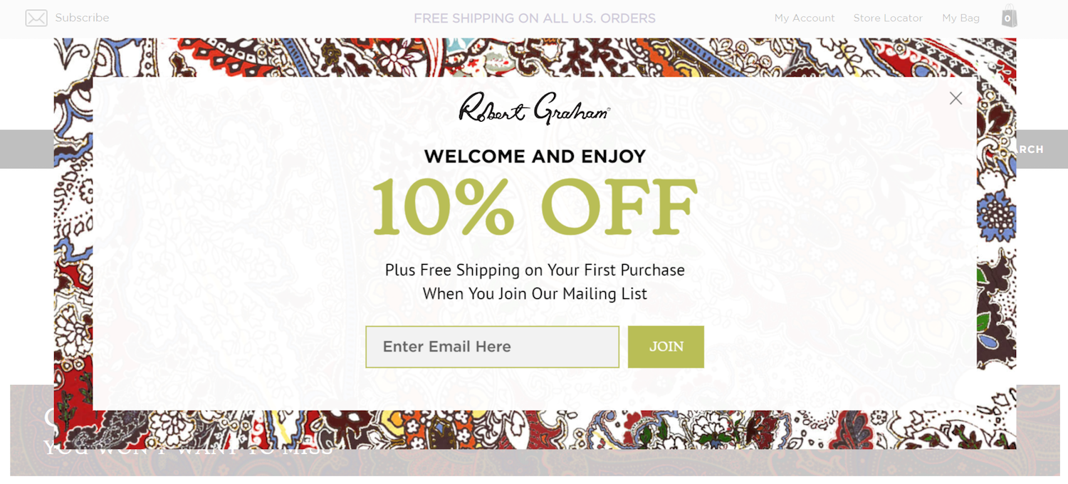
What this ecommerce landing page does well:
- This squeeze page is clear about what you’re getting by inputting your email: 10% off and free shipping on your first purchase.
- The “10% off” your first purchase is maximized to draw attention as the main benefit.
There are only two ways off this squeeze page: convert or click the “X” in the corner. - The page only asks for email, which consumers are usually comfortable submitting.
What this ecommerce landing page could improve:
- The text “Free Shipping” should be up there, maximized with the “10% off” text. Something like “10% off + Free shipping” would convey both benefits to signing up.
- Disappearing placeholder text has been shown to confuse visitors. It’s better to label your form fields above rather than inside.
18. Freshly

What this ecommerce landing page does well:
- Professional photos make these meals look highly appetizing.
- Testimonials boost trust in the offer.
- Logos of well-known publications where Freshly has been featured add to the offer’s credibility.
- Icons quickly convey the easy process of using Freshly, and icons below it indicate every meal is healthy.
What this ecommerce landing page could improve:
- An imbalanced conversion ratio doesn’t keep visitors focused on the offer.
- Testimonials that only feature first name don’t come across as totally credible.
19. bistroMD

What this ecommerce landing page does well:
- The headline is clear and compelling. It makes a great case for submitting your email address by highlighting both benefits of doing so.
- The CTA button is tailored to the offer.
- This squeeze page doesn’t ask for name or phone number, just email address in exchange for a discount and free shipping. Not a bad deal at all.
What this ecommerce landing page could improve:
- The button text below the CTA “I don’t want an extra 10% off” is a touch obnoxious. Everyone wants 10% off, however, they may not be willing to hand out their email address for it. Trying to guilt them into clicking your CTA is a tactic likely to annoy users. A simple “No thanks” works just fine.
- The button below the CTA isn’t even necessary when there’s an “X” in the corner of this squeeze page. As it stands, there are two ways off this squeeze page and only one way through it.
20. Beach Body

What this ecommerce landing page does well:
- This headline offers a free product, which makes it really hard to turn down.
- The subheadline tells visitors that they could lose a lot of weight in a very short time.
- The CTA button is bright and attention-grabbing.
- Short sentences quickly communicate the processes ease of use.
- Testimonials from customers boost prospect trust, and they come with photos.
- A 1:1 conversion ratio keeps the visitors focused on the offer.
What this ecommerce landing page could improve:
- These photos are very stock-ish, and they don’t seem unique to the product.
21. Fabletics

What this ecommerce landing page does well:
- The headline offers a big discount.
- An optimized conversion ratio allows no way out other than through the CTA button or by exiting the browser.
- A counter of products sold, product reviews, and satisfied VIP members uses social proof to compel visitors to convert.
- Three icons convey a simple three-step process to shopping with Fabletics.
- Well-known publications where Fabletics has been featured are displayed prominently to boost authority.
- Photos of women in action wearing the product are great demonstrations.
What this ecommerce landing page could improve:
- More white space, particularly above the fold, would draw more attention to the headline, promotional price, and CTA button.
22. Ellie

What this ecommerce landing page does well:
- The headline here conveys a clear benefit.
- The subheadline uses FOMO to further compel viewers to sign up (“don’t miss out”), along with words like “exclusive” and “latest” and “tips.” These communicate insider information, including news, and quick and easy ways to stay healthy.
- The label “Enter email” is permanent and outside the field, as opposed to disappearing and within it.
What this ecommerce landing page could improve:
- The CTA “Submit” doesn’t exactly compel visitors to claim the offer.
- This headline/subheadline could be better written. “Get 10% off your first purchase/along with exclusive deals, wellness tips, and new collections when you join our list!”
23. Spark People

What this ecommerce landing page does well:
- The headline offers a free product.
- A badge from US News for best diets adds credibility to the offer.
- Big success stories instill confidence in prospects.
- Short sections below the fold break down what the visitor will get by converting.
- A 1:1 conversion ratio keeps visitors focused on the offer.
What this ecommerce landing page could improve:
- All-caps lettering makes the reader feel yelled at.
- This page design feels a little outdated.
24. Cremo Company

What this ecommerce landing page does well:
- The italicized text conveys the benefit of entering your email address.
What this ecommerce landing page could improve:
- The organization of this squeeze page is all off. The italicized text, filled with benefit, should come before the CTA button. The “No thanks” should come after the CTA button.
- The headline “Follow the crown” means nothing to a first-time visitor. It should be eliminated altogether.
- The exits from this page outnumber conversion goals, 2:1.
25. Sunglass Warehouse
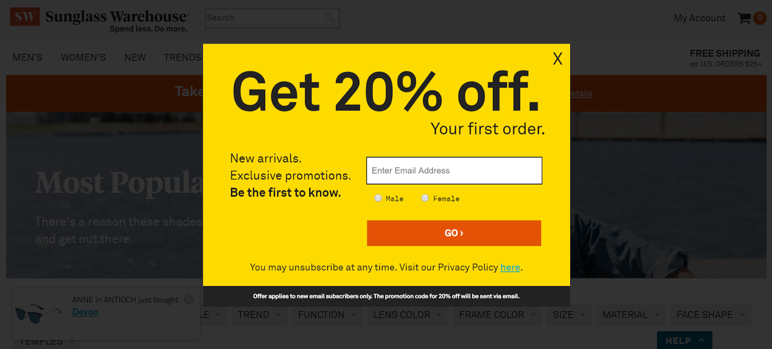
What this ecommerce landing page does well:
- This headline is big, bold, and it conveys a clear benefit: 20% off your first order.
- Copy below the headline conveys further benefits: new arrivals and exclusive promotions.
- The text “Be the first to know” communicates exclusivity. Find out before everybody else.
- The text “you may unsubscribe at any time” helps calm any spam-phobic readers.
What this ecommerce landing page could improve:
- This headline/subheadline is grammatically incorrect for no apparent reason. “Get 20% off. Your first order.” Eliminating the first period makes more sense. It may seem insignificant, but even small grammatical errors can decrease trust in the mind of the prospect.
- Disappearing placeholder text can potentially confuse visitors.
- The CTA “Go” has many better alternatives, more closely tailored to the offer.
- This form asks for gender as well as email. The more you ask your prospects, the better quality content you can deliver. However, you also increase friction. A great way to ask this, which justifies collecting the information for the benefit of the reader, is “Would you like us to send you information on products for males or females?”
26. Crown Wellness

What this ecommerce landing page does well:
- This squeeze page does a good job of eliminating most background distractions by fading them out.
- The subheadline conveys the benefit of signing up for the email list.
- The headline directly speaks to the visitor with the word “You.”
- The CTA button color is noticeable on a black background.
- One form field is all this squeeze page asks visitors fill out, making it a low-friction ask.
What this ecommerce landing page could improve:
- The headline doesn’t convey a benefit at all. The subheadline would make for a stronger headline than the current one.
- The subheadline, which conveys all the benefits, is written in extremely small type, making it somewhat difficult to read.
- White text on a black background is largely unpleasant to the eye. Avoid this. Stick to lighter colored backgrounds and black text for easiest reading.
- The CTA button location is odd, diagonally below the form field, making it appear as though it’s a mistake in the design rather than a deliberate quirk. If you’re going to violate design conventions, it should appear purposeful.
27. Gwynnie Bee

What this ecommerce landing page does well:
- This subheadline offers a free trial for 30 days, a hard-to-resist offer.
- The CTA button grabs attention with its purple hue.
What this ecommerce landing page could improve:
- Lack of information is this landing page’s biggest enemy. There’s minimal, and then there’s too minimal. That’s what this is. What you see in the image is the entire landing page. There’s not enough information here to help visitors make an informed decision on the offer.
28. Watch Gang

What this ecommerce landing page does well:
- The short video does a good job of quickly explaining the product.
- The headline offers a chance to win a Rolex on Fridays or a TAG on Tuesdays, along with a new watch guaranteed every month.
- The “Featured on” section adds credibility to the offer.
- A warranty and full insurance give confidence to potential buyers.
What this ecommerce landing page could improve:
- A highly imbalanced conversion ratio gives visitors way too many escape routes on this page.
- A hamburger menu, while organizing navigation links in a neat fashion, still knocks the conversion ratio out of balance.
29. Cellular Outfitter

What this ecommerce landing page does well:
- This headline is short, to the point, and it conveys a clear benefit.
- The hero shot of the phone case is aesthetically pleasing, and it shows visitors an example of what they could use their 25% off on.
- The offer, 25% off for just an email address, is a great deal for visitors.
- The call-to-action is tailored to the offer.
- The “X” in the corner of this squeeze page is, other than by clicking the CTA button, the only way off the page.
What this ecommerce landing page could improve:
- The fine print makes visitors question whether the deal is worth it. The offer excludes bluetooth headsets, custom cases, phones and select OEM products. Maybe “some restrictions apply” would be a better way to communicate this. Or, in the subheadline, list what visitors CAN put their discount toward, rather than listing what they CAN’T put it toward in the fine print.
- The offer of a free gift should be highlighted up with the 25% discount, not hidden in gray like the fine print.
- The disappearing placeholder text should be swapped out for a permanent label to avoid any potential confusion.
30. Ipsy
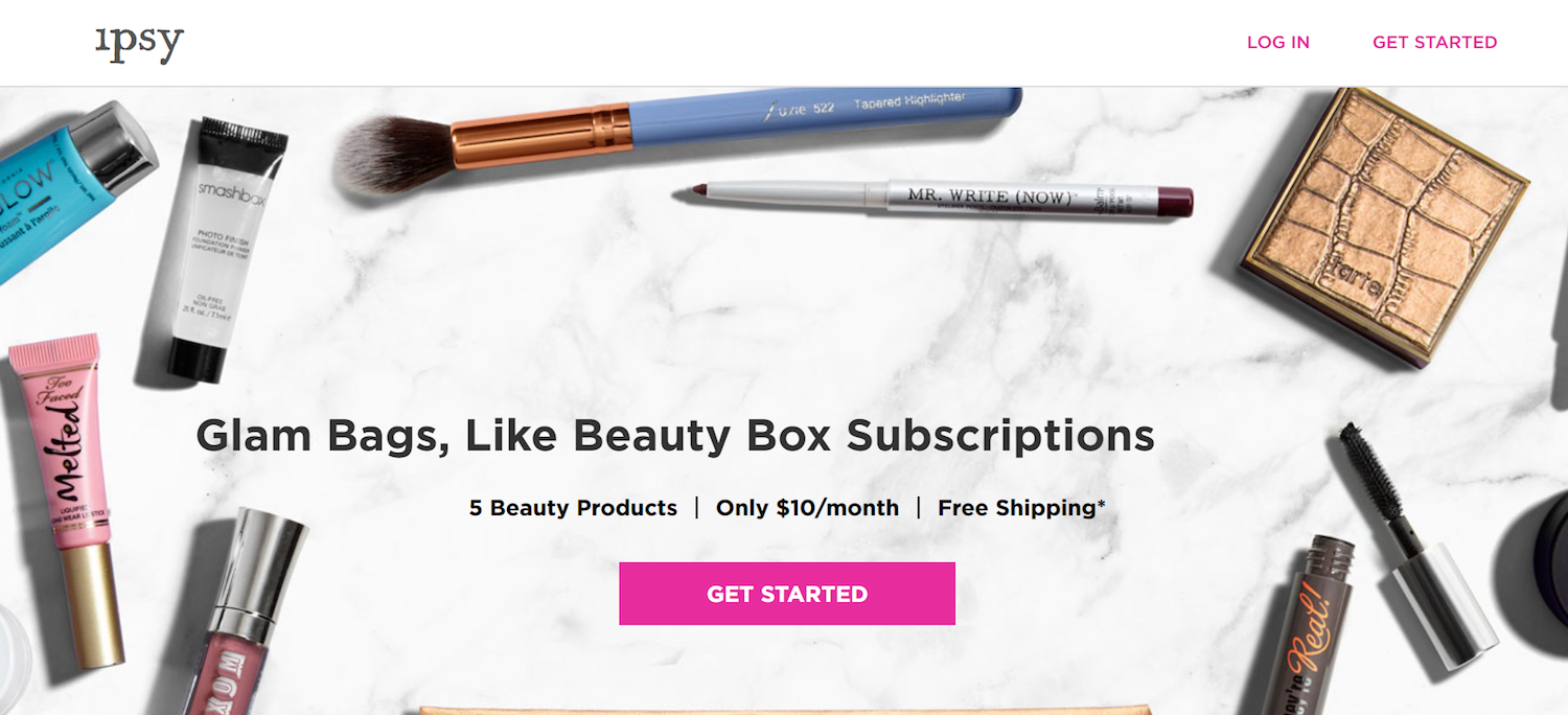
What this ecommerce landing page does well:
- The featured image does a good job of previewing products in the bag, including the brands they’re made by.
- The CTA button pops on the page.
- The subheadline communicates a few benefits of claiming the offer.
What this ecommerce landing page could improve:
- This headline is a little wordy and doesn’t contain a clear benefit. The subheadline “5 beauty products, only $10 a month, free shipping” would even make a better headline.
- “Get started” could be replaced by something that implies a little less work to sign up.
- Information is sparse on this page. It’s good to be minimal, but there’s not enough here to convince a visitor to claim the bag.
Start building your ecommerce landing page
To keep up with today’s distracted visitors, ecommerce landing pages need to evolve. They need to be built with elements of persuasiveness that compel conversion.
Ecommerce landing pages should be thought of as a virtual elevator pitch, including all the information that other, higher-level pages, might add to their argument. Otherwise, marketers risk continuing to waste traffic and ad spend.
Sign up for an Instapage 14-day free trial and see how our platform allows you access to a suite of tools to significantly improve your advertising ROI and streamline your landing page building process.

Try the world's most advanced landing page platform with a risk-free trial.
